
Table of Contents
The Blueprint
Muted / Sophisticated
Muted Tones
Paint
Natural, Neutral, Warm
Muted Tones for Your Home
You need a muted paint color to add interest to your home without overwhelming your space. These tones evoke a timeless look, perfect for historic and modern designs alike.
- Great for adding a subtle touch of color
- Calming and versatile
- Perfect for any room in the house
Meet the Experts
Try adding a designer’s insight to your paint selection! Learn from professionals who have a wealth of experience in color application.
- Susan Jamieson – Creator of Bridget Beari paint line
- Andrea Dussault – Founder of Striped Lemon Design
- Catherine Shuman – Owner of The Intentional Design Studio
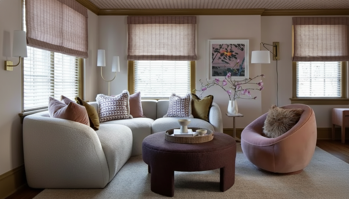
Farrow & Ball Sulking Room Pink No. 295
Invest in a rich muted rose with Sulking Room Pink, perfect for powder rooms and guest-facing spaces. This color pairs beautifully with brass accents and bold art.
- Sophisticated and versatile
- Pairs well with various textiles
- Creates a calming atmosphere
Benjamin Moore Soft Chamois OC-13
You need a warm, muted tone, such as Soft Chamois, to create a soft backdrop that enhances your space. Ideal for hallways and open living areas.
- Elevated alternative to stark neutrals
- Creates continuity without monotony
- Perfect for both walls and ceilings
Benjamin Moore Cinnamon Slate 2113-40
You need a nuanced, muted tone like Cinnamon Slate that imparts a moody, atmospheric feel to your rooms. Perfect for creating a sumptuous ambiance.
- Richly pigmented blend of colors
- Creates a cozy, enveloping feel
- Ideal for bedrooms and powder rooms
Alkemis Walking in the Rain No. 71
Try adding a timeless powder blue like Walking in the Rain to make your space feel light and airy. This color adapts beautifully to various lighting conditions.
- Perfect for creating a retreat-like atmosphere
- Pairs well with soft whites and natural wood
- Great for those hesitant about color
Benjamin Moore Herb Bouquet 460
You need a versatile sage green like Herb Bouquet that complements natural light beautifully. Ideal for blending indoor and outdoor living.
- Perfect for kitchens and communal spaces
- Pairs well with warm whites and natural textures
- Creates an inviting atmosphere
Bridget Beari Colors Bearzey No. 10
Invest in a d dusty rose like Bearzey that adds warmth and femininity to your space. This color is perfect for intimate and cozy settings.
- Flattering and quietly romantic
- Works well in powder rooms and bedrooms
- Bonus tip: Pair with richer muted colors for a modern contrast