
Table of Contents
9 Outdated Living Room Paint Colors and Trendy Color Upgrades
Living room paint colors are more than just a backdrop; they are the heartbeat of your home’s aesthetic, setting the mood and tone for every corner. Once cherished hues that oozed elegance and inspiration can now feel stale, devoid of the vibrancy that modern aesthetics crave. These outdated shades can leave your living space feeling disconnected, lacking the spark that contemporary design demands.
Refreshing your living room’s paint is a simple yet transformative act, breathing new life into your space and steering your home’s vibe in a fresh, inspired direction.
Outdated Paint Colors and Modern Alternatives
Color trends are as fleeting as the seasons. The secret to choosing the perfect living room hue lies in selecting what resonates with you. When you pick colors that you genuinely love, they become timeless in your eyes, bringing enduring joy to your home.
Even if your go-to shade has found its way onto the “outdated” list, fear not. There’s often a contemporary twist on your beloved color that maintains its charm while offering a fresh, modern appeal.
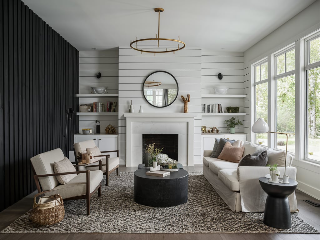
Bright White

Once the darling of minimalist design, bright white has fallen from grace, now seen as cold and stark. While neutrals are still in play, the trend has shifted towards warmer, richer shades. The once-popular bright white now feels too sterile, lacking the cozy depth that today’s homeowners seek.
Modern Alternatives: If you’re still drawn to white, consider warmer off-whites like cream, ivory, or a soft greige. Think of colors like Benjamin Moore’s White Dove or Farrow & Ball’s Salt. These shades retain the lightness and brightness but add a subtle warmth, creating a more inviting and textured space.


THROW PILLOWS

Dark Navy

Navy blue has long been a classic choice, its deep, rich tone a staple in many homes. However, its overuse has rendered it somewhat predictable and traditional. The trend now is to find something equally dramatic but with a twist.
Modern Alternatives: Dark blues are not off the table; they’re simply evolving. Consider slate blues with gray undertones or indigos tinged with a hint of purple. Colors like Blue Note by Benjamin Moore or Grays Harbor by Sherwin Williams offer the depth of navy but with a softer, more contemporary flair. For those seeking more vibrant blues, shades like cobalt, peacock, cerulean, and royal blue can provide a striking pop.


AREA RUGS
Rose Pink

Once adored for its romantic allure, rose pink has taken on a nostalgic air, feeling more retro than relevant. Pink hasn’t lost its charm, but the modern take leans towards shades infused with a touch of salmon or brown, adding sophistication and depth.
Modern Alternatives: Today’s top picks include Farrow & Ball’s Setting Plaster and Templeton Pink, along with Sherwin Williams’ Malted and Pueblo. These shades blend beige and pink, offering a whimsical yet elegant choice for a contemporary living room.


BLACKOUT CURTAINS
Tuscan Yellow

The sun-kissed warmth of Tuscan yellow once brightened many homes, but now it feels too intense and overwhelming. The trend has shifted towards lighter, more muted yellows that still bring warmth but in a more subtle and versatile way.
Modern Alternatives: Opt for soft, buttery yellows or pale lemon tones. They’re cheerful without being overpowering, creating a spacious and airy feel. Consider Farrow & Ball’s Dayroom Yellow or the perennial favorite, Hawthorne Yellow by Benjamin Moore, for a fresh, modern twist on yellow.


FLOOR CUSHIONS
Forest Green

Forest green’s deep, moody tones have long been a favorite, evoking a connection to nature. Yet, its widespread use has led to a search for fresher alternatives. While still a beautiful choice, it’s often bested by mid-tone greens that offer a more dynamic and lively feel.
Modern Alternatives: For a vibrant green, look to colors like Calke Green and Breakfast Room Green from Farrow & Ball or Verdigris from Benjamin Moore, which adds a captivating blue undertone to the green.


RECESSED FRAMED PRINTS
Cool Grays

Gray has been the go-to neutral for years, but the tide is turning, especially for cool grays with blue or purple undertones. These shades can feel too cold and impersonal. However, warm grays and greiges still hold their ground, offering a soft, welcoming vibe.
Modern Alternatives: While some warm grays, like Benjamin Moore’s Edgecomb Gray and Sherwin Williams’ Agreeable Gray, may feel overused, there are plenty of fresh alternatives. Consider Benjamin Moore’s Balboa Mist or Seapearl for a warm, modern take on gray.


FLOOR PILLOWS
Teal Green

Teal green, with its distinctive blue-green blend, can bring a bold, beachy feel to a living room. However, it might not be the easiest color to work with, especially if you’re aiming for a contemporary, organic design.
Modern Alternatives: For a more versatile choice, earthy greens like sage and eucalyptus are excellent alternatives. Sherwin Williams’ Pewter Green, Retreat, and Clary Sage, along with Benjamin Moore’s Hollingsworth Green, are perfect examples of light, earthy greens that harmonize well with modern living spaces.


THROW PILLOWS
Sky Blue

Light blues are a staple in interior design, beloved for their calming, airy qualities. But choosing the right shade is crucial; sky blue can sometimes come off as too cold. The key is finding a shade with a hint of green or gray undertones, adding depth and sophistication.
Modern Alternatives: Favorites like Sherwin Williams’ Sea Salt and Farrow & Ball’s Pale Powder are versatile choices. These colors can shift between blue, green, or gray, depending on the lighting, making them adaptable and elegant.

Black

Black, the ultimate classic, will always have a place in design. However, stark black walls can feel lifeless and harsh. A deep gray with warm undertones can create a moody yet inviting atmosphere, offering a more nuanced take on this dramatic hue.
Modern Alternatives: Consider Farrow & Ball’s Railings, a blue-tinged black, or Benjamin Moore’s Kendall Charcoal, a warm gray with balanced undertones. These colors provide the boldness of black but with a richer, more welcoming feel.


RECESSED FRAMED PRINTS
Embracing these modern alternatives can transform your living room, making it a space that feels fresh, inviting, and in tune with contemporary aesthetics. Whether you’re drawn to warm neutrals, vibrant blues, or soft, earthy greens, there’s a perfect shade out there waiting to bring your living space to life. Remember, the best color choice is the one that brings you joy and makes your home feel truly yours.

2 comments
[…] floating battery-operated candles subtly pay a nod to Halloween but can remain hanging in your living room all season long—and even throughout the winter, if you wish. You’ll appreciate the […]
[…] you want your living room to be warm, inviting, and filled with romantic touches, embracing the bohemian design style is the […]