Table of Contents
Why Room-Elevating Color Schemes Matter
Choosing the perfect room-elevating color scheme can feel overwhelming. With endless options, many default to neutral tones, fearing bold choices. Yet, interior designers agree—strategically selected hues can transform a space, making it feel more sophisticated, vibrant, and luxurious without requiring a complete makeover.
Whether you seek a cozy retreat, a lively entertaining area, or an elegant sanctuary, the right room-elevating color schemes make all the difference. To simplify your decision-making, we’ve gathered expert-approved palettes that are timeless, impactful, and easy to implement.
Cream and Sand – A Timeless Neutral Palette
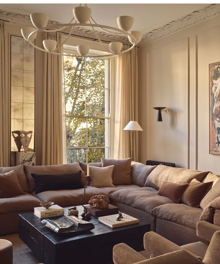
Neutral color schemes are a fail-proof way to create a calming and versatile backdrop. While some fear neutrals can be bland, designers emphasize that earthy, warm hues elevate a space effortlessly.
How to use it:
- Opt for creamy white or warm beige walls.
- Layer with sandy and taupe furnishings.
- Add depth with terracotta or rust-colored accents.
Why designers love it:
“A neutral palette doesn’t mean boring—it’s about creating depth and warmth,” says interior designer Murude Katipoglu. “Pairing a soft cream base with sandy hues and rustic browns results in a space that is both timeless and luxurious.”
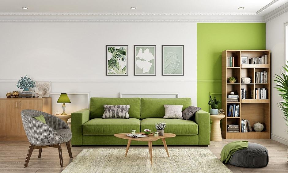
Pistachio and Chartreuse – A Playful Yet Sophisticated Pairing
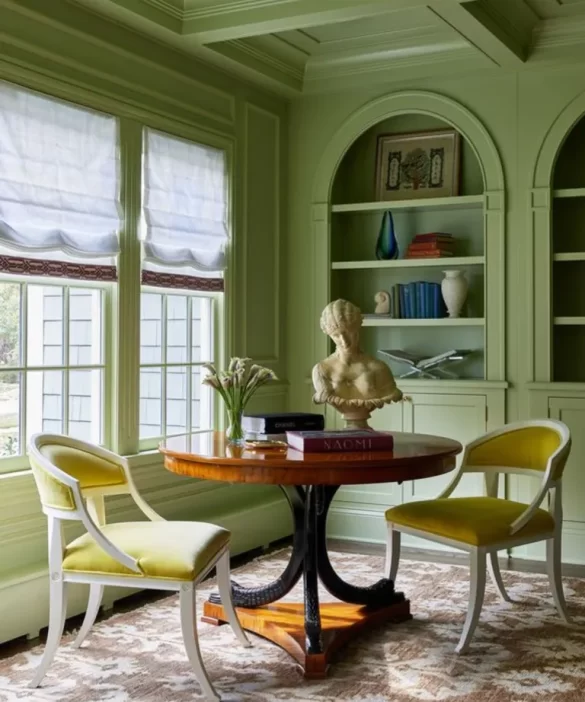
Pistachio green and chartreuse are game-changers for those wanting a bold yet balanced aesthetic. These unexpected hues inject personality while maintaining a sense of refinement.
How to use it:
- Paint walls in soft pistachio green.
- Introduce chartreuse through accent chairs or artwork.
- Balance the vibrancy with neutral flooring or muted decor.
Why designers love it:
“Green has a grounding quality, and when paired with chartreuse, it exudes vibrancy without feeling overpowering,” explains a top designer. This scheme works exceptionally well in historic homes that need a contemporary touch.
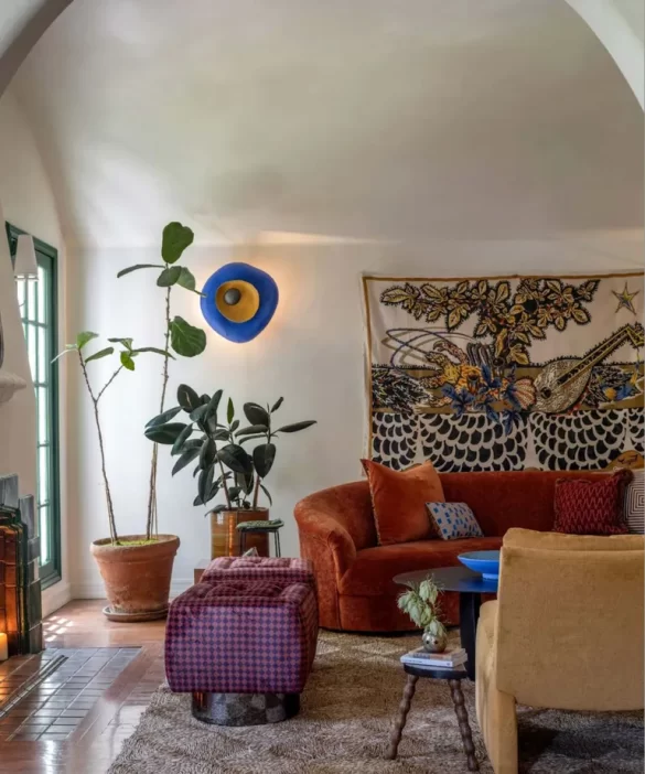
Burgundy – A Statement Shade with Timeless Appeal
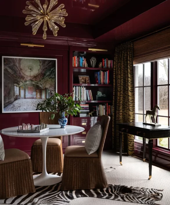
Rich, deep, and inherently sophisticated, burgundy is perfect for those who love a touch of drama. It exudes warmth, elegance, and historical charm, making any room instantly feel more luxurious.
How to use it:
- Paint an accent wall or opt for a bold look with burgundy walls.
- Pair with dark wood furniture for a traditional look.
- Add gold accents or deep green upholstery for a contrasting effect.
Why designers love it:
“A deep burgundy can take an ordinary space and turn it into something undeniably rich and opulent,” says interior designer Sarah Vaile. This color also thrives in candlelit spaces, adding to its moody allure.
Forest Green and Ice Blue – A Nature-Inspired Duo
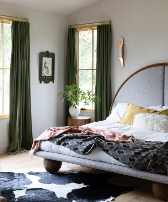
Breaking old design rules, forest green and ice blue prove that blue and green should be seen together! This combination mirrors nature’s tranquility, creating a serene yet dynamic color scheme.
How to use it:
- Use forest green for statement walls or large furniture pieces.
- Complement with soft ice blue curtains or rugs.
- Add brass or gold details for an elegant touch.
Why designers love it:
“A deep green paired with a whisper-light blue creates just the right mix of depth and airiness,” says Amy Pigliacampo. “It’s a foolproof way to achieve both drama and calm in one space.”
Rust Orange and Mustard – A Warm and Welcoming Contrast
For a cozy yet stylish home, rust orange and mustard yellow are perfect earthy shades. They create a modern rustic aesthetic that radiates warmth and energy.
How to use it:
- Choose rust orange for a statement sofa or walls.
- Add mustard yellow through cushions, throws, or artwork.
- Contrast with neutral or deep brown elements.
Why designers love it:
Kristina Khersonsky, founder of Studio Keeta, emphasizes the power of this duo: “Rust orange adds character, and mustard yellow grounds the warmth without overwhelming. The result? A space that feels bold yet livable.”
Final Thoughts: Elevate Your Home with the Right Colors
Choosing room-elevating color schemes isn’t just about aesthetics—it’s about creating an atmosphere that resonates with you. Whether you prefer classic neutrals, bold hues, or unexpected pairings, these designer-approved color palettes offer foolproof ways to enhance your space.
Which color scheme speaks to you the most? Let us know in the comments!
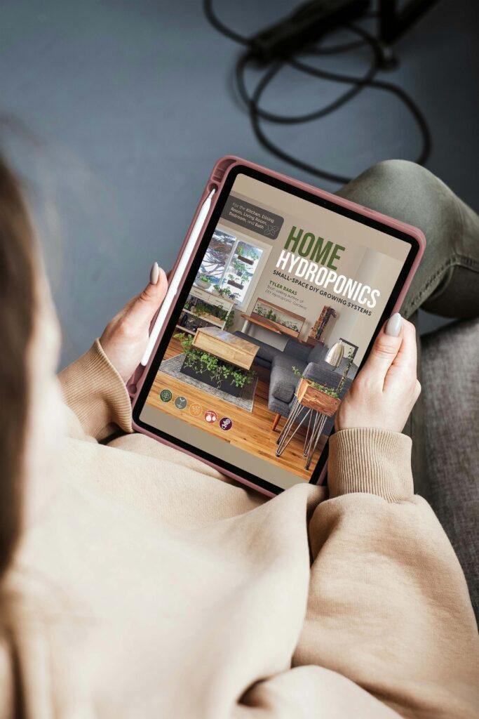
Home Hydroponics
Turn a coffee table, kitchen cupboard, bathroom wall, bedside table, or windowsill into a wonder of hydroponic production with project plans and DIY tutelage from hydroponic-growing pro-Tyler Baras.
