Table of Contents
Color doesn’t just fill a room—it defines it. One swipe of the right shade can shift a space from average to absolutely elevated. Designers are well aware of this, and when clients seek an “instant luxury” effect, they opt for particular hues. Deep, moody blues. Silky taupes. Wines that almost glow. Greens that feel like evening light. These are the colors that whisper expensive the moment you walk in.
Below, you’ll find the 11 designer-approved paint colors that instantly upgrade your home’s atmosphere—and exactly how the pros use them to create refined, high-impact spaces.
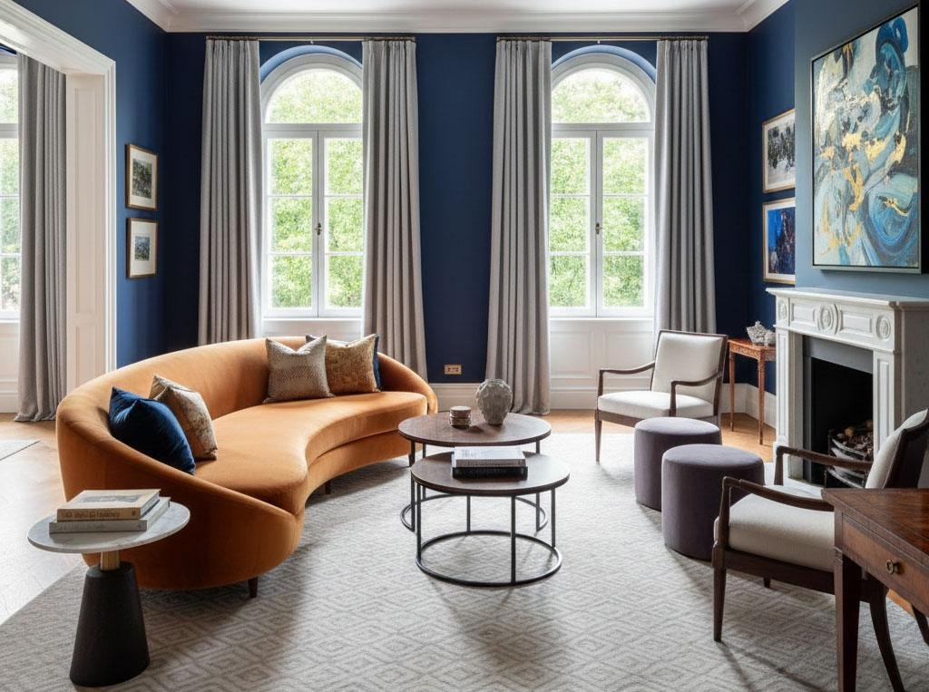
Navy Blue
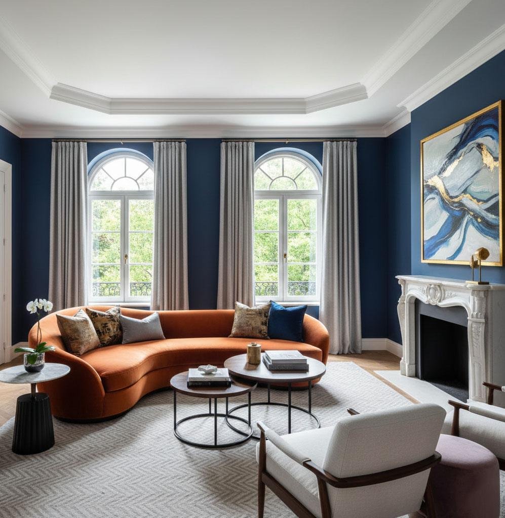
Navy never loses its elegance—it simply shifts between classic and modern depending on how you style it. Designers love navy because it’s calming, familiar, and endlessly adaptable. It works in kitchens, living rooms, libraries… anywhere you want subtle drama. Pair navy with warm golds or jewel tones for a luxurious, moody finish, or soften it with ivory to create a balanced, tailored look. The shade’s depth makes any room feel more intentional and more expensive.
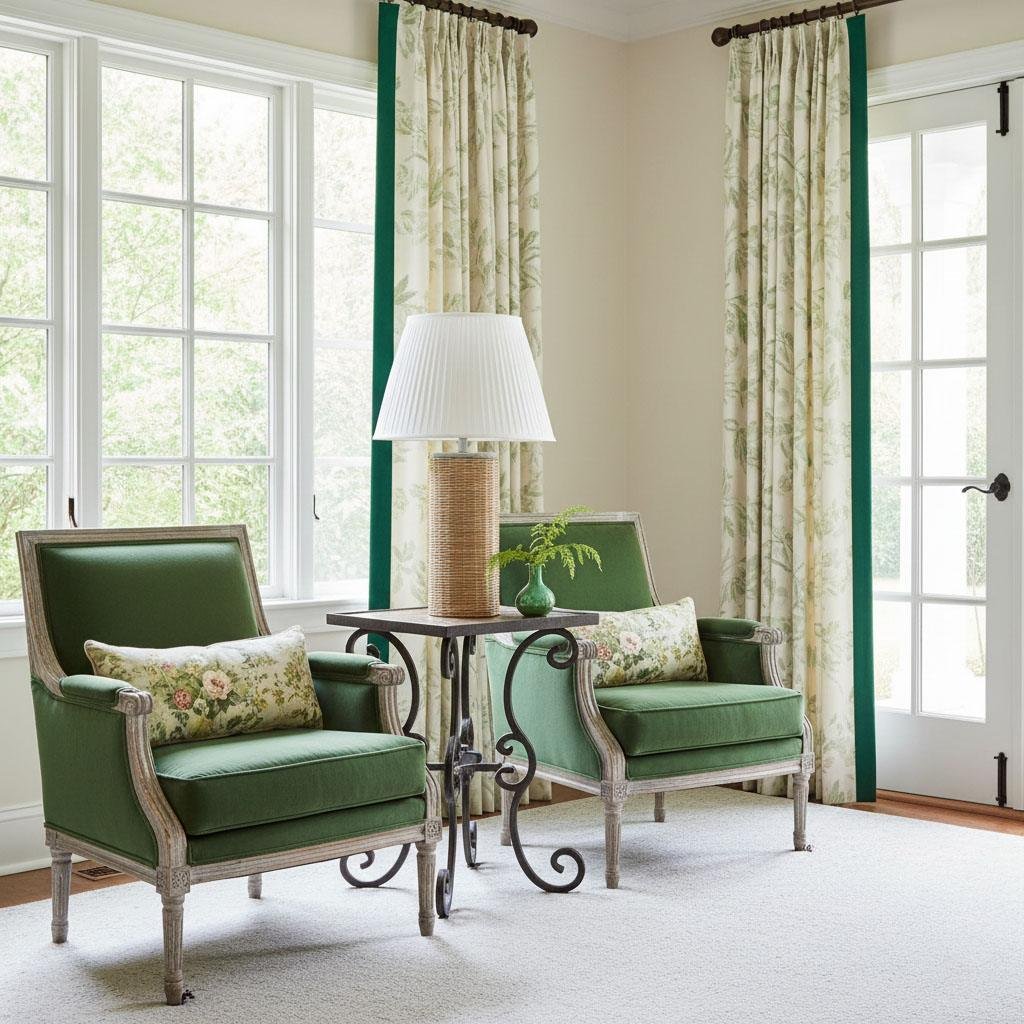
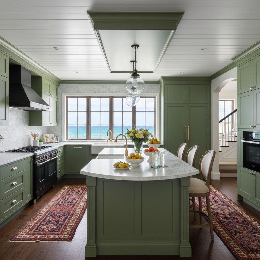
Olive Green
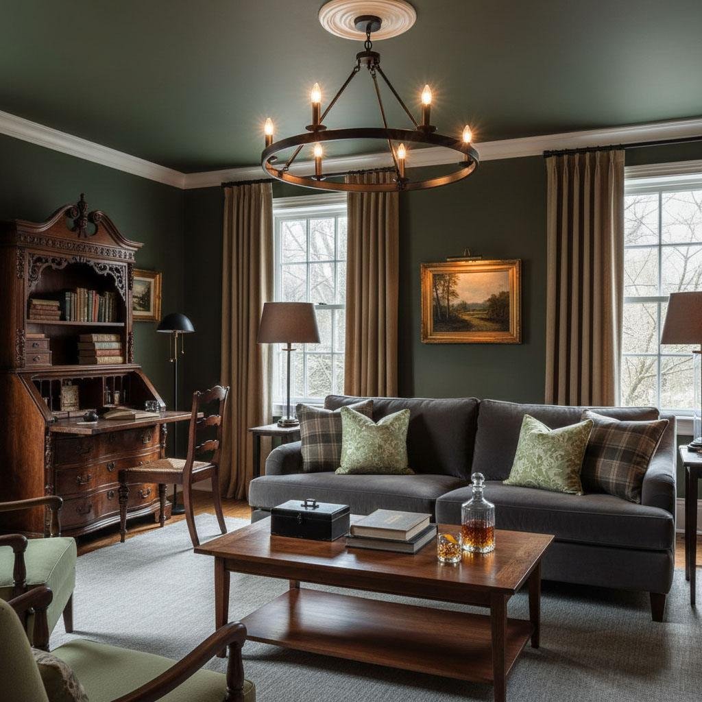
Olive green wraps a room in quiet sophistication. Designers praise this shade for its ability to feel earthy and rich at the same time. Whether you use it on all four walls, just the trim, or even the ceiling, olive green adds instant warmth. It harmonizes beautifully with brass, camel tones, white oak, or crisp white accents. For homeowners wanting color instead of black—but still refined—olive is the perfect compromise.
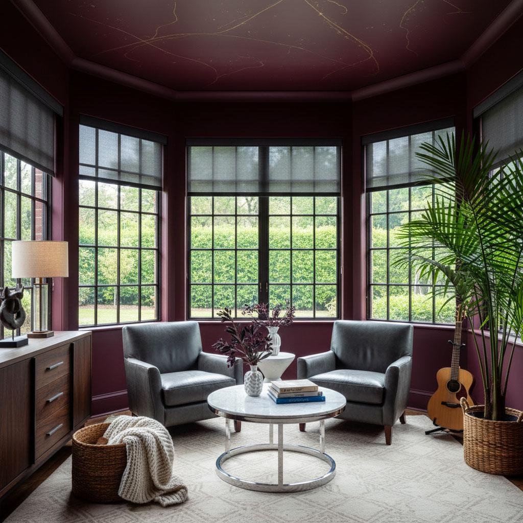
Oxblood
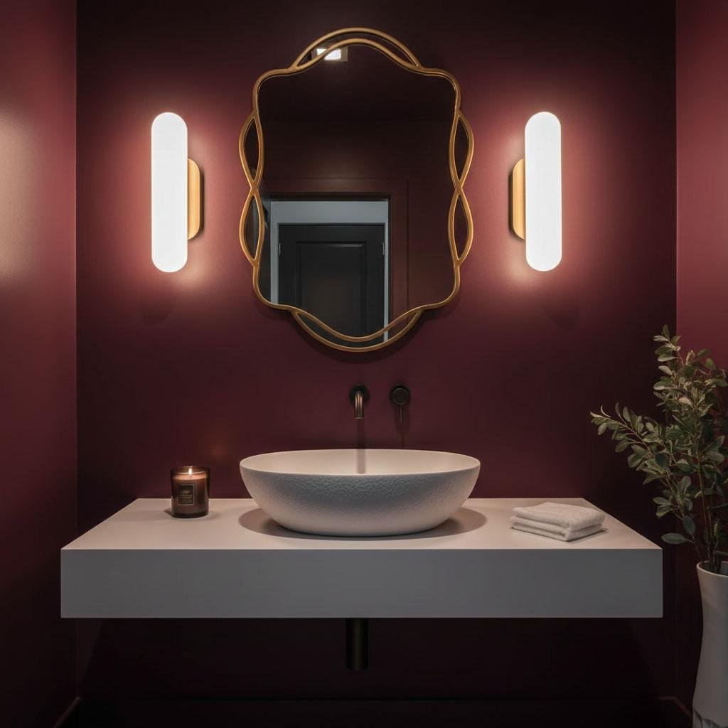
Oxblood is deep, dramatic, and impossible to ignore. Designers describe it as a color that feels handcrafted, aged, and luxurious—like walking into a room filled with old books and polished wood. It’s ideal for dining rooms, media rooms, or libraries. When used in large spaces with high ceilings, oxblood creates an enveloping, velvet-like atmosphere. Pair it with soft neutrals for balance or with deep charcoals for added edge.
Dark Teal
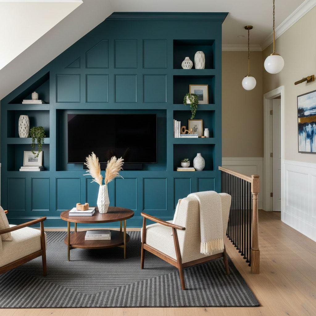
Dark teal offers richness without feeling overpowering. It’s bolder than navy but still grounded, giving rooms depth and elegance. Designers love using it to play with shadow and light, especially when combined with brass or warm metallics. Soften dark teal with neutrals like beige or pale wood paneling to keep the space luxe but airy.
Plum Purple
Purple has long been linked to royalty, and plum lives up to that legacy. It’s rich, moody, and instantly sophisticated. Designers brighten it with gold or metallic accents, but plum also pairs beautifully with modern tones like emerald, burgundy, or even playful shades like tangerine. Whether used sparingly or boldly, plum adds undeniable luxury.
Off-White
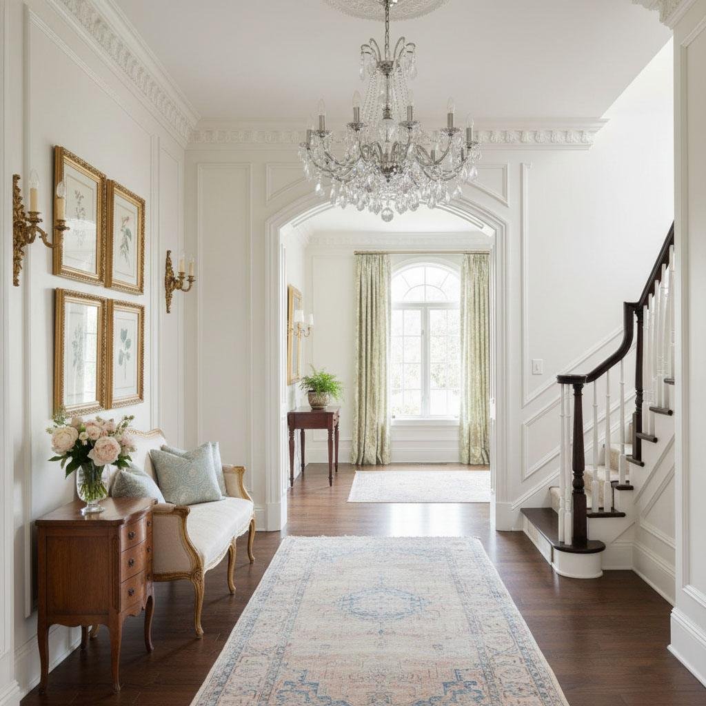
If you prefer a neutral palette, off-white is the quiet luxury color designers swear by. Unlike stark white, an off-white tone feels warm, soft, and refined—not clinical. It works especially well in open-concept homes, creating a serene backdrop that highlights textures, art, and furniture. To elevate off-white even further, pair it with velvet furnishings, brass accents, and rich wood tones.
Smoky Taupe
Smoky taupe is the color equivalent of suede—soft, warm, and inviting. Designers choose this shade when they want depth without heaviness. It sits beautifully between beige and gray, offering a refined feel that works in modern or traditional settings. Pair smoky taupe with crisp whites or soft greens for a polished, calming look.
Charcoal
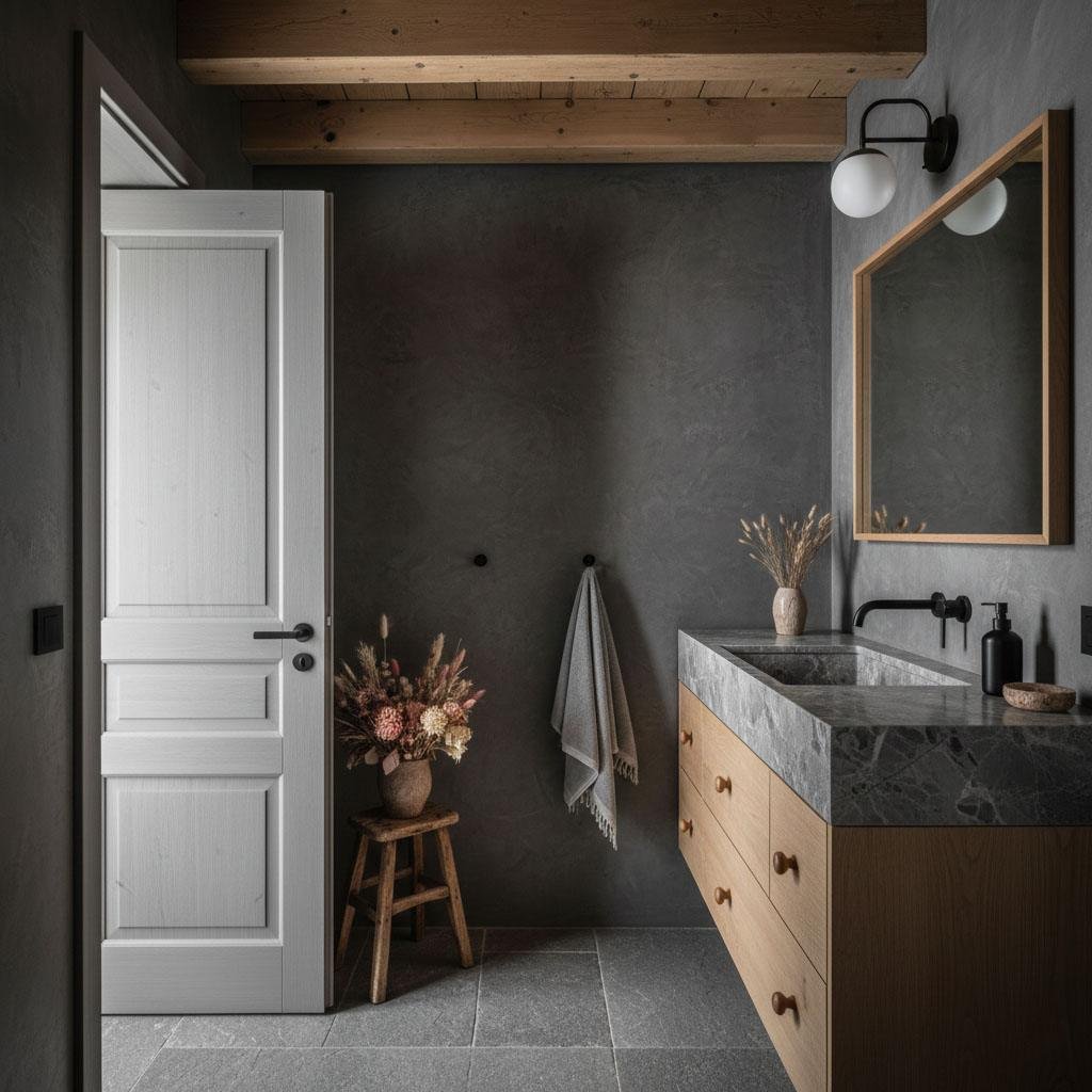
Charcoal brings moody sophistication to any room—especially when applied with a limewash finish. The textured look adds movement and complexity while keeping the palette dark and grounded. Designers pair charcoal with marble, brass, warm woods, and plush fabrics to enhance the luxurious effect. Under soft lighting, charcoal creates an intimate, boutique-hotel feel.
Dusty Blue
Dusty blue blends blue and gray into a timeless, tailored hue that feels both classic and contemporary. Designers love it for the sense of calm it brings, as well as its refined, soft elegance. It looks stunning on cabinetry, millwork, and walls. Pair it with whites, light woods, or warm metallics to complete the upscale effect.
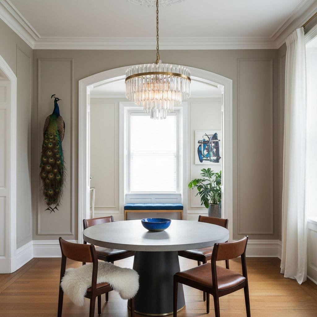
Plaster Finishes
Rather than choosing a single color, many designers elevate a home’s aesthetic through texture. Limewash, clay plaster, and Venetian plaster transform simple white or neutral walls into something sculptural and refined. The slight variations in tone create a high-end finish that feels custom. Pair white plaster walls with jewel tones to enhance the contrast.
Celery Green
Celery green is bright, fresh, and surprisingly elegant. Designers are using it more often in kitchens and adjoining spaces, especially in glossy finishes. This shade brings energy and light into a room while still looking upscale. Because it’s such a statement color, it pairs best with off-whites, dark accents, and soft neutrals that keep the palette balanced and intentional.
Final Thoughts
Luxury doesn’t always come from marble floors or high-end lighting. Sometimes it starts with the paint can in your hand. These designer-approved shades can transform your space—quietly, instantly, dramatically. Whether you want moody sophistication, soft elegance, or bold personality, one of these 11 colors will elevate your home the moment it hits the wall.
If you’re ready to upgrade your space, explore the full article and dive deeper into each designer’s expert tips.
{ “@context”: “https://schema.org”, “@type”: “Article”, “headline”: “11 Paint Colors That Instantly Make Your Home Look Expensive”, “description”: “Discover 11 designer-approved paint colors that make your home look expensive instantly. Learn how navy, olive, oxblood, taupe, and more elevate any room.”, “author”: { “@type”: “Person”, “name”: “Monika Bürger” }, “publisher”: { “@type”: “Organization”, “name”: “Your Website Name”, “logo”: { “@type”: “ImageObject”, “url”: “https://example.com/logo.png” } }, “keywords”: [ “paint colors that make your home look expensive”, “luxury paint colors”, “designer paint colors”, “expensive-looking paint colors”, “interior design color trends” ], “articleSection”: “Home Decor”, “datePublished”: “2025-11-24”, “dateModified”: “2025-11-24” }