
Table of Contents
Best Bedroom Colour Combinations – 8 Fool-Proof Palettes for a Calming Retreat
When decorating a bedroom, colour isn’t just decoration—it sets the entire mood. The best bedroom colour combinations help your mind unwind, soften the day’s noise, and make falling asleep easier. Using colour psychology and design principles, we’ve rounded up eight expert-approved palettes to turn your bedroom into the restful retreat you deserve.
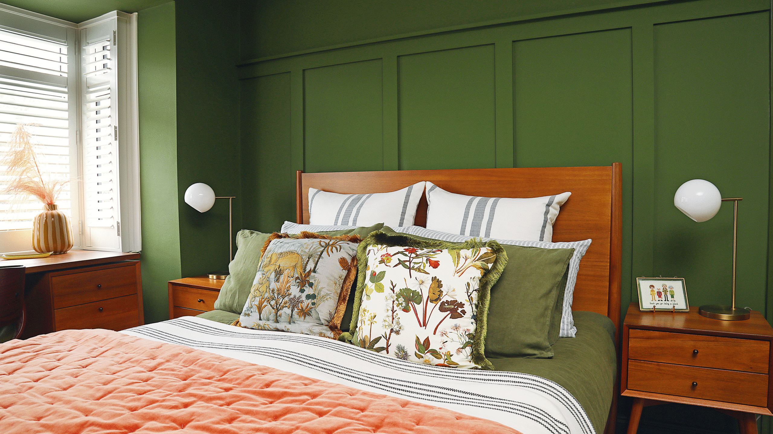
1. Earthy Pink & Moss Green

Earthy pink radiates warmth; moss green grounds the space in the calm of nature. Together, they strike a perfect balance—soft, natural, and sophisticated.
Design Tip: Use earthy pink on walls for a warm embrace, layer moss green through bedding or an upholstered headboard, and introduce natural wood tones for harmony. A 50/50 colour split keeps the palette soothing, not overwhelming.
Mood: Restful, organic, welcoming.
2. Pale Blue & Mustard

The serenity of pale blue meets the cheerful energy of mustard yellow. This unexpected combo merges cool tranquillity with sunny warmth, creating a bedroom that feels airy yet vibrant.
Design Tip: Keep pale blue as the dominant color across walls and linens. Introduce mustard through rugs, lampshades, or accent chairs for controlled bursts of warmth. Natural fabrics like linen or cotton keep the palette feeling soft and breathable.
Mood: Bright mornings, calm nights, timeless charm.

Large Tall Clothes Basket Bin with Bamboo Handles
SpaceAid Laundry Hamper with Lid, 110L Large Tall Clothes Basket Bin with Bamboo Handles, Collapsible Laundry Hamper for Bedroom, Bathroom, Dorm, Laundry Room.

3. Navy & Stone

Navy blue anchors the room with elegance, while stone softens the depth for a cozy, balanced retreat. This duo is perfect for those who appreciate understated luxury.
Design Tip: Feature navy on an accent wall or bedding, then layer stone tones—taupe, oatmeal, or soft clay—on curtains, throws, and furniture. Metallic accents in brass or gold add quiet sophistication.
Mood: Calm, elegant, slightly dramatic.
4. Butter Yellow & Burgundy

Warm butter yellow wraps the space in golden light, while deep burgundy introduces richness without heaviness. Perfect for bedrooms seeking warmth with a touch of drama.
Design Tip: Use butter yellow generously on walls or the ceiling for a sunlit glow. Add burgundy on an upholstered headboard, artwork, or scatter cushions to prevent overstimulation while adding modern depth.
Mood: Cozy, inviting, slightly romantic.
5. Ink Blue & Deep Green

Dark and cocooning, this palette creates a sanctuary-like feel. Ink blue soothes the senses; deep green connects the room to nature’s grounding energy.
Design Tip: Try an even colour split on walls and ceiling for a moody, intimate effect. Incorporate rattan furniture, trailing houseplants, and natural textures to soften the darkness and add life.
Mood: Restful, moody, nature-inspired luxury.
6. Ochre & Black

Ochre adds warmth reminiscent of Mediterranean sunsets; black grounds the brightness with contemporary sophistication. Together, they balance boldness with calm energy.
Design Tip: Keep ochre as the hero on walls and fabrics, using black sparingly on bed frames, curtain trims, or decorative accents. Layer soft whites and natural textiles, such as linen, for a light and warm feel.
Mood: Dramatic, stylish, earthy.
7. Peach & Apple Green

Fresh and lively, peach brings softness while apple green injects energy and optimism without chaos. Perfect for a rejuvenating bedroom vibe.
Design Tip: Use muted tones for walls to prevent a childish feel. Pair with natural wood furniture, soft lighting, and subtle accents in grey or mustard for grounding balance.
Mood: Refreshing, youthful, uplifting.
8. Lilac & Aqua

Lilac whispers calmness with floral softness; aqua evokes coastal freshness. Together, they create a cheerful yet serene palette ideal for light-filled bedrooms.
Design Tip: Follow the 60-30-10 rule—let aqua dominate the walls, lilac enrich the fabrics, and introduce 10% of a third color, like white or soft grey, for depth and balance.
Mood: Gentle, optimistic, modern.
Colours to Avoid
Bright reds, neons, and harsh pinks raise energy levels, making it harder to unwind. Similarly, jet blacks or dark charcoals can feel heavy and depressing in small or poorly lit spaces.
Conclusion
The best bedroom colour combinations don’t just beautify—they transform your space into a sanctuary. Whether you crave earthy warmth, cool serenity, or playful pastels, these eight palettes deliver harmony, comfort, and timeless style.