Table of Contents
Every designer we spoke to has agreed that yes, in some ways, the kitchen should match the rest of your open-plan space. Creating an interior that brings each of the separate zones together is key to the success of the space, and, according to Ash McCullough, Lead Designer at Blakes London, there are a few insider tricks to bear in mind.
‘The first is to try and make the kitchen as unobtrusive as possible. We like to hide as many appliances away as we can: integrate your fridge freezers, and ideally have a hidden pantry or larder cupboard where you house all your small appliances and other day-to-day items,’ she shares. ‘Careful planning of kitchen storage ensures that your surfaces remain clear and uncluttered. This downplays the functionality of your kitchen so it can sit more harmoniously alongside the living space.’
Ash also recommends that, for a modern kitchen area, you need to zone the different spaces. ‘An island does a wonderful job of offering a visual divide between the kitchen and the living area.’ Other ideas could include subtle partitions, like a low-level sideboard, or introducing different levels to elevate and demarcate a particular area.
‘Your color or material palette is also key in both defining and uniting the separate zones,‘ Ash continues. ‘It may be that the color of the sofa is a similar tone to that of the kitchen units so that the spaces speak to one another, or perhaps a shade of timber can repeat in the joinery or flooring in another part of the room.’
Finally, Ash outlines the importance of lighting in an open-plan space. ‘You’ll need task lights in the kitchen for preparing meals, and ambient lighting for when the living area is in use. Therefore, it’s helpful to have your lighting on separate loops so that you can set the mood across the whole room, depending on the activity taking place.’
HOW TO MAKE YOUR KITCHEN MATCH YOUR LIVING ROOM
Keen to hear more ideas for a cohesive kitchen and living room? Read on for our round-up of top tips from the experts.
1. STICK TO NATURAL MATERIALS
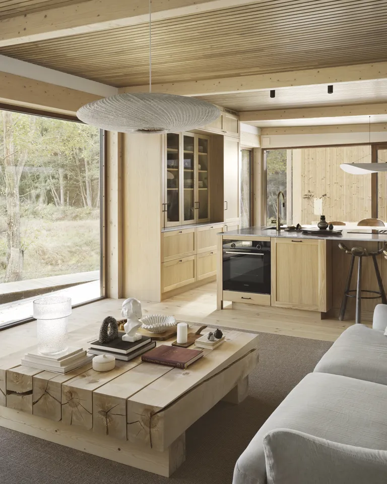
Studio He and Swedish kitchen brand Nordiska Kök teamed up to create this bespoke solid oak kitchen for a home in the Stockholm Archipelago. Timber floors and ceilings create a fluid feel in this serene space, where the wooden kitchen cabinets and dining area flow effortlessly through to the living room.
‘White-pigmented shaker doors in solid oak match the rest of the home’s interior perfectly,’ says Nordiska Kök’s creative director Johan Lundkvist of the kitchen’s design, which also creates a link to the dense forest outside. In the modern farmhouse living room, a coffee table made from birch logs from the garden adds to the interior’s rustic appeal.
2. CREATE A VISUAL LINK
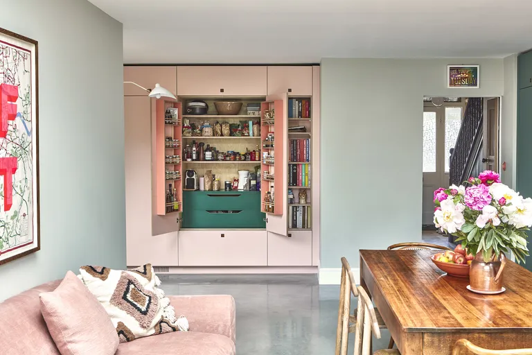
We love the use of cheery pastel pink in this inviting kitchen, which was designed by Pluck. ‘The sofa is a signal that this is a room to chill and chat in, as well as to cook and bake, and do all the other traditional kitchen activities,’ says Leila Touwen, Pluck’s co-founder. ‘
Color is used to link the different uses of the space, with the pale pink uniting the cozy sofa area with the practical cabinetry. It also visually links them, suggesting the wall of cabinetry is part of the living zone, so you can really enjoy a sense of connection here,’ she adds.
3. SOFTEN THE TRANSITION
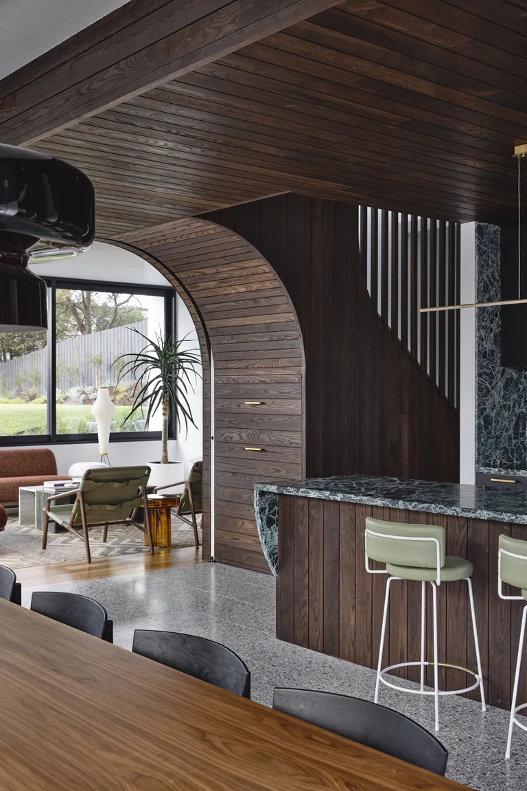
Richly stained timber envelops this kitchen, which forms the centerpiece of an Australian beach house designed by Jost Architects and furnished by interior decorator Simone Haag.
The cladding extends out to meet the adjacent living room, which is accessed through a gentle arch that marks a subtle transition between the two spaces. ‘The architecture and palette were confident, and we wanted to match that,’ says Simone of the interior selections. ‘We chose a sofa that echoed the building’s curves, as well as accents of amber and olive.’
4. CONNECT SEPARATE SPACES WITH DIFFERENT SHADES OF THE SAME COLOR
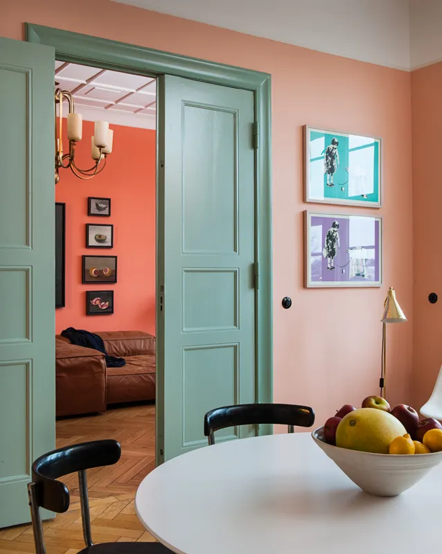
‘We developed this color concept to enhance the perception of space and depth,’ says Remo V. Lotano of German interiors and architecture studio, Gisbert Pöppler. When overhauling this family home in Berlin, the studio switched up the layout, moving the kitchen next to the living room.
‘We chose to paint the living room in a hearty salmon color, which we feel gives the space a kind of atmosphere suitable for lounging, and the kitchen in a light but decisive pink,‘ explains Remo. ‘While the colors are similar, their difference in intensity accentuates the connection between the rooms and their purpose in the home.’
5. ENSURE YOUR ISLAND IS A GATHERING POINT
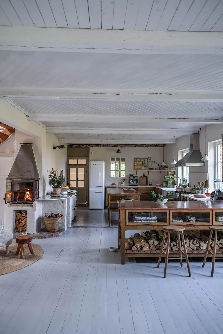
When Norma and Lorna of Our Food Stories set about transforming this Swedish cottage, they turned to deVOL for a kitchen that would match the home’s abundant charm and character. They chose the Haberdasher’s design for its vintage feel, placing a free-standing island unit at the end of a row of fitted cabinets to partially enclose the kitchen.
Crucially, the layout still allows for easy movement between the kitchen and adjacent living space, and provides a gathering point for guests, keeping the smaller central island free for cooking prep. ‘Islands, if designed well, can really make a room,’ says Helen Parker, deVOL Kitchens’ creative director. ‘I love the idea of creating a place that everyone gravitates to.‘
6. UNITE SEPARATE ZONES WITH A BOLD WALL COLOR
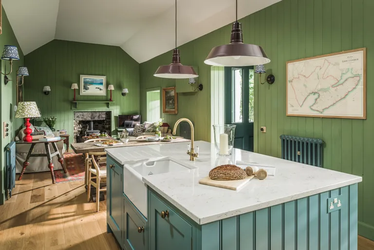
Set close to the seashore on the Isle of Mull, the kitchen of this idyllic bolthole features a vibrant palette that wraps the room in color and instantly draws the different sections of this long and slender space together.
‘Color and texture play a major role in keeping the aesthetic in this Scottish kitchen, dining, and living space looking seamless, ‘ says Rebecca Nokes, Head of Design & Brand Creative at John Lewis of Hungerford. ‘Using the same color and wood cladding on the walls throughout creates a cohesive look, while the complementary shade on the island, which also features the cladding used on the walls, cleverly zones the kitchen area. ‘
7. USE SUBTLE PARTITIONING TRICKS TO DEFINE DIFFERENT AREAS
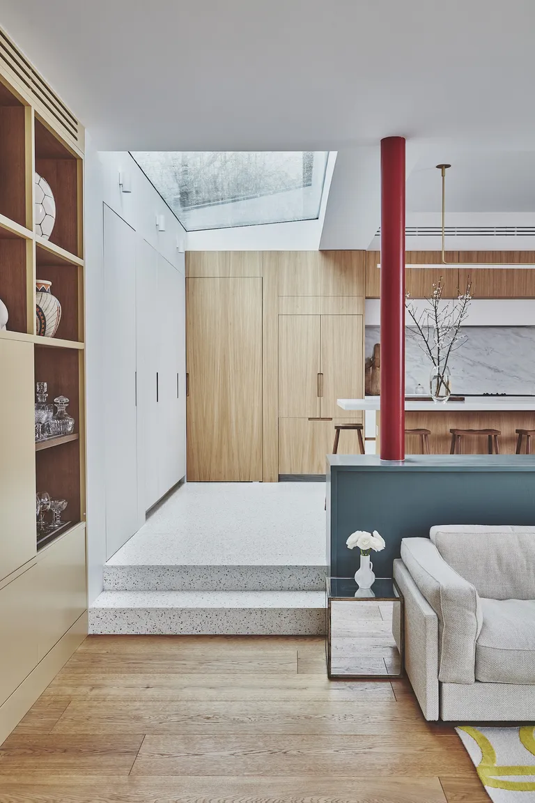
‘Incorporating different levels within an open-plan room offers a practical and visually appealing solution to zoning different functional areas,’ says Ash McCullough, Lead Designer at Blakes London.
‘By utilizing low-level cabinetry, such as this striking blue unit, you can create a visual barrier that effectively divides the room without obstructing the overall flow and sense of space.’
Ash favors this trick as it marks out separate zones for activities such as cooking and living while maintaining a connection between the areas. ‘Keeping the materials consistent, for example, mirroring the timber kitchen joinery with the living room flooring, creates a pleasing sense of unity within the room.’
8. TRY A TONAL PALETTE
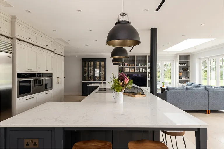
‘Selecting the right tone and shade for your space is especially important when it comes to an open-plan kitchen and living space,’ says William Durrant, owner of Herringbone Kitchens, the company behind this calm and cohesive interior.
‘Carrying a color thread through from the kitchen to the living area creates an intimate space that feels cozy but also looks connected,’ explains William, referencing the charcoal island and the mid-grey shade used to paint the insides of the built-in shelving. ‘Details like this can enhance a sense of harmony in an open-plan space.‘
9. CREATE INTIMACY WITH A CENTRAL FIREPLACE
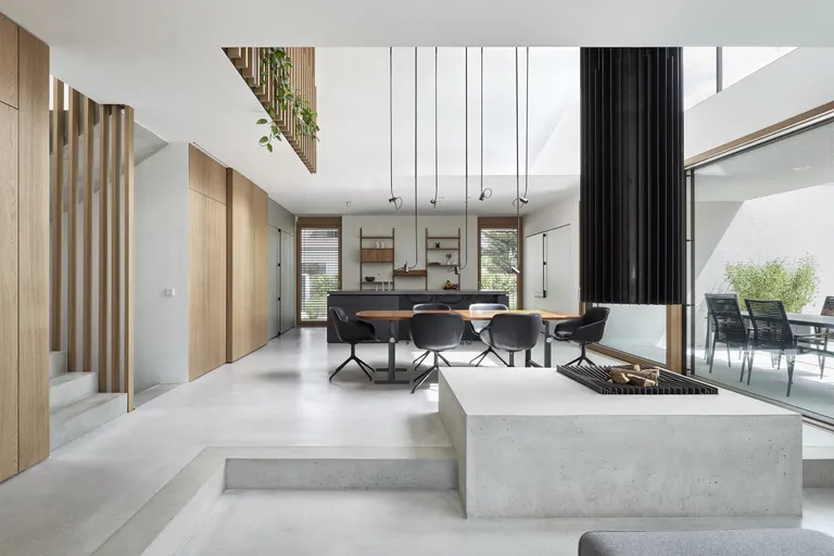
Nothing creates a focal point quote like a roaring fire: a particularly effective tool if you’re trying to up the coziness of a large room that serves multiple purposes. In this sleek German abode, Munich studio Holzrausch drew the two ends of this sizable, split-level kitchen, dining, and living space together by installing a striking hearth in the middle.
‘The fireplace, whose black steel flue looks like a sculpture hanging from the ceiling, forms the visual center of the living space and emphasizes the maisonette-like character of the room,’ say its designers.
10. EXTEND YOUR KITCHEN CABINETRY INTO THE LIVING SPACE
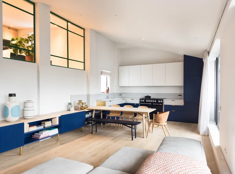
‘We wanted this space to be versatile and flexible: able to accommodate an intimate meal, a dinner party of 12, or a family night on the sofa,‘ says architect Eryk Ulanowski of this apartment in London’s Covent Garden, which was reworked by his practice, Studio Ulanowski.
‘The previous space was very rigid in its layout, so we designed the kitchen as a piece of bespoke oak joinery that wrapped around the entire room to break down those boundaries.‘ Eryk introduced the fluted timber and terrazzo worktops to add tactility and contrast and chose the bright blue hue to focus the eye and tie it all together. ‘The furniture around the room can be easily configured in different ways, depending on how the clients want to use the space,’ he adds.

8 comments
[…] of furniture around the living room fireplace can be effective, or in a larger, open-plan living room try dividing the space up with two or more different seating […]
[…] and storage beds are another fabulous invention, opening with either a hinge that reveals masses of storage space, or handy drawers. Meanwhile, bench seating is another perfect way to add seating and storage […]
[…] noticing that dark green paints are being used far more easily than they once were and not only on kitchen cabinets where they have lived for decades but in softer rooms […]
[…] feel spacious even though space is limited. Whether you’re focused on small bedrooms, small kitchens, or small bathrooms, these are the clever ways designers make rooms look […]
[…] from being two-dimensional, a blue-and-white color palette can be used to achieve all sorts of looks, from smart and sophisticated to subtle and […]
[…] light to enter the room. However, brightening a living room is not just about natural daylight; planning living room lighting to the last degree is vital too. Below, Patrick gives his advice on […]
[…] While open floor plans have been all the rage for quite a while, Leigh predicts this trend is coming to a close in 2024. If you have an open-plan space, however, don’t panic. […]
[…] truly versatile color, Hannah Yeo says, ‘from a mood-setting entryway to practical kitchen cabinets to an accent wall by the fireplace, Hale Navy works in any room.‘ It also pairs well with an […]