Table of Contents
When it comes to colors that go with pistachio green, you’ll be surprised at how versatile this shade is, and what a great companion it can be to other tones. Pistachio is a big color trend that is slowly taking over interiors and is a wonderful shade that has several incarnations. It can be a soothing pale to sage green, or an energetic, more pastel, and bright green. Designers have been paying special attention to this tone and are creating some remarkable schemes that are fresh, unique, and complement a wide array of styles. Whether you want a modern and contemporary home that is full of life or one that is calm and has a certain gravitas, there’s a pistachio and accompanying tone to make that vision come to life. While it may be easy to create palettes with colors that go with green as a generic idea – pistachio can be a tricky one.
10 COLORS THAT GO WITH PISTACHIO
Pistachio is slightly more grounded, mature, and timeless than some other pastel-like green paints.
‘Pistachio is a wonderful color to work with,’ says Amy Krane, architectural color consultant and founder of Amy Krane Color. ‘Green is a cool color, but pistachio is a warm green. It’s a warm, cool color, and that’s complex! It allows for endless combinations with mid-toned or dark neutrals, pales or pastels, and bright saturated colors as well. It’s the color of spring and signals freshness and new beginnings. It offers a wide field of opportunities.’
1. YELLOW
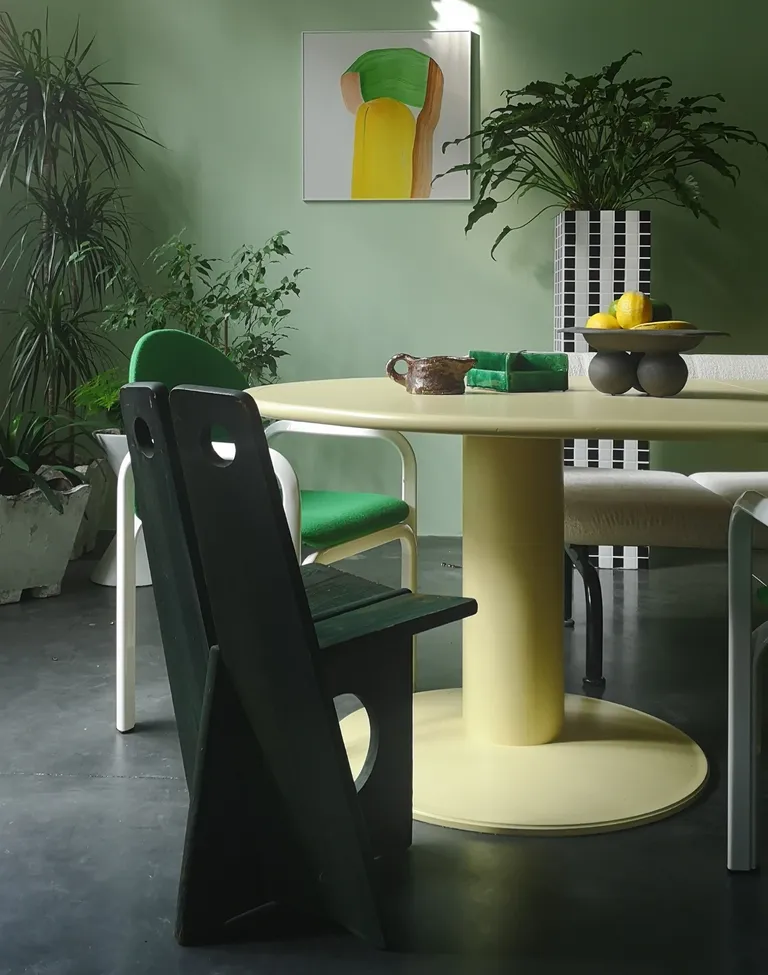
The combination of green and yellow is beautiful, especially when you choose yellow in lighter, greener tints that feel like spring. This combination is fresh and perennially youthful. A super muted yellow can, in fact, even work as a neutral, upon which you can layer several tones. And, many colors go with yellow.
‘I really like to use analogous colors, and then energize certain areas with one or more complementary colors,’ says Hélène Rebelo, set designer and curator, interior styling consultant, and founder of Cool Machine. ‘I also choose a lot on a whim, and green is one of my favorite colors.‘
‘For this space, I chose my color palette based on two things – a set of vintage Orsay chairs by Gae Aulenti for Knoll with wool in a vibrant sport green, and a Julie Lansom artwork on the wall,’ says Hélène. ‘The scheme was developed mostly from these items.’
2. WOOD TONES
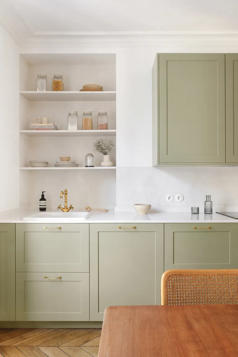
This is a color combination that occurs in nature, which means you can never go wrong with green and brown. This can be used to create a serene interior that doesn’t look dated for decades. Consider varying shades of brown and green to create the interior of your dreams.
Since many colors go with brown, choose, and consider any tone of green, although a softer shade of pistachio will allow you to subtly yet noticeably highlight interior features (say cabinets, accent walls, decoratives, etc). To further ground the scheme, go with softer, more earthy browns, like a ‘twig’ brown, to a darker, more walnut brown.
3. ORANGE
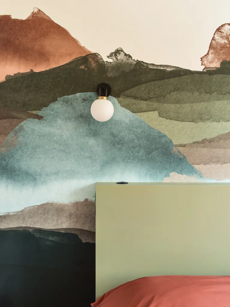
If you’re in the mood to create an impactful, dramatic interior, then pair pistachio with an equally deep-toned hue like bright orange.
Pistachio and bright orange is a creative, yet brave scheme. Due to their energetic and sometimes overwhelming visuals, it’s a good idea to try them in smaller spaces or quantities. Perhaps a children’s bedroom, a corner, or a space where either of the shades is used on smaller surfaces. The advantage of using these as accent elements, like in this project by Space Factory, is that they can be changed up whenever required.
If you do want to keep the pistachio and orange scheme intact, think of other colors that go with orange to create a more layered scheme where the intensity of all colors is diluted for a more cohesive interior.
4. PALE PINK
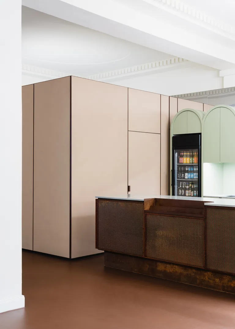
Sure, pink and green may feel like an unusual combination, but if color trends are to be believed, pink is a tone that is flowing unabashedly through homes and creating some of the most eye-catching combinations in the process. Plus, many colors go with pink, and a great companion to it is pistachio.
While a bolder version of each of these colors could create an interior that may be a little too OTT, the warmer, more grounded tones (think pink with a brown or grey undertone) would work great with a more diluted green. Instantly soothing to look at, this color combo would work especially well in spaces that need a little bit of calm, like the kitchen or a reading room.
‘The natural tones of the color concept follow the earthy reddish-brown color of the original preserved linoleum flooring in the foyer,’ says Patrick Batek, lead architect and founder of Batek Architekten. ‘The color palette is complemented by the surprising addition of a soft pistachio-green coat for the arched foyer bar and balanced by a pale natural cork covering on the cupboard fixtures.’
5. WHITE
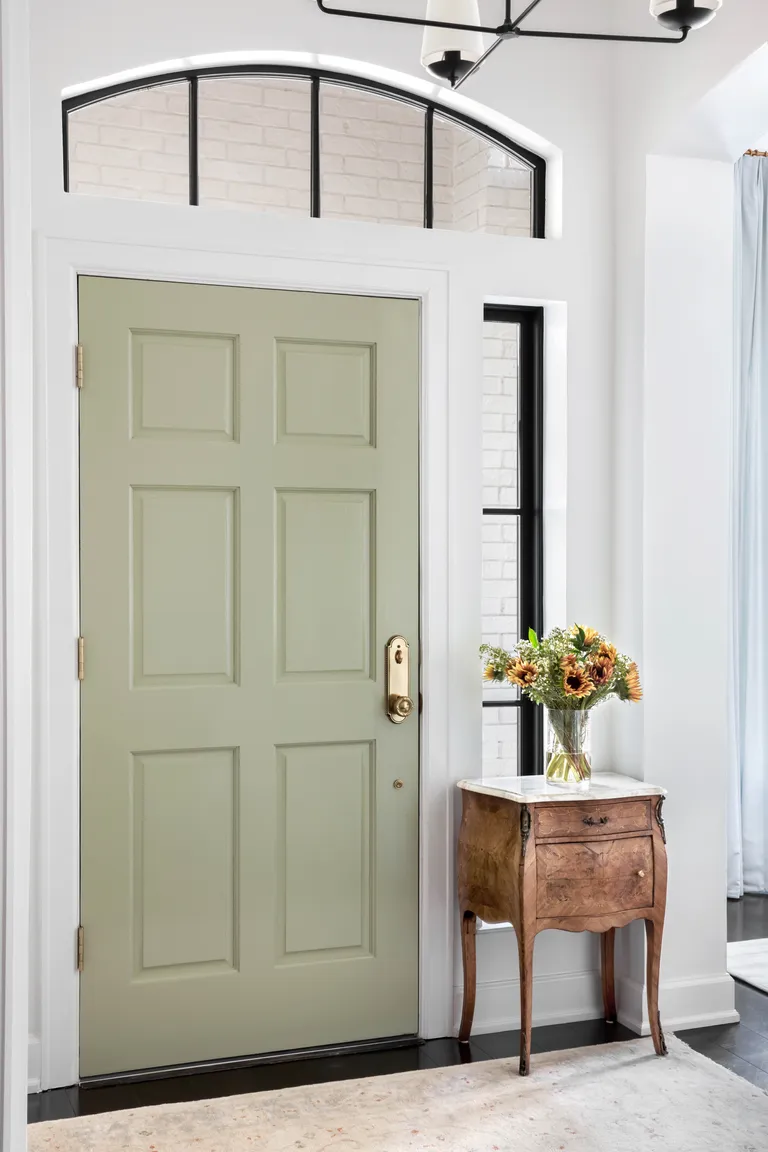
Decorating with neutrals is perhaps the easiest and most flexible way to play with hues. Every color on the color wheel goes with white, although you may want to go for a warmer white that helps create a more soothing scheme. A crisp, pure white can look a bit clinical and make the interior feel stark.
The other advantage of using white is that it allows the inclusion of at least two or even three hues for a lovely color block or layered scheme. Keep in mind, though, the more colors you add, the more care you need to exercise on the visual you’re creating. A sweet spot is usually two or three; more than that, and you run the risk of an interior feeling like a circus.
6. BLACK
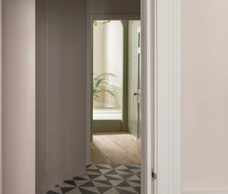
Think of tall trees holding clusters of tiny, black berrylike fruits. With rain, the trunks of these trees darken due to the saturation of water and appear black. There is gravitas in a green and black combination. When used carefully and in moderation, the two, with their sharp contrasts, can create an unforgettable interior.
If a black and green combo feels too two-dimensional to you, other colors go with black. Add a softer tone of pink or cream to balance the scheme.
7. PASTEL PINK
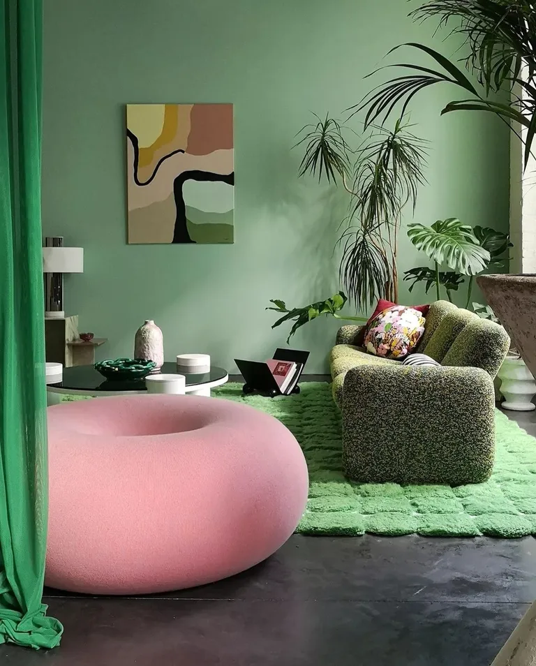
There are several ways to decorate with pastels, and a great combination to try is with pistachio green and pink.
‘We wanted to play with a wide range of greens and bring a touch of nature into the interior and create a feeling of inside/outside, like living in a garden,’ says Hélène. ‘I chose to create this garden feel with a thick patterned rug that I designed myself, and which was made by the craftsmen at Stitch Rugs. Plus, natural tones of green and pink accent the space.’
8. CREAM
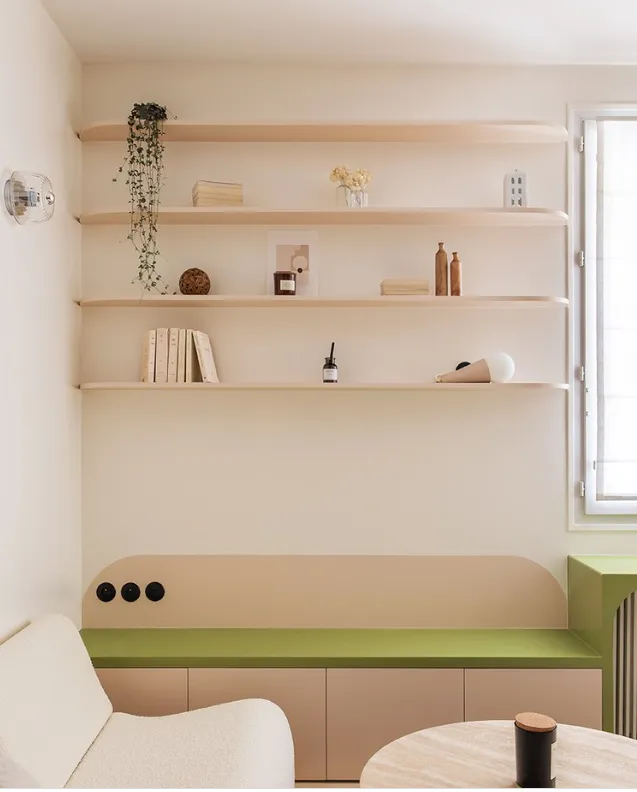
‘Pistachio is a bright saturated color,‘ says Amy. ‘When combining it with others, make sure not to create an overpowering color scheme. If you choose pistachio walls, choose deeper, darker, or more muted colors for your decor. In an overall neutral room, shots of bright colors like pistachio can be mixed with other saturated colors if used in moderation.’
For an unexpected pop of color to a neutral living room, bedroom, or kitchen, consider using pistachio on an accent feature such as a desk, a chair, a cabinet, or even an artwork.
9. RED
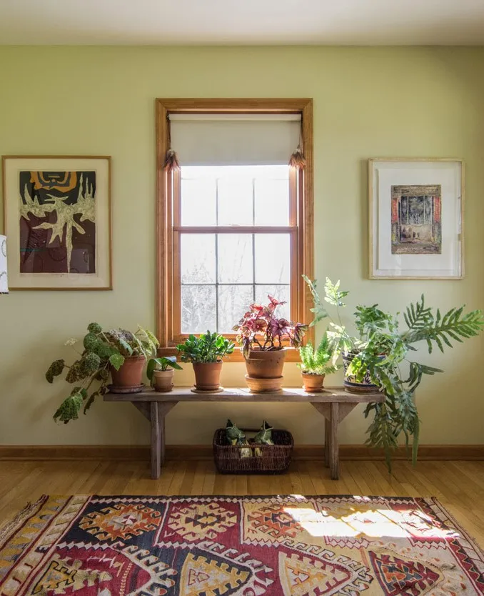
No, red and green aren’t the only colors of Christmas. It goes way beyond festivities and can help create a fantastic modern interior. The key is choosing the right intensity of shades and how you plan to incorporate them in your home.
Consider using this combination in textures, furniture, wallpapers, to even cushions or curios can keep your space from looking too seasonal, but cheery all year round. Plus, a lot of colors go with red, helping create an even more unique decor.
‘Green and red are complementary, sitting opposite one another on the color wheel, and using them together creates a dynamic space,’ says Amy. ‘As we are accustomed to seeing all types of warm and cool greens mixed in the natural world, replicating that indoors feels right. Also, consider mixing a springy yellow-green like pistachio with a cooler blue-green to create an exciting space.’
10. GOLD
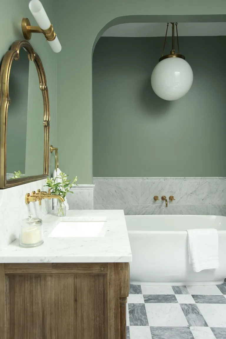
Gold is the new neutral. Yes, that’s right. A while back, gold had the reputation for being gaudy, pretentious, and flamboyant, but over time, the color’s various incarnations as satin gold, matte gold, and spun gold have taken over interiors, and their softer, more subtle glow is now totally on-trend, ideal for modern homes.
The advantage of gold is that, when used in a restrained manner, it can lift the look and feel of any color. Case in point: pistachio.
In this bathroom color scheme, the more grounded and sober look of the pistachio is given a leg up with the antique gold faucets and mirror frame. The room looks a lot more decorated and stylish.

3 comments
[…] the shade to walls or through select pieces of decor as a way to add color to an otherwise neutral scheme. ‘I would bring in a terracotta accent when a room needs texture or color but the chosen scheme […]
[…] Decorating with green walls a little safe for you? Why not use orange on the walls and temper the boldness of the shade with green accents? As Emma Deterding says above, decorating with teal and orange works well, but this blue-green shade isn’t the only option; other colors that go with orange include softer, apple greens. […]
[…] the first thing people notice as they enter a room; it sets the tone for a fun and adventurous decor scheme and can’t help but raise a smile. But what if you’ve gone for a kaleidoscopic pattern, […]