
Table of Contents
The Aesthetic Breakdown
Vibrant / Serene
Melancholic Reflection.
Cotton.
Cerulean, Amber, Charcoal
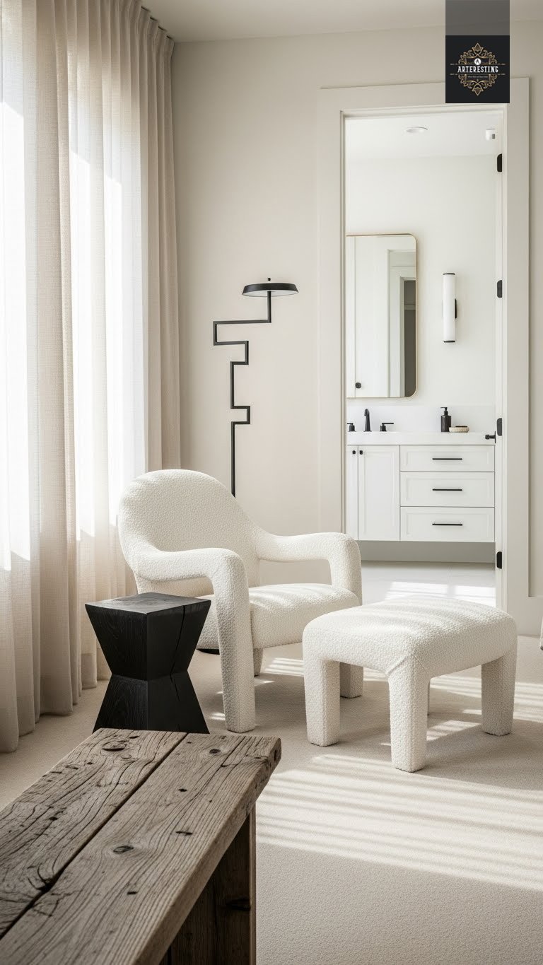
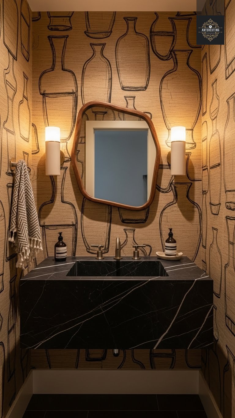
Designing a space with a neutral palette requires a delicate balance. Without vibrant colors to draw the eye, every detail becomes more pronounced—an errant undertone or poor contrast can easily tip the mood from serene to discordant. However, embracing a neutral color scheme doesn’t mean sacrificing visual interest; it simply shifts the focus to depth, texture, and form. Shades like creamy ivory, dusty taupe, and rich coffee can create an atmosphere that is both calming and chic. Such palettes evoke the tranquility of nature, grounding our spaces and providing a restful backdrop for daily life.
A neutral room thrives on aesthetic continuity, emphasizing layout and light rather than bold pigmentation. This creates a flexible canvas for furniture and art, allowing each piece to shine in its context. If you’re unsure where to begin, let these expert tips guide you through the nuances of neutral decorating.
1. Focus on Tone and Contrast
Use light and darkness to create tone and contrast in neutral spaces. (Image credit: Samuel S. Thorn. Design: Elma B. Miller)

Understanding color theory is invaluable when crafting a neutral palette. Variations in light and dark not only define a shade’s effect but also add necessary depth. According to Emma Shone-Sanders of Shone Sanders Studio, every neutral has a warm or cool undertone that must harmonize, with contrast providing the depth that keeps a scheme from feeling flat. Warm neutrals, such as cream and camel, work beautifully with cooler tones like dove gray and charcoal, creating a dynamic interplay that enhances the overall design.
Sheena Murphy of Nune suggests choosing between warm and cool neutrals based on the intended atmosphere of the room. For cozier spaces, warmer shades can create a sense of comfort, while cooler hues can be enlivened with accents of brass or wood to maintain a balanced aesthetic.
2. All Rooms Are Not Equal
Using the same neutral in every room of the home will leave it feeling flat. (Image credit: Samuel S. Thorn. Design: Elma B. Miller)

When adopting a neutral scheme, it’s crucial to recognize that not all spaces serve the same purpose. High-traffic areas like kitchens and living rooms benefit from richer, layered neutrals that provide contrast and depth. In contrast, quieter spaces such as bedrooms should embrace softer, gentler neutrals that evoke a sense of tranquility.
Emma advises that playrooms and children’s rooms should start with a neutral base tied to the rest of the home, complemented by pops of color in accessories. For areas with limited natural light, such as basements, darker neutrals can create a cozy atmosphere without feeling oppressive, while hallways may benefit from lighter tones to keep them feeling open and airy.
Texture Over Color
The secret to a neutral room that feels expensive, not boring? It’s all about the mix. We’ve curated 4 Amazon essentials that add the necessary texture, warmth, and contrast to elevate your palette.
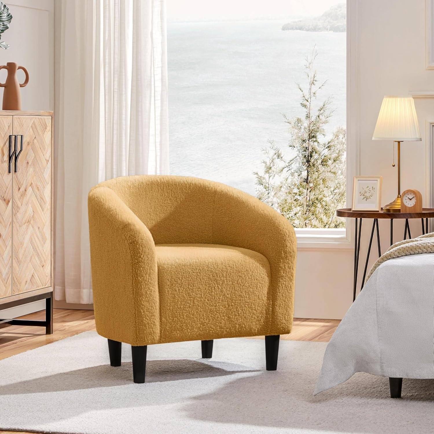
Cream Bouclé Accent Chair
The nubby fabric catches the light, adding depth to a white corner. A timeless piece that screams “quiet luxury.”
View on Amazon →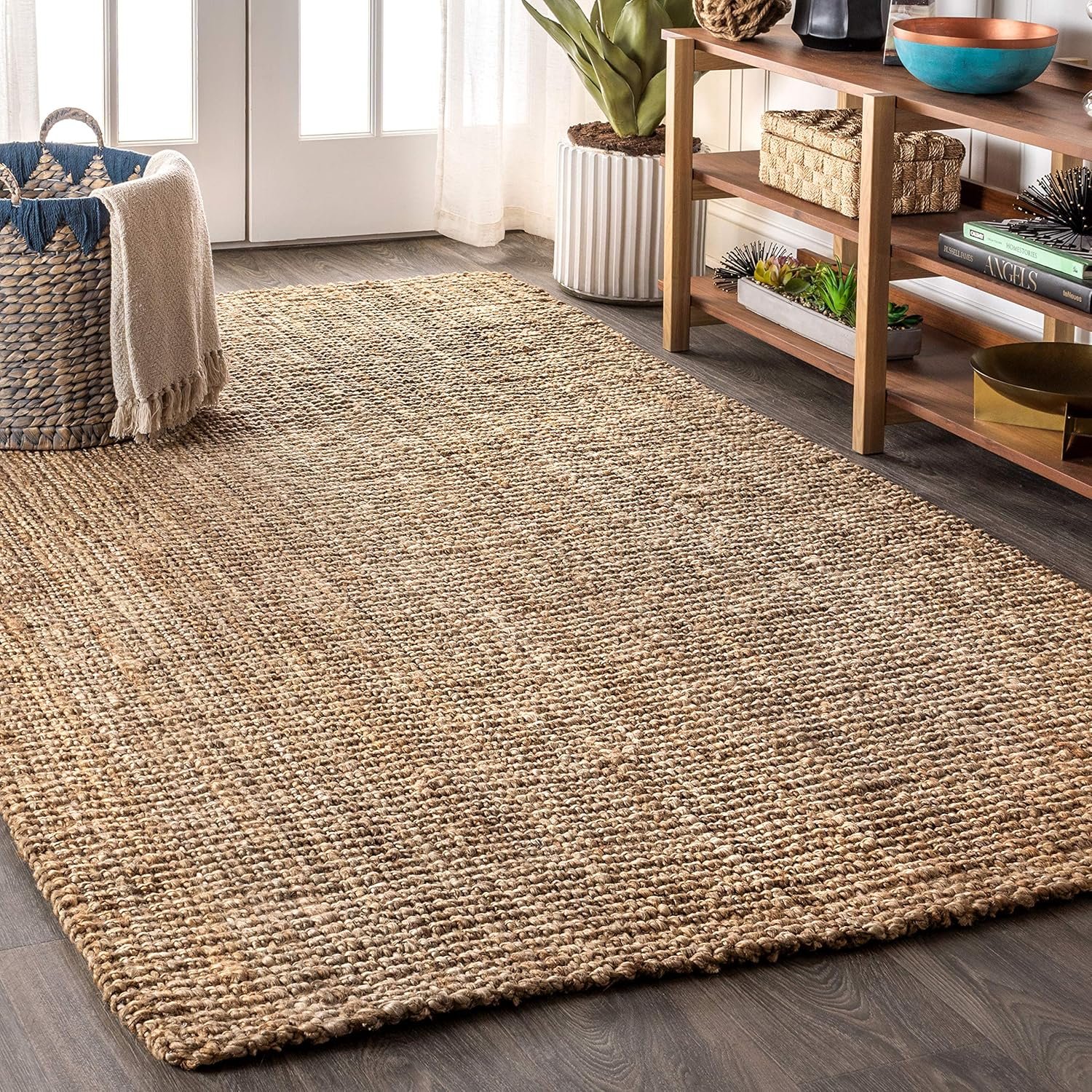
Handwoven Jute Rug
Neutral doesn’t mean sterile. Use natural fibers like jute or sisal to bring earthy warmth to your floors.
View on Amazon →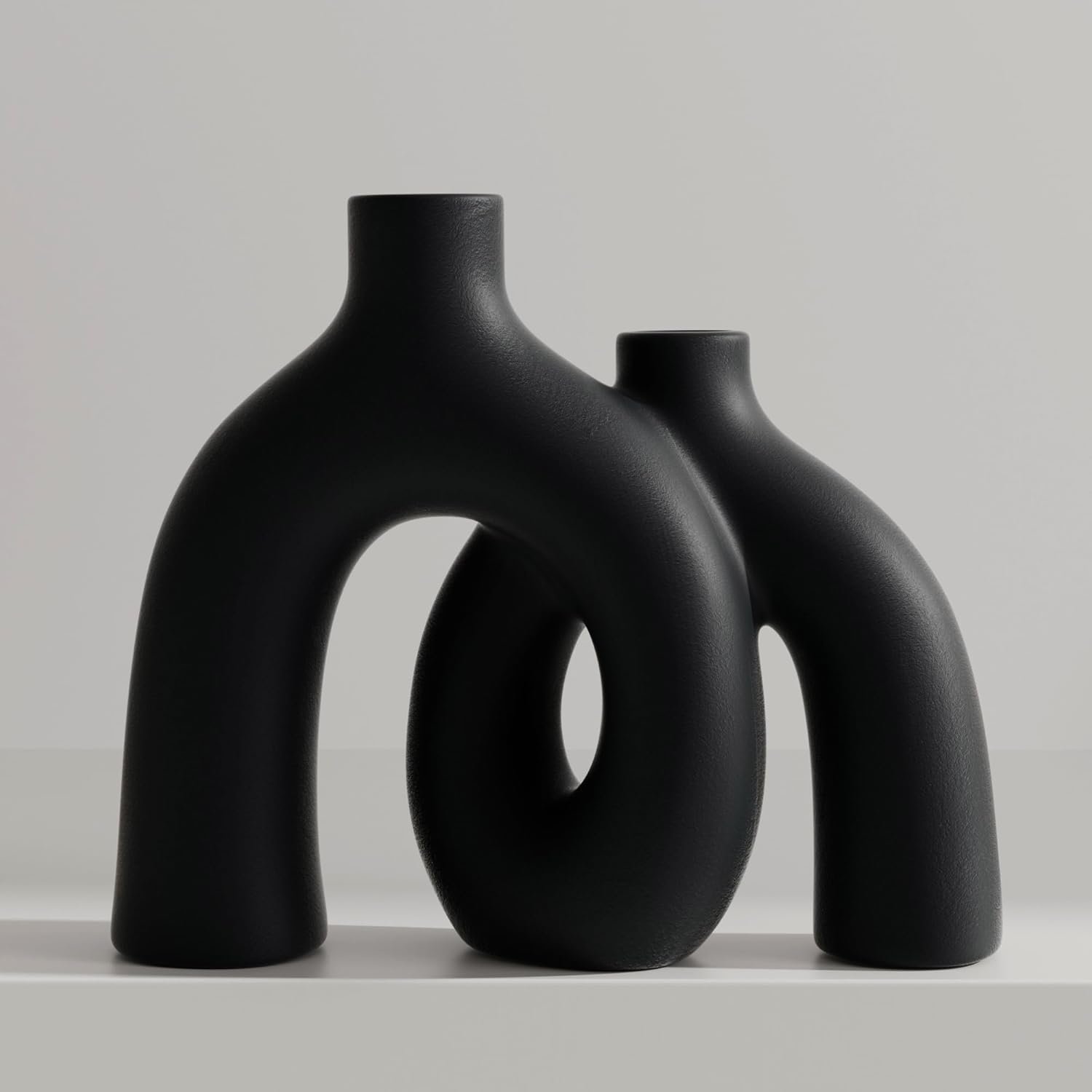
Matte Black Sculptural Vase
Every neutral room needs a “drop of ink.” A black accent piece provides the definition your eye is looking for.
View on Amazon →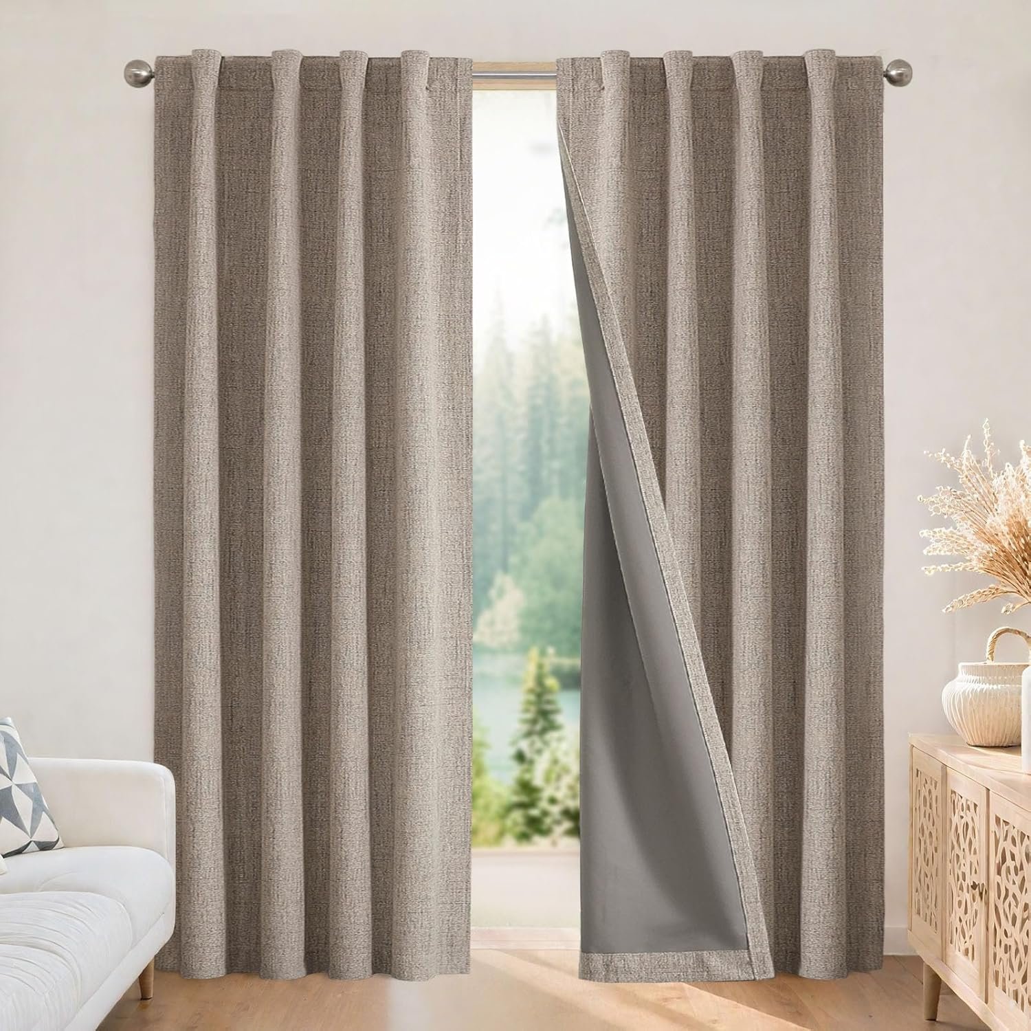
Faux Linen Curtains
Swap heavy drapes for breezy linen-look panels. They filter the light beautifully and keep the mood airy.
View on Amazon →3. Shift Rather Than Switch
Stick to the same undertone, but subtly shift up and down shades throughout your rooms. (Image credit: Samuel S. Thorn. Design: Elma B. Miller)
Creating a cohesive neutral aesthetic involves maintaining a consistent undertone throughout your home while allowing for variations in shades. Sheena suggests focusing on a single undertone for the entire property while introducing different shades and textures in each room. This approach ensures that as you transition from one space to another, the flow feels natural yet distinct.
Mixing pale, mid, and dark neutrals helps achieve depth, while incorporating a signature color or texture in each room adds individuality without disrupting the overall harmony. Repeating materials like wood or fabric throughout the home ties everything together seamlessly.
4. Get Maths Involved
Getting the balance of neutrals right can be a simple equation. (Image credit: Samuel S. Thorn. Design: Elma B. Miller)
The secret to achieving the perfect balance in a neutral palette lies in understanding proportions. A guideline to consider is the 70-20-10 rule: allocate about 70-80% of your main neutral, 20-30% for a secondary accent, and use these accents in smaller details, such as textiles or trim. This method fosters a cohesive and intentional design, ensuring that no single tone competes for attention.
By thoughtfully applying these principles, neutrals can become more than just a backdrop; they can transform your interiors into soothing and sophisticated spaces. Trust your instincts, embrace what you love, and let the nuances of neutrals guide you to create a home that feels both welcoming and timeless.
The Arteresting Takeaway
Simplicity enhances functionality and beauty in design.