
Table of Contents
Trendy Palettes
In the realm of design, the allure of new paint color trends is undeniable, especially when faced with walls that appear drab or outdated. However, interior design experts like Tracy Kurc emphasize the importance of restraint when selecting a palette. Rather than succumbing to the latest fad, consider how the chosen colors serve the architectural integrity and emotional atmosphere of the space. A thoughtful approach to color selection can lead to interiors that evolve gracefully over time, rather than feeling locked into a singular moment.
Choose colors that complement and enhance the room’s architecture, allowing your design to remain timeless and elegant.
Beige and Taupe Everything
The once-refreshing palette of beige and taupe is beginning to fade from favor as homeowners seek more vibrancy and dynamism in their spaces. As Galey Alix points out, the move is towards bright whites that evoke a fresh and expansive feel without sacrificing the neutrality many desire. Selecting nuanced whites, such as Benjamin Moore’s Swiss Coffee, can imbue a space with warmth while maintaining an airy quality that feels inviting and lived-in, rather than sterile.
Opt for warm, nuanced whites to create a timeless backdrop that feels both sophisticated and welcoming.
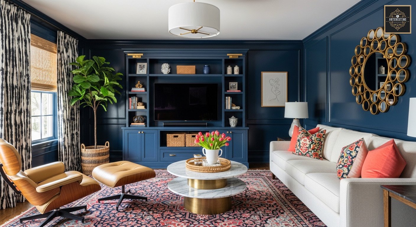
Color Drenching
While color-drenched interiors may provide stunning visual impact in photographs, their immersive nature can overwhelm in daily life. Alix warns against the use of deep jewel tones across entire spaces, as they can create a claustrophobic atmosphere. Instead, she advocates for the incorporation of color-drenched elements—think bold rugs or statement furniture—while introducing textural contrasts to elevate the overall aesthetic. Custom wood paneling or intricate molding can add dimension and intrigue without the need for overwhelming hues.
Incorporate color thoughtfully with layered textures and tonal variations to create a harmonious and inviting space.
Flat Blacks, Saturated Teals, and Artificial Pastels
The current obsession with flat blacks and overly saturated teals can lead to a rather one-dimensional experience. Kurc suggests exploring muted alternatives that draw upon nature’s palette, such as Sherwin-Williams Oyster Bay or Farrow & Ball Green Smoke, which offer a more complex and calming ambiance. When considering black hues, opt for those with depth and character, such as inky charcoals that change with the light, adding a layer of architectural interest to your design.
Choose paints with depth and complexity to create a rich and inviting atmosphere that transcends trends.
Themed Palettes
As we move away from the predictable themes of farmhouse gray and coastal blues, Alix encourages us to embrace a more eclectic palette that tells a story. While themed palettes can provide a cohesive direction, integrating unexpected tones such as rust, ochre, or moss can infuse a space with freshness and spontaneity. This approach not only grounds your color story but also offers a delightful surprise that keeps the design feeling current and engaging.
Incorporate unexpected colors to breathe new life into traditional palettes, ensuring your space remains vibrant and timeless.
How to Avoid Painter’s Remorse
The phenomenon of painter’s remorse is all too real, particularly when it comes to bold color choices that demand attention. Alix emphasizes the need for intentionality in color selection, advocating for spaces that lend themselves to bolder hues—like playrooms or home theaters—while approaching more visible areas, such as kitchen cabinets, with caution. By carefully considering the purpose of each space, you can make informed choices that will bring joy rather than regret.
Choose bold colors for spaces where you can afford to take risks, while keeping more prominent areas neutral to ensure longevity.