Table of Contents
Entryways can be one of the hardest spots to design in your home. Not only do you have to deal with space constraints, but it’s also the one room that really sets the tone for the whole house as well. That’s a lot of pressure for such a small area.
But for many designers, the pressure is worth it. Especially when you design a space that really makes a mark and sets the stage for the rest of your interiors.
“An entryway is the opening act for your home,” Victoria Holly, Principal and Founder of Victoria Holly Interiors, explains. “This space shouldn’t be forgotten, but instead crafted with striking elements.”
Peak Petersen, Lead Designer at Hoedemaker Pfeiffer, agrees, adding that the entryway is one of the best spaces in the home to show off your personal style as it’s the first spot guests encounter. “A great entryway is a reflection of the home’s inhabitants,” she says. “So I love to see personality when I enter.”
There are plenty of elements that make for a great entryway, but there are a few key things designers always notice. To find out exactly what those are, we chatted with professional designers from the West to get their takes on the good, the bad, and the aspirational.
Visible Clutter
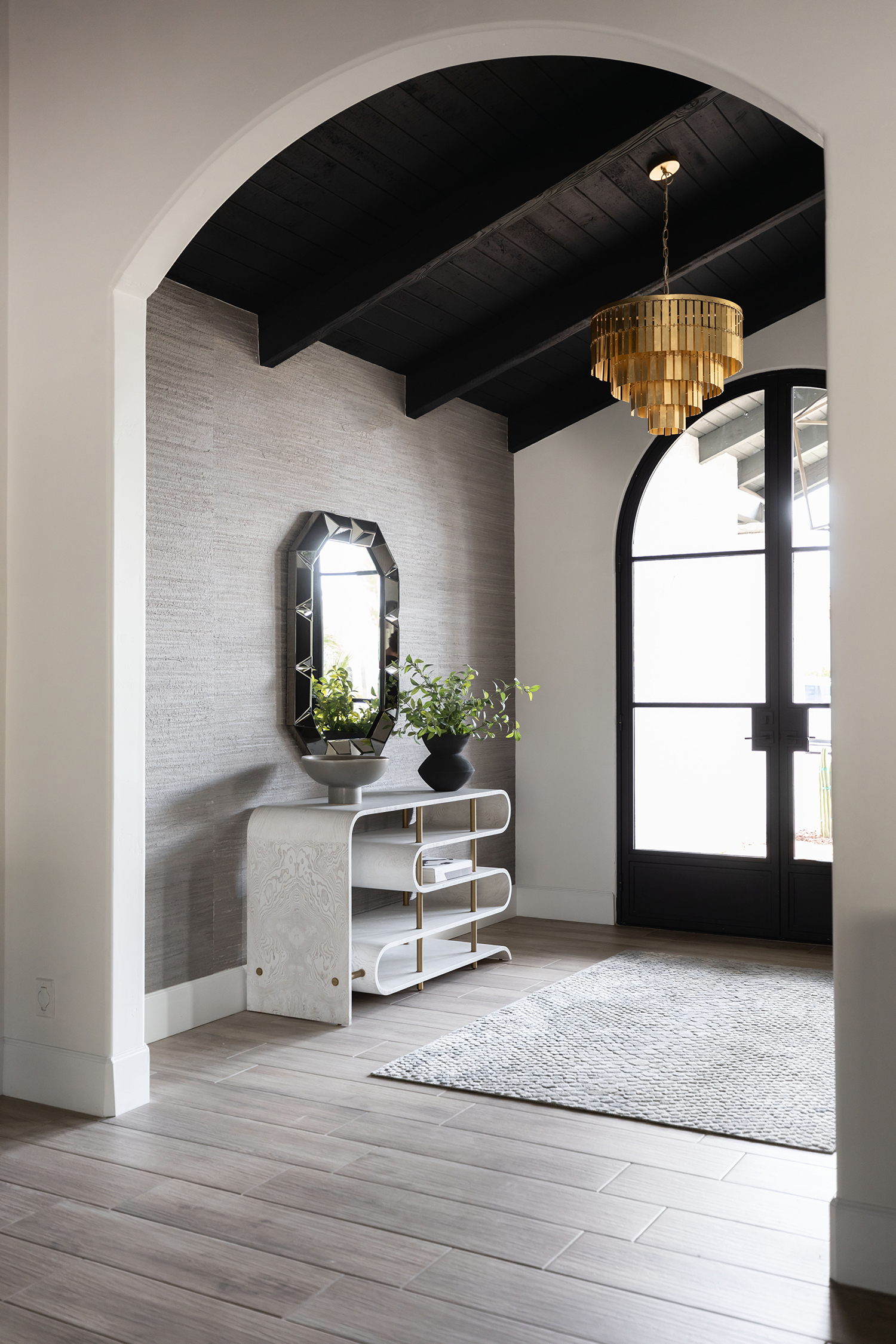
“One common mistake I often notice when walking into a person’s entryway is allowing clutter, such as keys, mail, etc., to consume their console table, which sort of sets the tone for the whole home since it’s the first space you walk into,” says Erin Chelius, Principal Designer and Owner of Chelius House of Design. “One way to avoid this is to add a decorative box or bowl to put your odds and ends into to keep things organized and visually appealing.”
Thoughtful Accent Pieces
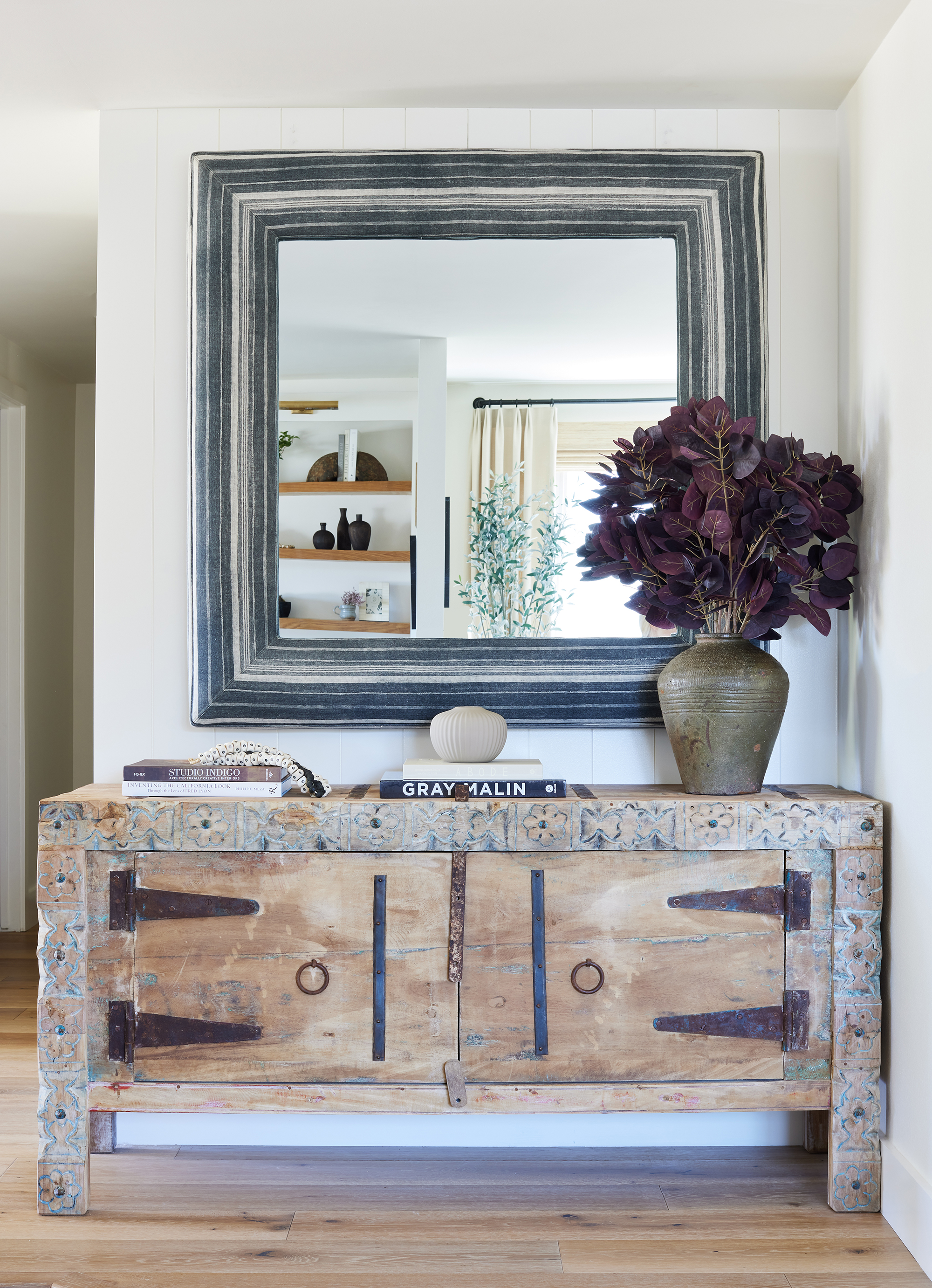
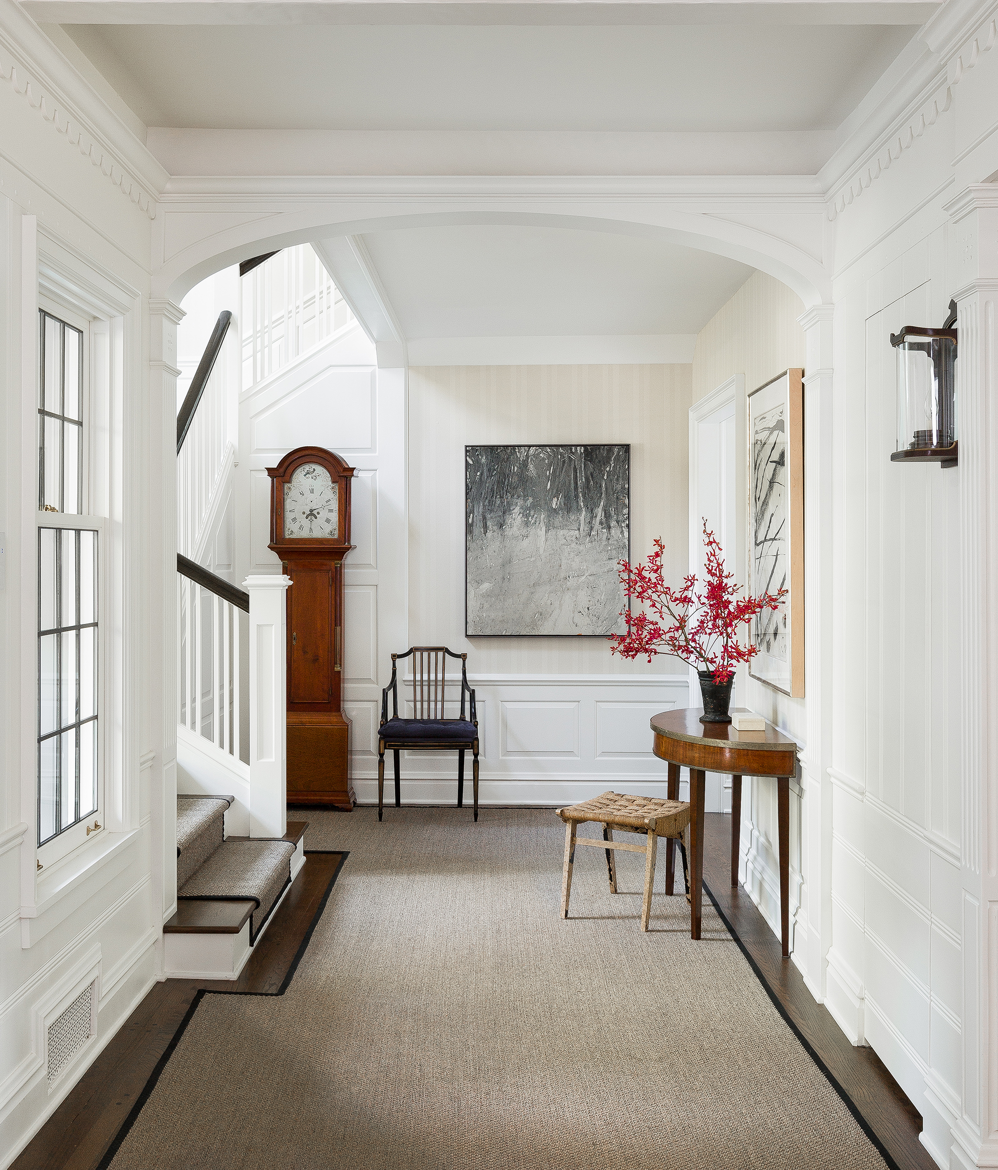
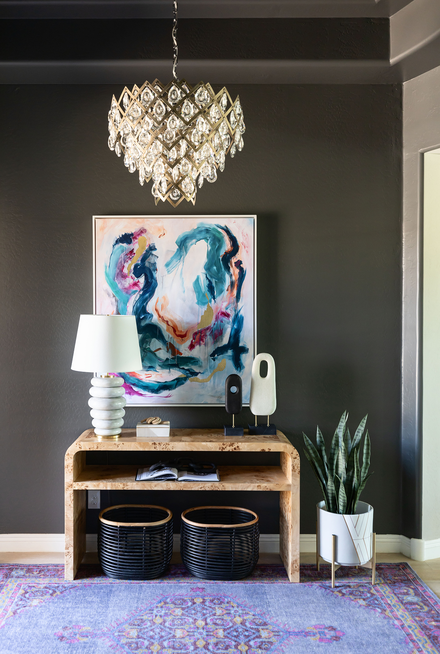
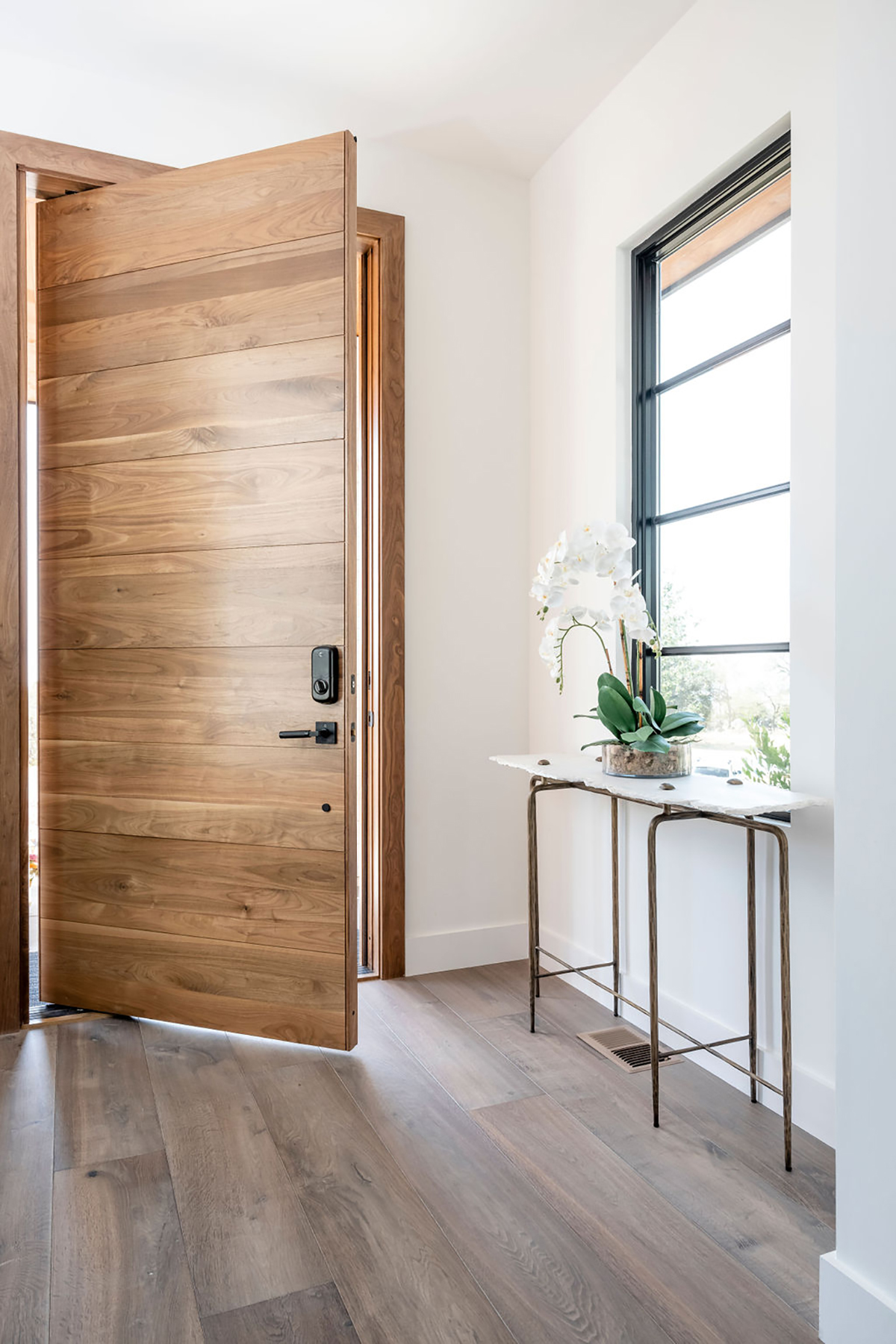
“An interesting piece of art set over a console where a set of keys or a handbag can be dropped is a fabulous start,” Petersen says. “If the space allows, an indoor tree brings an organic and casual element to the space; I am particularly fond of a leggy, asymmetrical Song of India tree.”
Proper Lighting
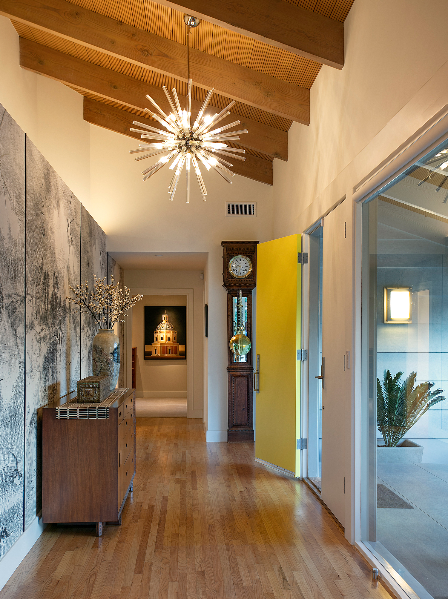
“Accent lighting is crucial to a gorgeous entryway,” Holly says. “A lot of homeowners may have an entryway light that is recessed, but getting a converter kit and putting in a flush mount light or pendant light is a much better option. When you opt for a statement light, you’re adding another dramatic statement and something unexpected. A distinctive fixture can instantly elevate the ambiance, casting a warm and welcoming glow.”
Poorly Thought-Out Storage
“I see a lot of entryway mistakes when it comes to shoe storage,” Holly says. “Many people seek out a storage bench, believing it to be the ultimate solution. However, a more flexible and practical alternative is a loose basket. While a storage bench might seem appealing, in reality, it often becomes an underutilized space, and shoes just gather next to it. On the other hand, a loose basket provides an adaptable solution that can accommodate varying shoe sizes, is easier to access, and encourages more frequent tidying.”
A Mirror
“A mirror allows for the practicality of checking yourself before you head out, but it also helps to open up the space,” Holly says. “An entryway is a perfect opportunity to include a unique statement mirror that you might not use in a more practical place, such as a bathroom. Especially choosing an asymmetrical mirror or bold material or color is the perfect pop for an entrance.”
Hooks
“A mistake I often see is a long run of hooks in an entry,” Petersen says. “While the practicality makes sense, the reality is your guests are greeted with a sea of mismatched jackets, backpacks, canvas grocery bags, etc. If possible, keep hooks in the mudroom or in a back-of-house space and leave the formal entry fresh and alluring.”

3 comments
[…] is also versatile enough to work in most styles of houses, whether yours is modern or traditional. We especially love a farmhouse living room that honors the basics: wood, shiplap walls, a […]
[…] For a simple change, create a seamless look by ditching bulky handles that take up visual space in favor of tactile pulls that are worked into the material, mimicking the grip of a hand and in this example by Michael Del Piero driving a minimalist mudroom aesthetic. […]
[…] truly versatile color, Hannah Yeo says ‘from a mood-setting entryway to practical kitchen cabinets to an accent wall by the fireplace, Hale Navy works in […]