Table of Contents
o a contemporary house on the edge of a village in rural Kent, England, a short drive from the coast, where a family holiday home blurs the boundaries of minimalist and maximalist design. The two-story house has a large entrance hall, a kitchen with a breakfast banquette area, a dining room, and a living room. Upstairs there’s a master suite with a dressing room, a guest suite, and three further bedrooms – one used as a playroom – plus a family bathroom.
At first glance, this modern home appears to be an exuberant design playground, characterized by bright colors, contemporary shapes, and modern art. But look closer and you’ll notice that the decor follows minimalist principles of curation, space, reduction, quality, and calm. It just so happens to have been done in bright shades.
In terms of the look, interior designer Charlotte Beevor was keen to find the sweet spot between homeowner Monica Gibb’s love of rustic modern farmhouse and Scandinavian design vibes, and her partner Simon Lamb’s more colorful and architectural style. ‘Fusing the differing tastes of a couple is one of my specialties,’ says Charlotte. What scored highly with the whole family was their love of snuggling down together to watch TV or a movie, ‘They like sharing the same space, either as a family or with friends, so we decided to open up the two living rooms into one super-sized space.’
You don’t have to choose between a functional family home and a high-design house, with the right furniture and materials, you can have both.
CHARLOTTE BEEVOR
LIVING ROOM
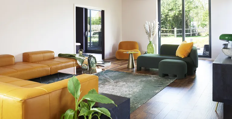
In the main family area, yellow and gold seem to take center stage. But notice how there is nothing more here than you need – it’s actually a pared-back minimalist living room. Proof, yet again, that minimalism can mean color.
Here there’s a huge, low-slung and seriously comfortable sofa, as well as a chaise longue and reading chair, perfectly positioned to create versatile options, ‘It works as one big social space, or Monica can be hanging out on the chaise, chatting to Simon who’s preparing dinner at the kitchen island, while their son is gaming,’ Charlotte explains.
BREAKFAST AREA
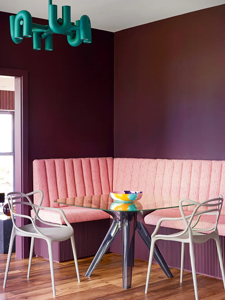
Charlotte created an extra-deep breakfast banquette with fluted edging designed to look as if floating, then had it upholstered with luxurious fabric to make a talking point. ‘My background is in textiles so I’m all about using interesting, high-quality fabrics,’ Charlotte says.
KITCHEN
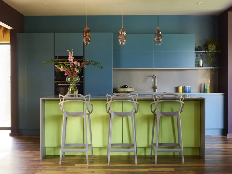
Again, this colorful space is actually – deceptively – a minimalist kitchen. There is nothing extra here, no handles or unnecessary embellishments. Just bright shades that highlight the clean lines.
In fact, Charlotte transformed the existing modern kitchen by color-blocking with paint, using a teal for the cabinets that flows onto the wall behind for maximum impact, and a contrasting lime green on the island.
Over the kitchen island, she has hung a trio of colorful hand-blown glass pendants. ‘The way they glow up is beautiful, they create a special atmosphere when people are hanging out around the island,’ Charlotte says.
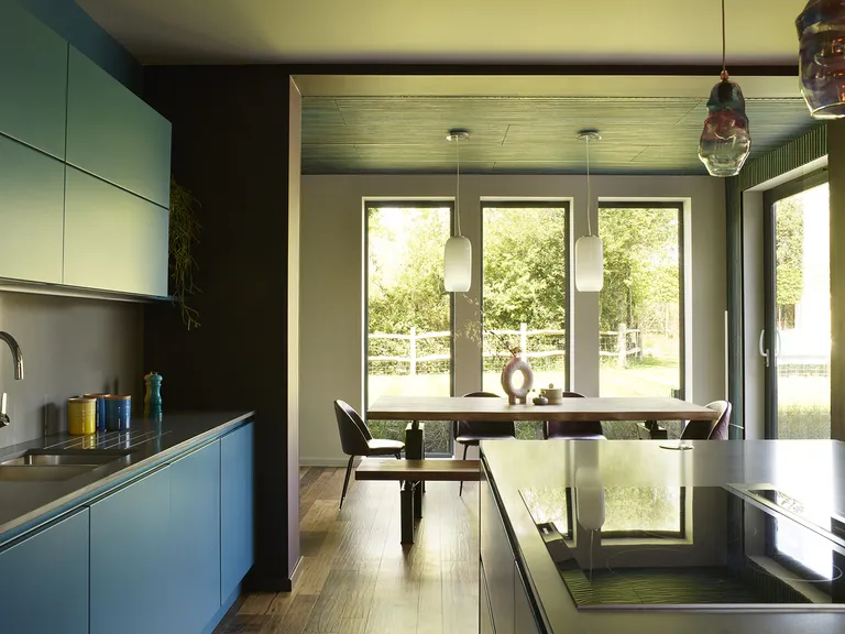
DINING AREA
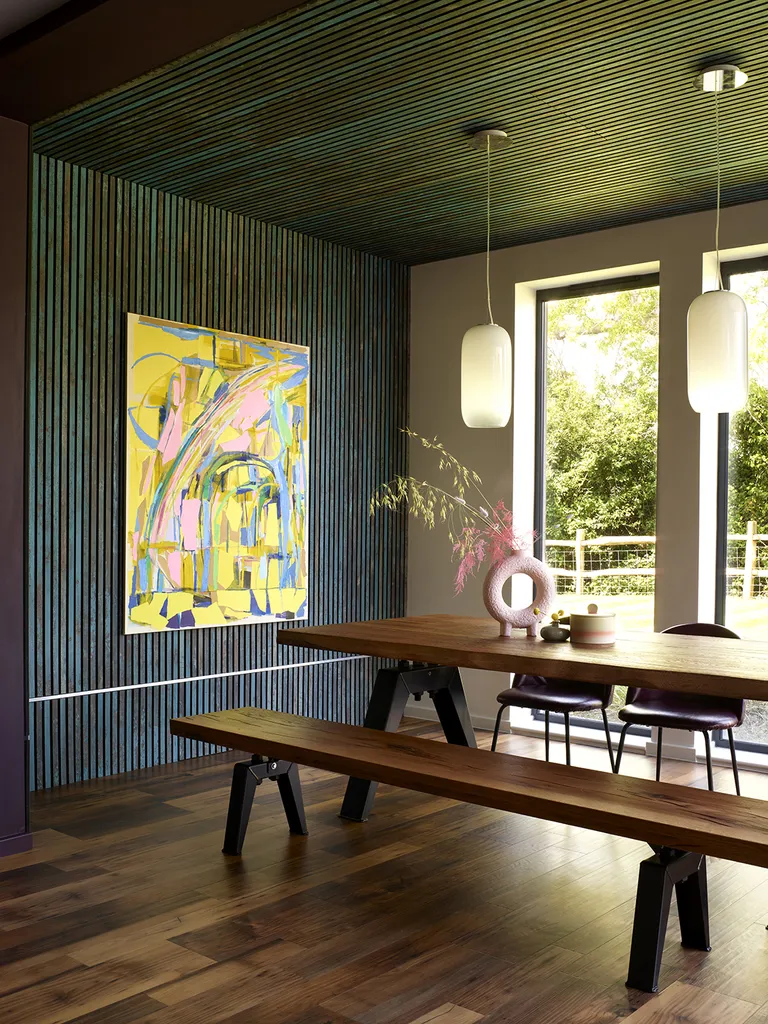
Inspired by the owners’ favorite weekend getaways, Charlotte wrapped this dining room space in colored cladding for a contemporary log cabin effect. This creates an element of texture in this calmingly minimal space which doesn’t detract from the view.
Charlotte worked hard to source supremely comfortable furniture, as well as visually stunning, ‘With the right color on the walls and an amazing sculptural piece of furniture, you’re going to elevate any room.’
CORRIDOR
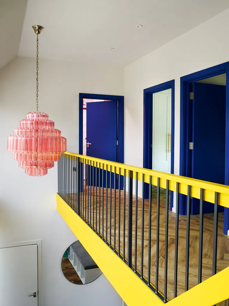
Color is a lifelong passion for Charlotte. For her, the key to working with big, bold colors like these is a process of careful curation, considering each space in turn and how it relates to the neighboring rooms.
Meanwhile, Simon loves lighting, so Charlotte found many feature pieces, including the pink glass chandelier hanging in the double-height entryway. ‘In front of a wall of glass, it sets the tone as soon as you turn onto the driveway,’ says Charlotte.
BEDROOM
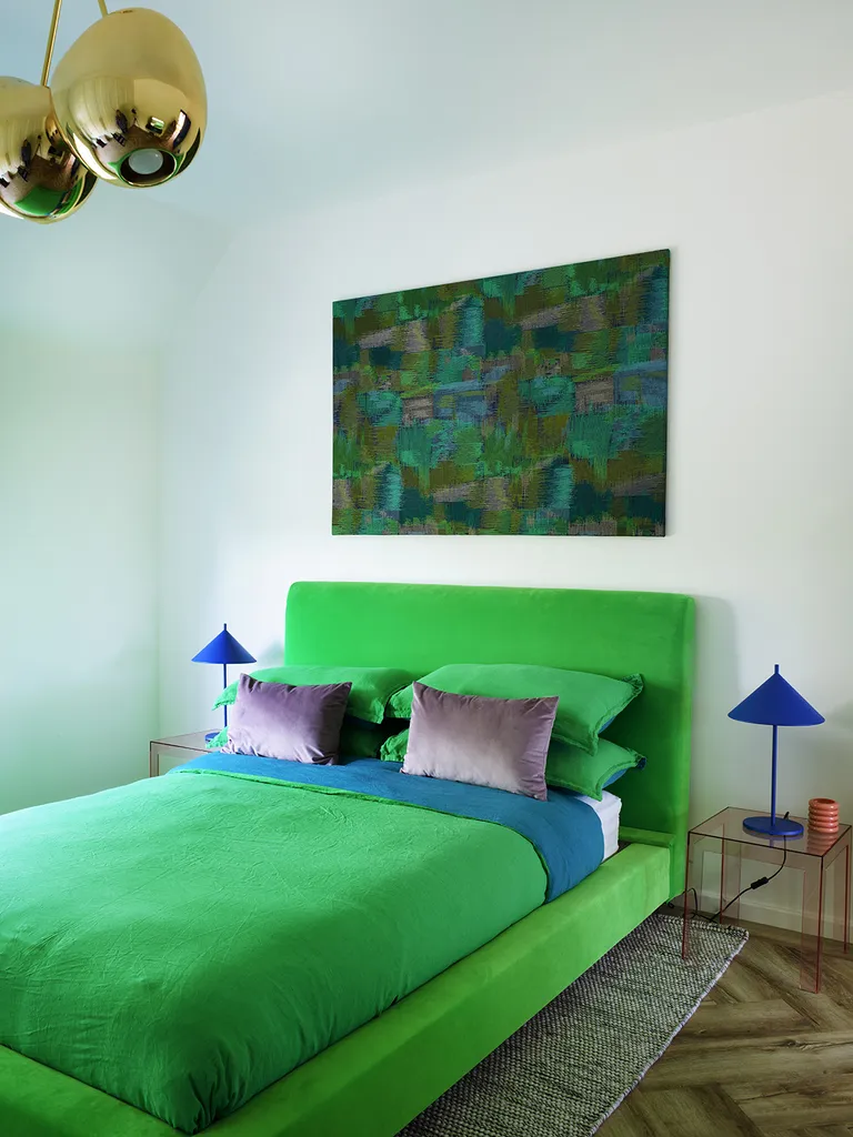
Charlotte reupholstered the bed and placed it on blocks to add height to this high-ceilinged modern bedroom.
Walls and ceiling in Wimborne White by Farrow & Ball.
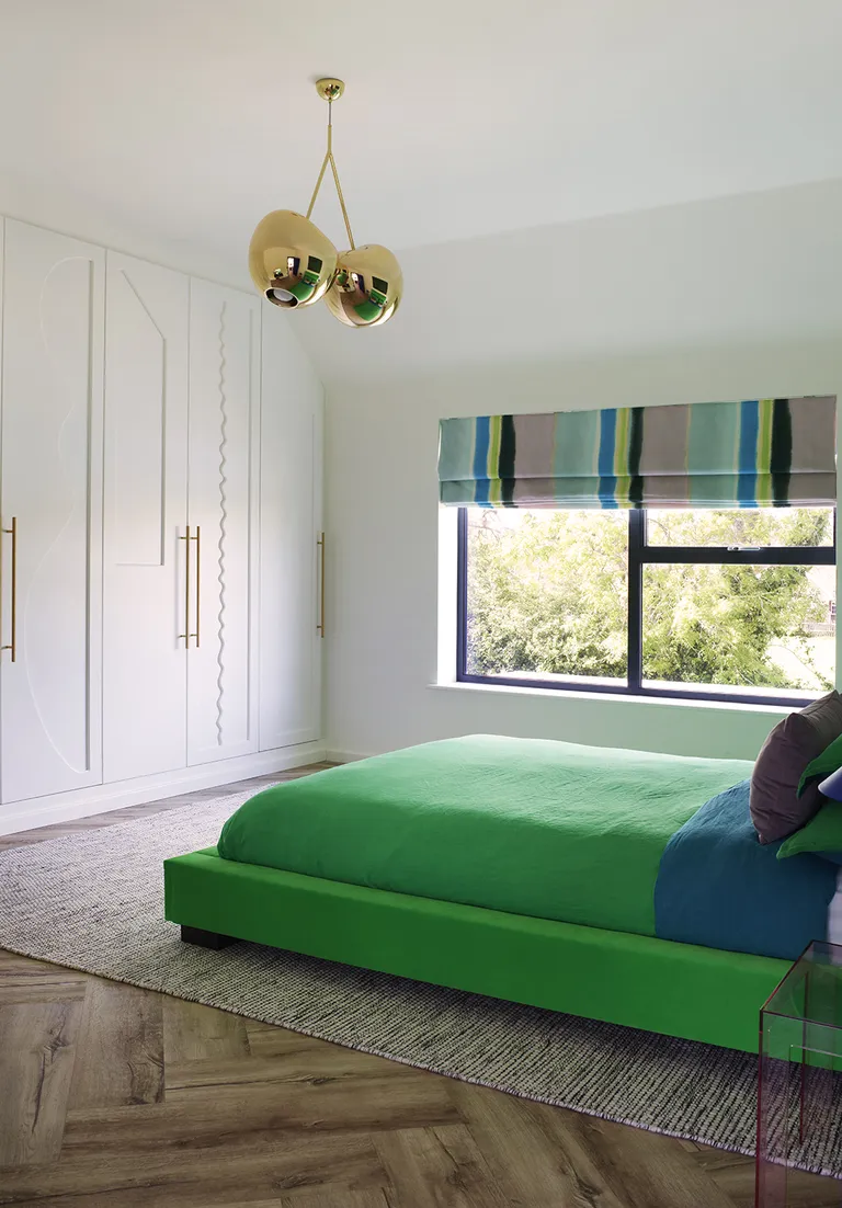
The scalloped edges of the millwork are another way decoration has been added subtly, in a way that doesn’t overpower. This home is a shining example of minimalism and how it is evolving to incorporate more personality than ever before.

7 comments
[…] so instead, think about making your home as liveable and luxurious as possible. Pay no mind to outdated decorating rules, and remember that comfort is […]
[…] this bathroom color scheme, the more grounded and sober look of the pistachio is given a leg up with the antique […]
[…] Color-blocking walls are not the only surprising way to play with color. Sofa pillows can do the same, but in a more subtle and non-permanent way. On a plain, muted, or solid-toned couch, these can provide a refreshing contrast and uplift the room’s mood. Alternatively, you could create a color block with just pillows, all drenched in different colors, adding to the color layering of the room. […]
[…] also recommends that, for a modern kitchen area, you need to zone the different spaces. ‘An island does a wonderful job of offering […]
[…] comfortable. It’s also easy to upgrade with modern touches that are timeless but exciting. Modern farmhouse design incorporates midcentury modern elements, rattan, and woven materials. The one color […]
[…] designer Alice Leigh says 2025 will bring the official end of cold, all-white living rooms that embrace minimalism. Instead, we’ll see more comfort and […]
[…] room rug (to frame the room) and more textural interest that belongs even in a minimalist’s space. ‘When dealing with luxury aesthetics, textures and shapes become a primary focus and are a […]