Table of Contents
Architectural limitations often result in heavy shadows and stagnant atmospheres. Therefore, selecting the precise paint colors for dark rooms becomes a crucial spatial strategy. Visually, the right pigment manipulates ambient light, expands boundaries, and completely transforms a rigid, low-light environment into an open sanctuary.
Warm White: The Premier Light-Reflective Paint
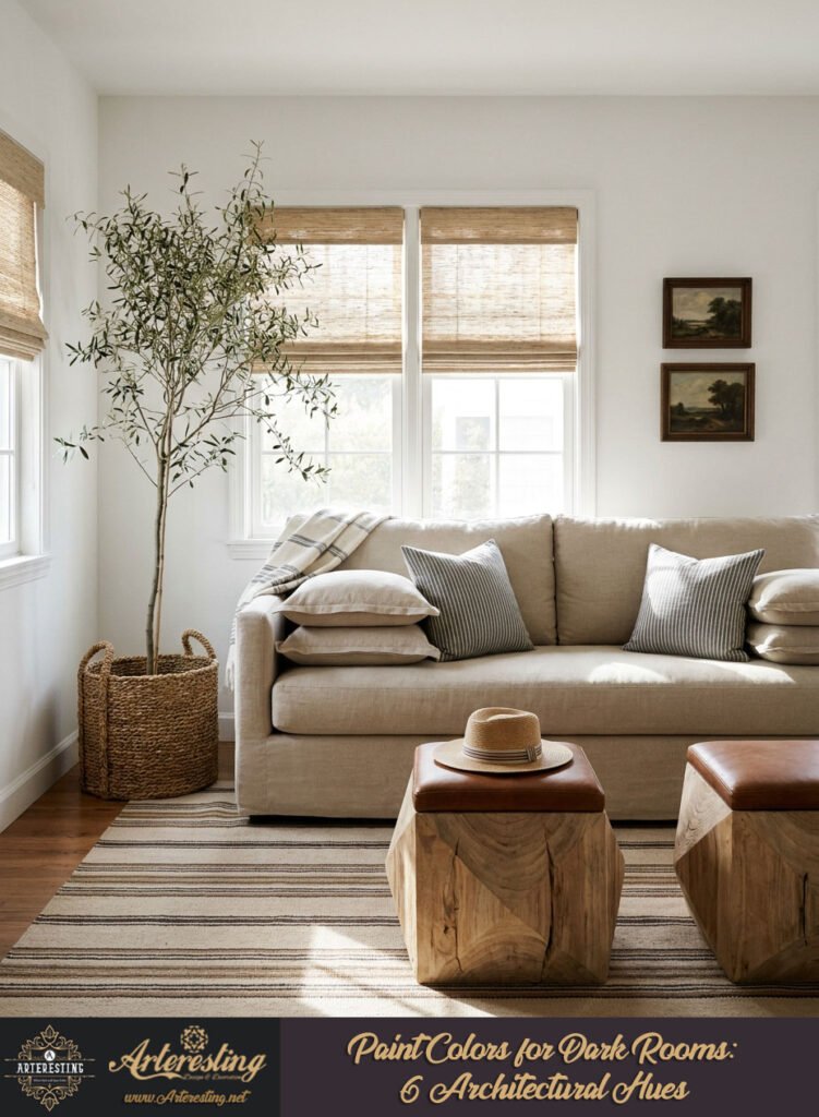
Warm white operates as the ultimate architectural tool for shadowed spaces. Specifically, it bounces minimal natural light across structural planes. Consequently, this hue neutralizes the cold, clinical shadows of north-facing rooms, instantly engineering a bright, expansive, and highly breathable environment.
Lighting behavior dictates spatial perception. When navigating north-facing exposures, stark whites often fall flat. Instead, warm undertones actively counteract heavy shadows. Visually, these soft pigments catch ambient light and disperse it evenly. Therefore, the room immediately feels larger and less confining.
Furthermore, execution requires precision. Always pair warm whites with layered, dimensional textures. Boucle, raw linen, and matte ceramics prevent the room from appearing sterile. Ultimately, this approach maximizes luminosity while retaining essential tactile warmth.
Cozy Beige: Embracing Moodiness in Paint Colors for Dark Rooms
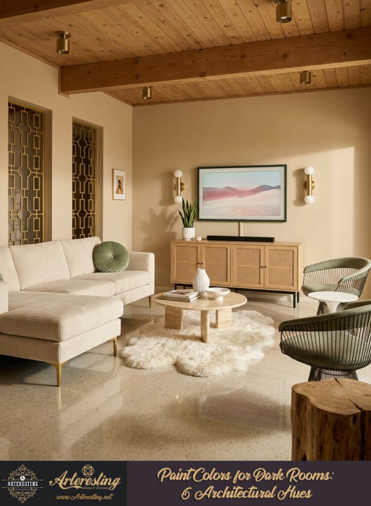
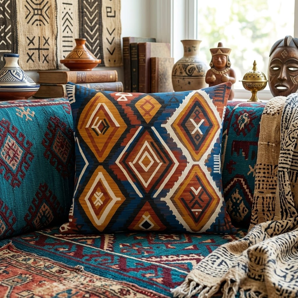
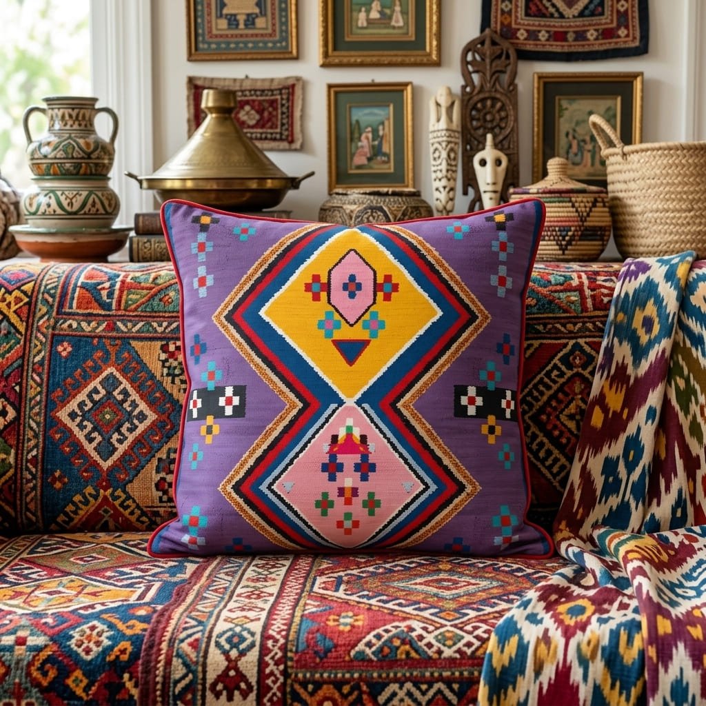
Cozy beige intentionally embraces a room’s inherent low-light ambiance rather than fighting it. Visually, muted earth tones create a sophisticated, cocooning effect. Furthermore, these deeper neutral shades reflect enough ambient light to prevent the space from feeling oppressive, balancing intimacy with illumination.
Sometimes, spatial limitations require leaning into the darkness. Therefore, beige acts as a strategic compromise. Instead of forcing artificial brightness, beige tones soften structural edges. Visually, the room adopts a grounded, highly tailored energy.
Crucially, implementation demands contrast. You must anchor beige walls with crisp, structured furniture profiles. Furthermore, incorporating metallic accents, like unlacquered brass, reflects micro-doses of light. Ultimately, this technique transforms a cramped, shadowed box into an intentional, high-end retreat.
The Color Edit
This viral corduroy sectional comes in three stunning shades. Find the perfect match for your space.
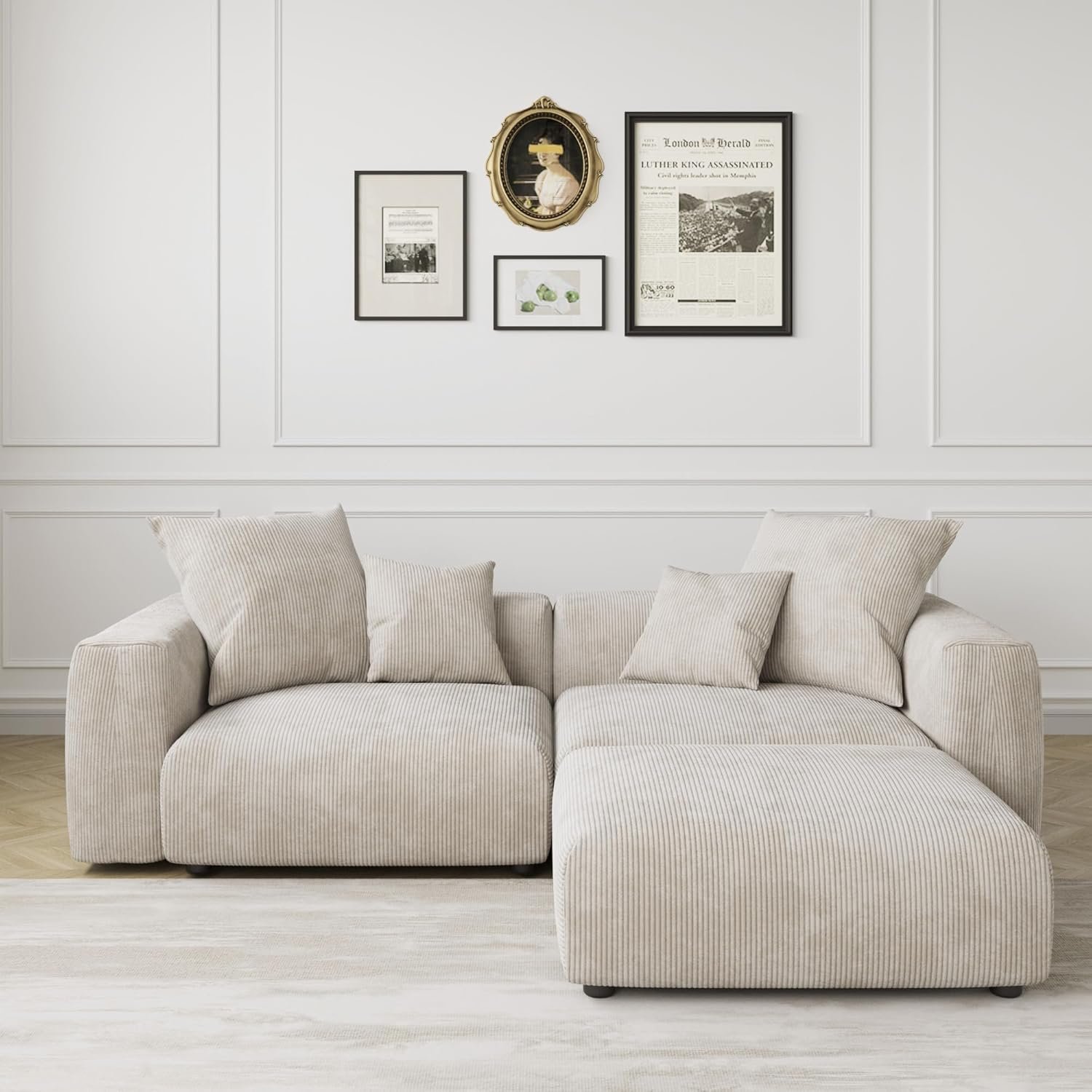
Creamy Beige
The ultimate “cloud” look. Warm, neutral, and pairs perfectly with organic wood textures.
View on Amazon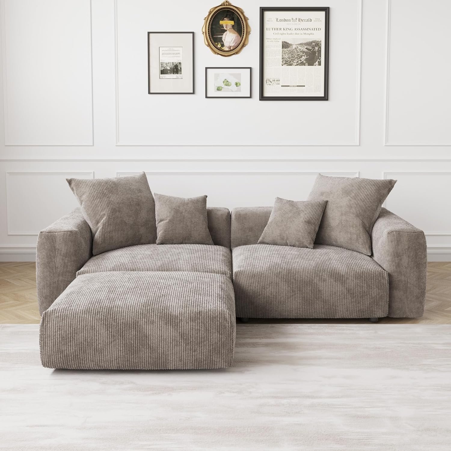
Dark Grey
Sleek and versatile. This cool-toned grey anchors the room and hides everyday wear beautifully.
View on Amazon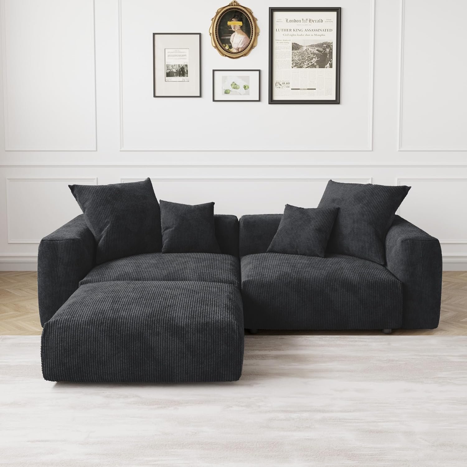
Midnight Black
Moody and sophisticated. Creates an instant focal point with a touch of luxury industrial edge.
View on AmazonBlush Pink: A Sophisticated Strategy for Brightening a Dark Space
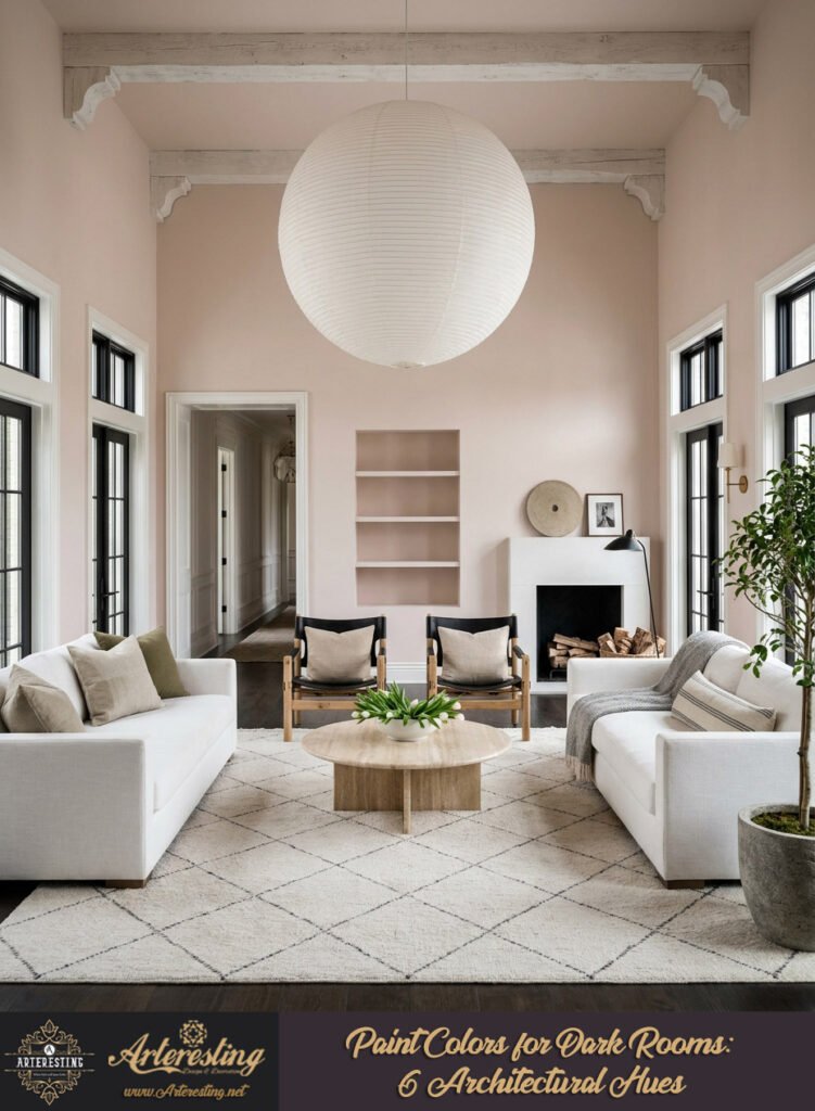
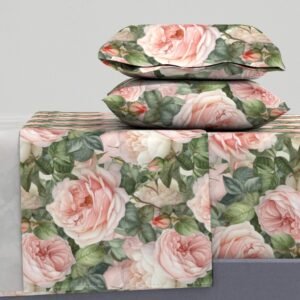
Blush pink functions as an elevated, light-enhancing neutral. Specifically, delicate pastels capture existing light and amplify it with subtle warmth. Consequently, this low-saturation hue prevents visual crowding while injecting a sophisticated, vintage-inspired energy into heavily shadowed, confined architectural layouts.
Pigment saturation directly impacts spatial flow. High-intensity colors visually shrink a room. Conversely, a soft blush operates on the periphery of perception. Therefore, it reads as a warm neutral rather than a dominant, heavy color. Visually, the gentle pink undertones actively counteract gray, dreary shadows.
Furthermore, strategic lighting elevates this hue. Always utilize warm-temperature LED bulbs to enhance the pink’s natural warmth. Specifically, wall sconces grazing the blush surface will highlight its dimensional quality. Ultimately, the room feels undeniably open and historically rich.
Painting Tip: Testing Colors to Brighten Dark Rooms
Undertone manipulation is strictly dependent on environmental lighting. Therefore, testing multiple paint samples is a mandatory architectural step. Crucially, you must observe how both artificial bulbs and limited natural light interact with each swatch across different times of the day.
Paint behaves dynamically, never statically. A color swatch in a bright showroom fundamentally shifts in a shadowed hallway. Consequently, rigorous on-site testing prevents costly spatial errors. Visually, the wrong undertone can quickly turn a room muddy or overtly clinical.
Specifically, paint large swatches on opposing walls. Furthermore, examine these sections during morning shadows and evening artificial lighting. Ultimately, observing this precise light-reflective behavior ensures you select the exact hue to elevate the room in question.
Shop The Look
Light Greige: The Chameleon Neutral
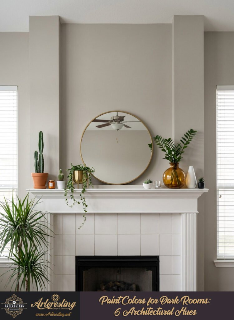
Light greige masters the balance between gray’s sophistication and beige’s warmth. Visually, this chameleon pigment adapts its temperature based on existing ambient lighting. Therefore, greige consistently amplifies available light, making it a highly versatile, elegant solution for low-light living areas.
Architectural adaptability defines greige. Specifically, it responds directly to surrounding textures and light temperatures. During overcast days, it leans slightly cool. Conversely, under warm lamps, it radiates deep warmth. Therefore, it solves complex lighting dilemmas effortlessly.
Crucially, pair greige with high-contrast architectural elements. Matte black hardware or rich walnut woods ground the floating, airy nature of the paint. Visually, this creates a deeply tailored environment. Ultimately, greige guarantees a polished, high-end spatial flow.

Soft Blue: Replicating Natural Skies
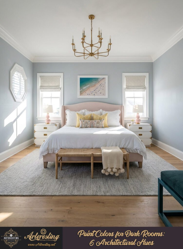
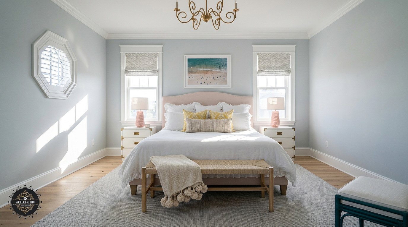
Soft blue acts as a psychological bridge to the outdoors. Specifically, light pastel blues mimic the expansiveness of the sky. Consequently, applying this nature-inspired hue visually dissolves rigid ceilings and walls, introducing an atmosphere of absolute freedom and bright tranquility.
Spatial psychology relies heavily on exterior connections. When windows lack a view or natural light, paint colors for dark rooms must compensate. Therefore, soft blue injects a permanent sense of summer sunlight. Visually, the cool, receding nature of blue pushes walls outward.
Furthermore, styling requires organic integration. Always complement soft blue walls with natural stone and raw timber. Specifically, this grounds the whimsical, airy color. Ultimately, the dark room sheds its heavy, claustrophobic shell for an expansive, breathable ambiance.
Shop The Look

Gentle Green: Balancing Light and Serenity
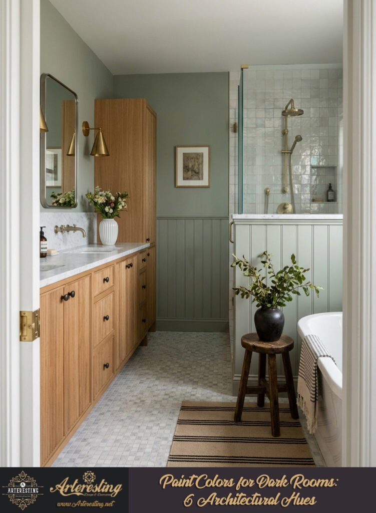
Gentle sage green revitalizes stagnant, low-light spaces by introducing organic warmth. Crucially, the yellow undertones within soft greens counteract cold, traditional blue-based shadows. Visually, this creates a highly reflective, comforting backdrop that seamlessly reconnects the enclosed interior with nature.
Low-light bedrooms require careful emotional engineering. Therefore, gentle green serves as a restorative anchor. Despite traditional color theories labeling green as cool, sage’s specific yellow base actively warms the space. Visually, it reflects light smoothly without causing spatial fatigue.
Specifically, layer green environments with tactile fabrics. Boucle, raw silk, and brushed cotton amplify the soothing nature of the walls. Furthermore, warm ambient lighting at the floor level maximizes the hue’s calming effect. Ultimately, you craft a perfectly balanced, deeply rejuvenating sanctuary.
Optimizing shadowed interiors requires intentional, mathematical color choices. Ultimately, choosing the right paint colors for dark rooms can alter spatial perception. By manipulating undertones and light reflectance, you can expertly engineer any heavy, confined space into a brilliantly luminous, high-end architectural triumph.
The Modern Rug Edit
This viral washable, high-low pile geometric rug comes in three versatile shades. Find the perfect textured foundation for your space.
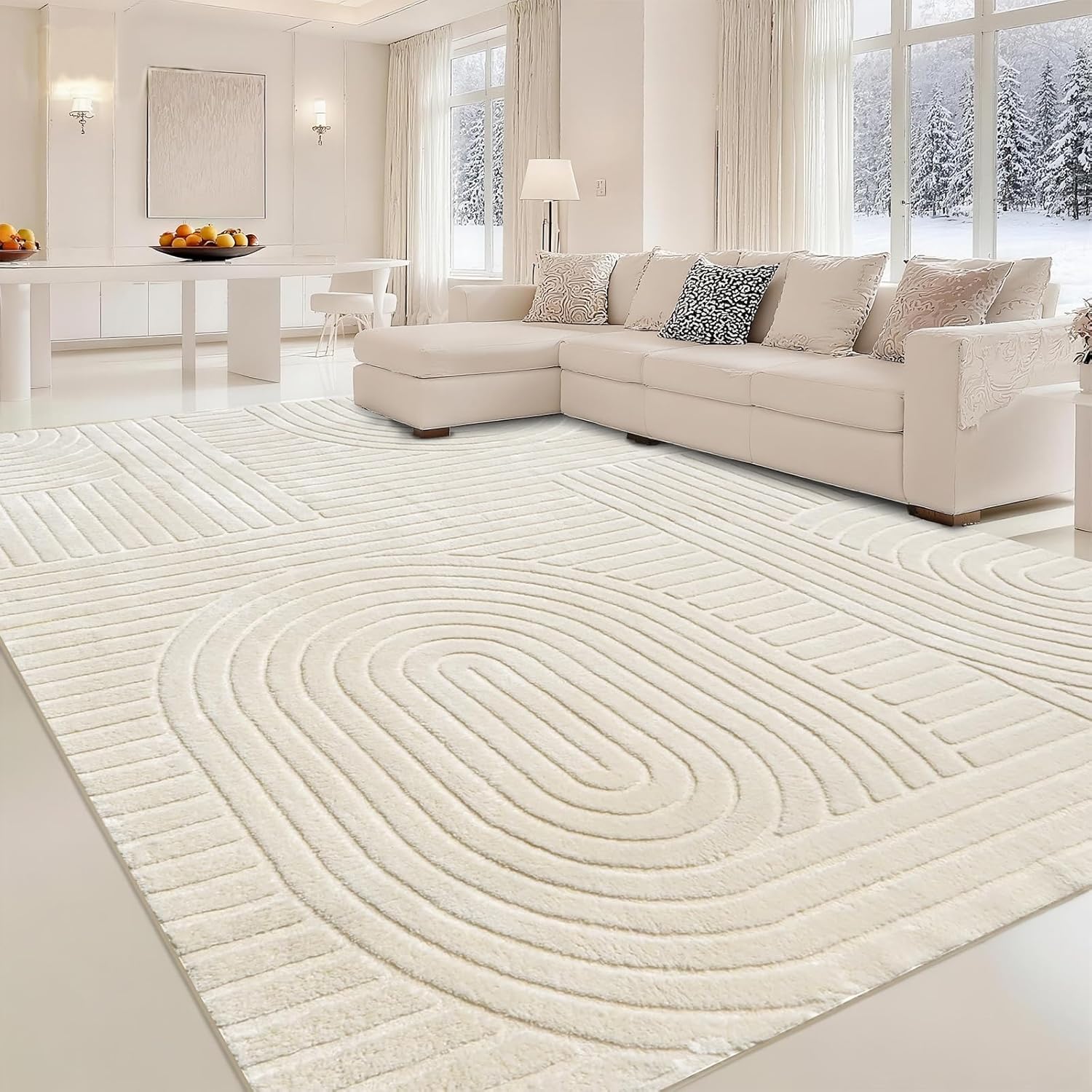
Light Beige
Fresh and airy. This soft, textured pattern reflects light beautifully and instantly opens up any living room.
View on Amazon
Light Brown
Rich and inviting. Adds a subtle layer of organic warmth and effortless bohemian charm to your floors.
View on Amazon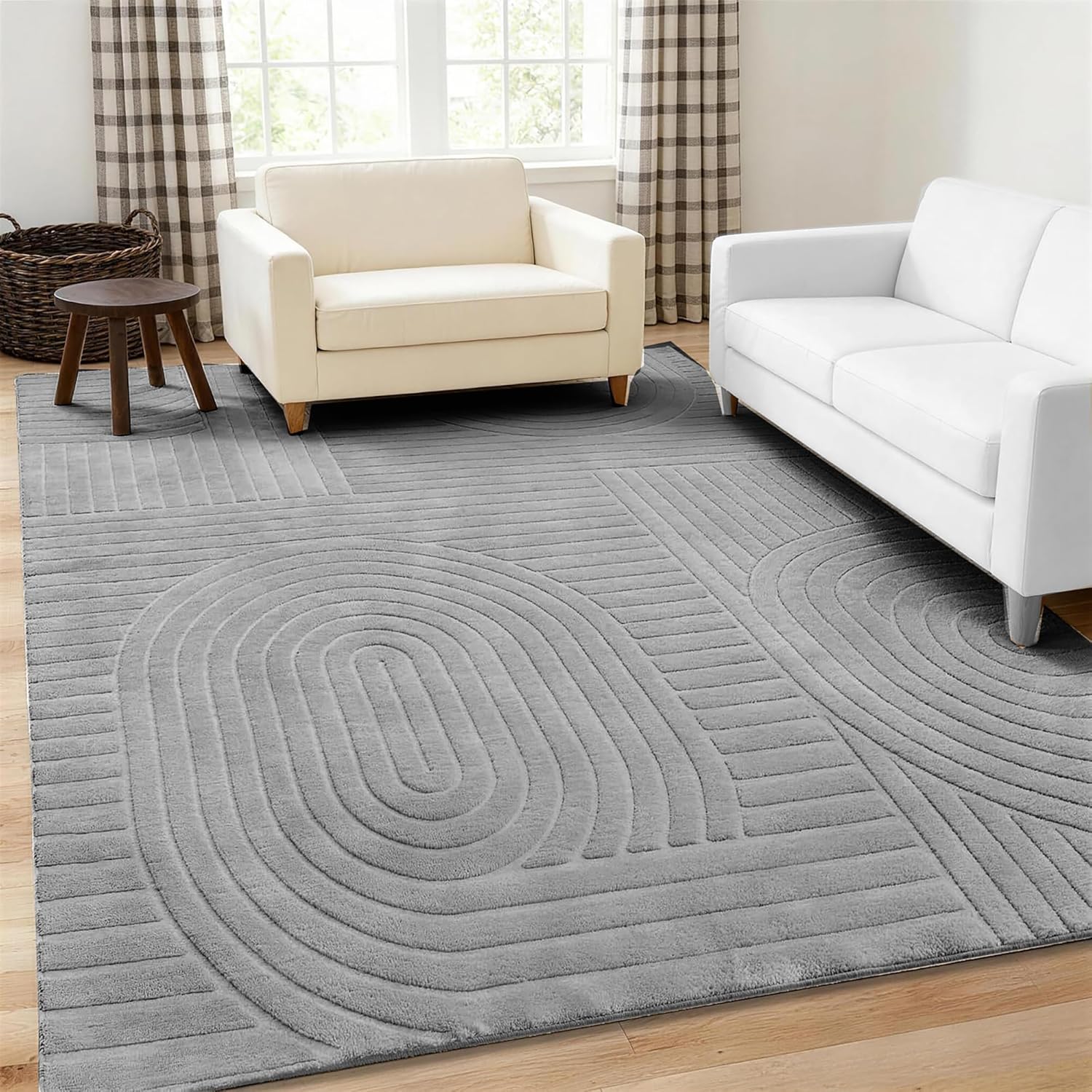
Soft Grey
Sleek and grounding. The perfect cool-toned, durable foundation for a highly styled, contemporary space.
View on AmazonTo brighten low-light spaces, interior architects prioritize warm-toned, light-reflective pigments. The most effective paint colors for dark rooms include warm white, cozy beige, blush pink, and light greige. These specific hues bounce existing ambient light, correct cold shadows, and visually expand the structural boundaries of a windowless or north-facing environment.