
Table of Contents
Navigating the intricacies of color rules is crucial when working with home decor, particularly when seamlessly incorporating saturated hues demands a professional touch.
The theory of color trends plays an important role in how a room feels, so it’s important to get it right when it comes to painting ideas. ‘The use of color in interior design is not just about aesthetics but also about creating a space that evokes desired emotions and serves its intended purpose,‘ says interior designer Nicholas Kaiko.
Once the colors of a room are mastered, it’ll make the rest of the decor easier to work around and ensure a cohesive and balanced look.
What Rules Do Designers Use When Working With Color?
According to interior designers, these are the most effective rules that they use when designing any room in the home, to ensure that the color choices work well together and establish the desired tone.
‘Adhering to these principles, derived from color theory, can help in achieving a well-balanced and harmonious decor,’ adds Nicholas.
1. DECIDE ON THE MOOD YOU WANT TO CREATE
When choosing colors for a room, you should always consider the way color will make you feel. Color psychology can be a powerful tool in creating an atmosphere, so this should always be carefully considered when selecting colors.
Luis Carmona, designer at VERDE Interior Design, says: ‘I first start with the mood that we want to achieve or what we want the person in the room to feel. Certain colors have specific emotional associations. Blue is often associated with calmness and serenity, while green evokes nature, harmony, and balance.‘
Kara Piepmeyer, Founder of design studio Studio Kosma, also highlights the importance of selecting colors for the desired mood, saying: ‘If the client is looking for high energy and wants to make a big impact, then I often choose dark, cool colors and go for complementary and highly contrasting shades on the color wheel. If the homeowner is yearning for a deeply relaxing space, then I lean toward warm, subdued earth tones. Selecting analogous colors on the color wheel will help foster that sense of tranquility.‘
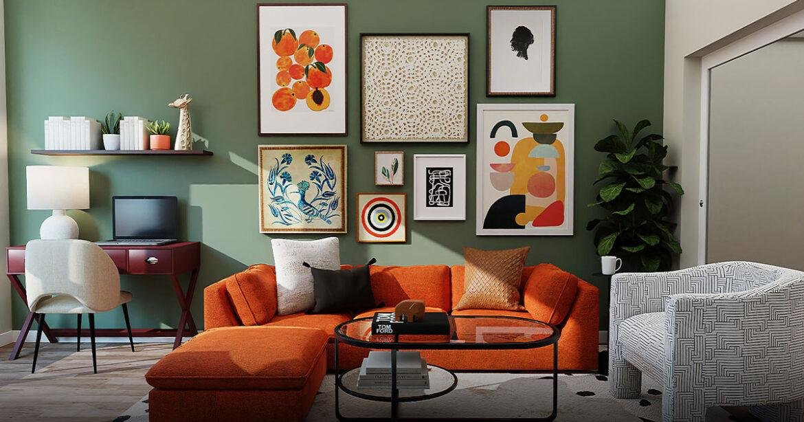
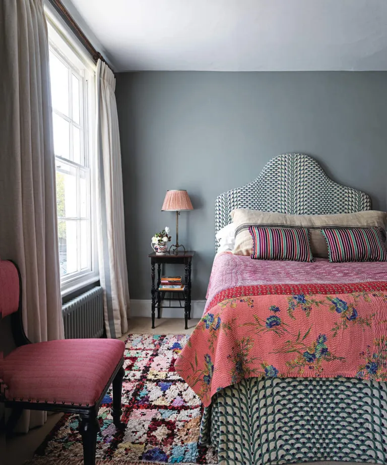
2. STICK TO USING THREE COLORS
‘I usually have at least three colors or tones in a project: light, medium, and dark,’ says Tyson Ness, Founder of NYC-based Studio Ness. ‘This helps to create depth to a palette and can be done with any scheme. I balance these colors in the room by thinking of a triangle and making sure that each point has each of the tones represented, with the center point being the main feature of the room.‘
‘This will help to create balance in the room by making sure the tones are evenly balanced and spread throughout the space through decorating with art and decor. You can also approach these as the main color, complementary color, and accent color,‘ Tyson adds.
Luis Carmona also advises sticking to between two and three colors to create a balanced look: ‘We like to stick to two to three dominant colors for any single space so that the room appears well designed and balanced. If we are designing a room with a neutral palette, a similar rule applies. We’ll stick to two to three shades to give the room depth. We then fill in any design gaps with textures and different surfaces to add dimension to the space.‘
3. USE THE 60-30-10 RULE
The 60-30-10 rule is a traditional color rule and helps to create a cohesive look by using three different colors in different amounts. Interior designer Rudolph Diesel explains: ‘60% of the room is in a dominant color, usually a calming or neutral shade.‘
‘30% of the room is in a secondary color that complements the dominant color, ‘ and ‘10% of the room is an accent color, which is complementary while being bold and offering a contrasting hue.’
He adds that if you’re not sure where to begin with selecting colors, it’s always worth referencing the color wheel to spark creativity. ‘The color wheel will guide you toward harmonious combinations using: Complementary colors that are placed opposite each other on the wheel; Monochromatic color schemes, which are variations of a single color; and Analogous colors that neighbor each other on the wheel.‘
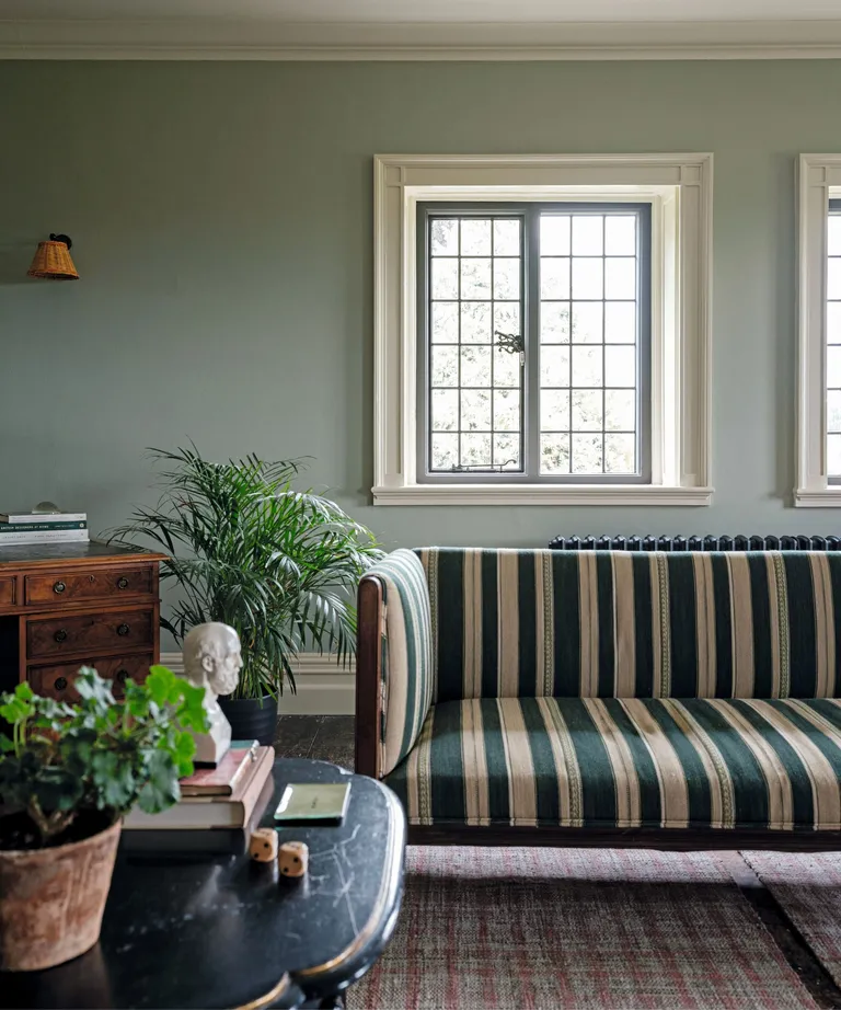
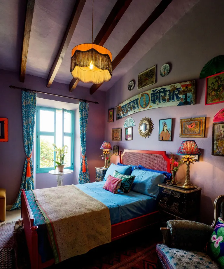
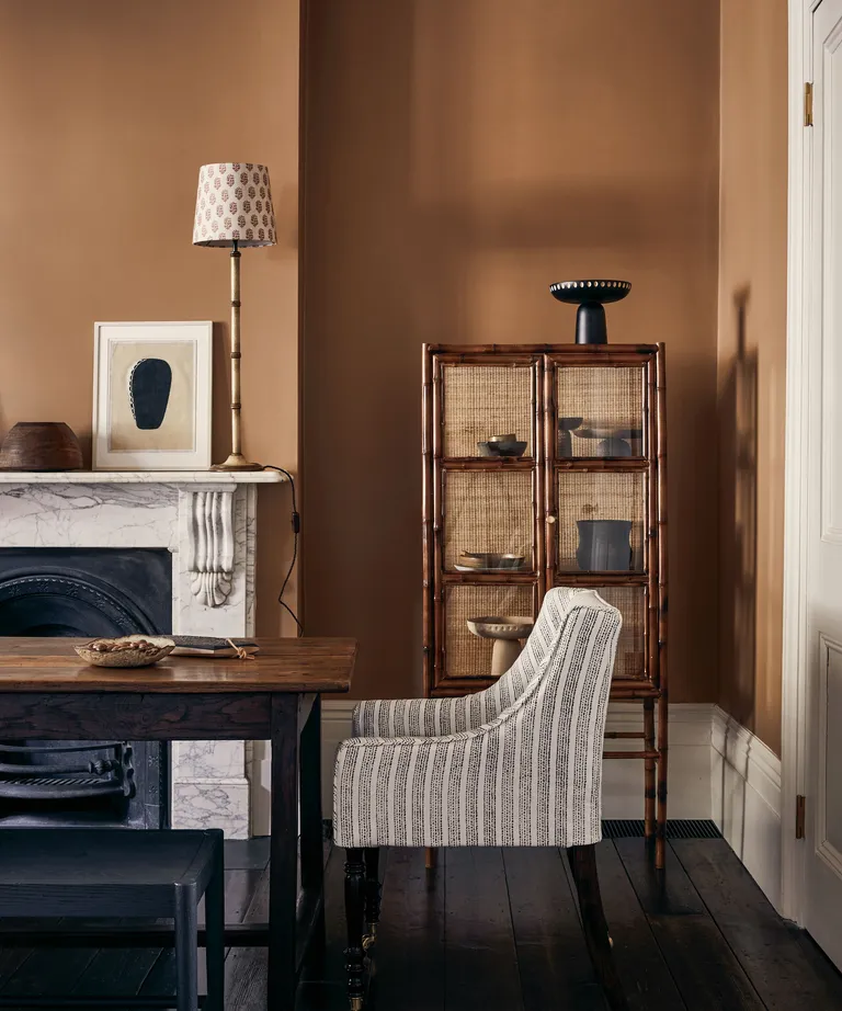
4. USE A LAYERED APPROACH TO BALANCE WARM AND COOL TONES
‘You can’t go wrong with pairing warm and cool colors to create a harmonious space,‘ says interior designer Naomi Astley Clarke.
Interior designer Matthew Williamson agrees, saying: ‘In most spaces, there should be a balance of complementary colors for contrast. I love decorating with a sense of layering, which is incredibly important. It’s not just about bringing bold, massive swathes of color in.’
Rudolph Diesel also recommends mixing warm color schemes and cool color schemes, adding: ‘While color schemes and styles differ in many homes throughout the world, it’s always a good idea to achieve a balance in the combination of warm and cool colors that you use. For example, using cool colors for larger areas like walls or furniture is often complemented by accents in warmer colors, like a throw or artwork.’
5. ALWAYS CONSIDER NATURAL LIGHT
As with any rule, it’s always important to consider this in the context of the specific room you’re working with. The amount of natural light a room receives will heavily impact how color looks, so make sure to understand this before settling on your colors.
‘Natural daylight can dramatically shift a color’s tone, so I always evaluate hues at different times and under various light sources,’ says interior designer and Founder of Arsight Artem Kropovinsky. Nicholas Kaiko adds that: ‘Rooms with abundant natural light can handle darker colors better than rooms with limited light, which might feel even more confined.’
6. TEST BEFORE COMMITTING
Before deciding on any colors for your interior schemes, designers say you should always test before committing. Color is complex and can look different depending on many factors, so it’s always worth testing out color in a small amount before fully committing to a color scheme.
‘Always test paint colors on a small section of the wall,‘ advises Nicholas Kaiko. ‘Observe them at different times of the day, under artificial lighting, and in natural light.‘
FAQS
WHAT ARE THE MOST IMPORTANT COLOR RULES TO CONSIDER?
While there are lots of color rules that designers use to create a cohesive and balanced look in a room, they also add that color is subjective, so rules should be used as a guide only.
‘Not all room designs are so strategic,’ says Luis Carmona. ‘With every rule, there is an exception. Sometimes a client wants a fun, colorful space full of color, textures, and patterns. We have just as much fun designing these spaces as the neutral, monochromatic designs that have become our signature.’
Matthew Williamson adds that it’s important to remember that color can easily be changed, so don’t worry too much about making mistakes: ‘No matter what you go for, always remember that color is one of the few interior design elements that can be changed quite easily, quickly, and affordably if you don’t like it. It’s not something which once chosen must remain forever, so it’s well worth giving it a go, having fun, and trying something new.‘
These color rules are supposed to be used as a guide and can be helpful as a starting point when choosing initial colors can feel overwhelming. You should also be wary of color decorating rules to ignore ahead of designing any room, as color experts say these feel dated and can be too restrictive.
0 comments
[…] with most aspects of interior design, it starts with a bit of creative thinking. Take a look at the existing space. What is it […]
[…] transformative power of color within your sanctuary. Infuse vibrant hues strategically into your decor scheme. Through captivating accessories, bold artworks, or striking furniture, these colors imbue a […]
[…] Pale gray is a wonderful color match for orange since each will temper the other’s intensity and effect. You can use orange as your main color and use touches of gray to cool down the effect, as in the room below, or, in our preference, use orange as an accent color for gray. […]
[…] cooler shades. However, as this modern rustic kitchen demonstrates, they can work so well amongst warmer color schemes and almost become a warm shade themselves when you pair them with wood and copper tones. […]
[…] often get turned to when people have made color mistakes in their own homes. Perhaps a room has lots of shades of the same hue which really ought to work, […]