Table of Contents
Keep it Earthy to Ground Your Space
The Power of Desaturated Pigments
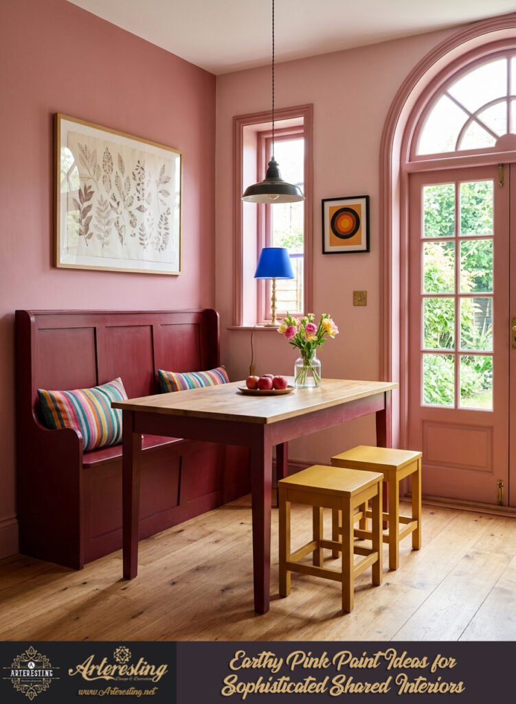
Earthy pink paint ideas successfully convince hesitant partners by abandoning sugary, hyper-saturated connotations. When brown or gray pigments are intentionally blended into the base, the color transforms from an overtly bright statement into a deeply nurturing shade. This subtle shift creates a sophisticated ambiance that feels organic, soft, and remarkably easy to live with over time.
Interior designers frequently recommend muted variations because they introduce warmth without visually dominating a room. By selecting shades with significant depth, you ensure the color reads as a rich, soulful neutral rather than a novelty. This approach changes how light bounces off the walls, offering a gentle embrace at the end of the day.
Selecting the Right Nuanced Shade
Navigating the paint chart requires looking closely at archive collections and heritage palettes. Look for formulations carrying heavy undertones of clay, terracotta, or warm taupe. These specific mixtures prevent the walls from reflecting overly rosy light, keeping the overall interior grounded.
- Look for historical archives featuring muted clay pigments.
- Test swatches directly against existing timber flooring.
- Observe how artificial lighting warms the wall color at night.
The Geometric Heritage Collection
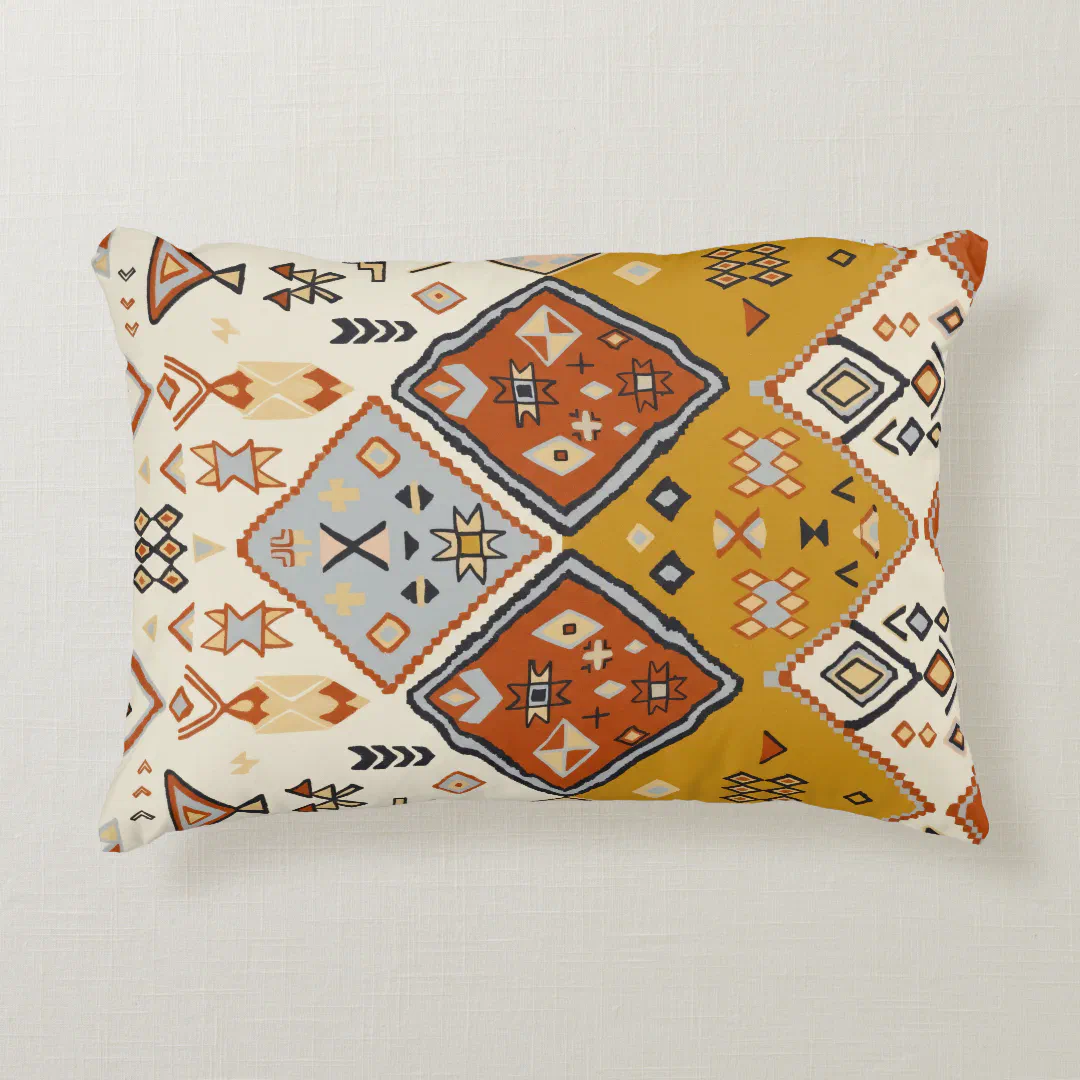
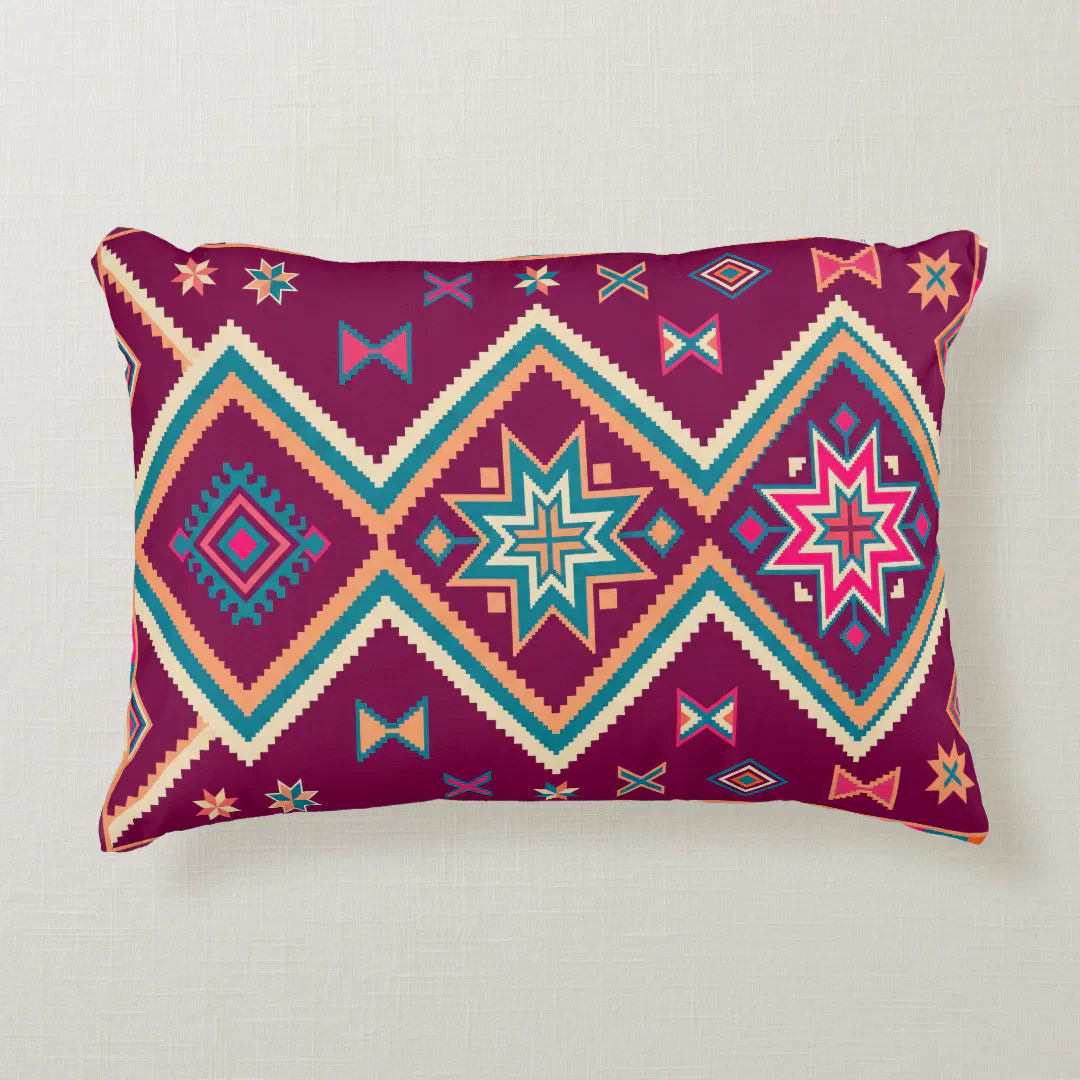
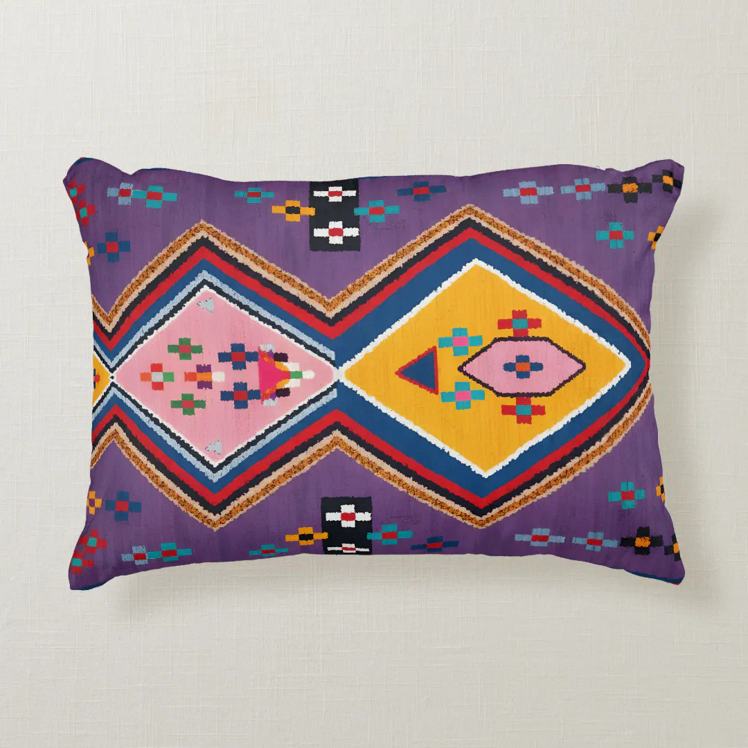
Infuse your home with global artistry. Discover our curated selection of accent pillows featuring intricate Moroccan tribal motifs, warm plum southwestern patterns, and Andalusian heritage geometrics.
Choose Considered Colour Partnerships
Balancing Tones with Intentional Pairings
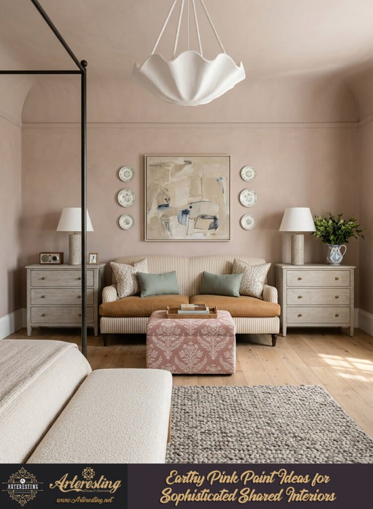
Pairing muted pink walls with contrasting or complementary elements dramatically alters the emotional impact of a room. Team these tones with olive greens or steely blues to establish a moody, contemporary atmosphere. Alternatively, introduce rich yellow ochres or burnt oranges if you desire a more vibrant, dynamic energy.
Natural materials play a vital role in balancing the inherent softness of these palettes. Deep chocolate brown woods, textured sisal rugs, and veined marble introduce a sense of permanence and architectural weight. These tactile additions strip away any lingering sweetness, rendering the entire scheme thoroughly mature and composed.
Crafting Cohesive Material Palettes
Bringing architectural balance to your interior involves mixing hard surfaces with soft, organic textures. When the walls carry a warm, desaturated hue, the supporting decor must anchor the space to prevent it from feeling weightless.
Eliminate Contrast for Seamless Flow
Softening Transitions Through Minimal Contrast
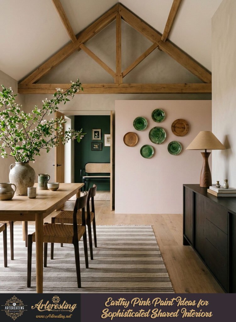
Placing a soft, desaturated wall next to brilliant white woodwork and ceilings immediately emphasizes its underlying chromatic identity. If your household partner is skeptical about the hue, this high-contrast frame draws unnecessary attention to the pigment. Removing these stark borders allows the color to recede into a quiet backdrop.
Designers advise neutralizing high-contrast architecture by extending the primary wall shade onto baseboards and architectural moldings. This technique unifies the structural envelope, creating a continuous plane that feels larger, calmer, and infinitely more refined.
Embracing Monolithic Color-Drenching
Color-drenching involves taking a single hue across walls, ceilings, and architectural joinery for an uninterrupted sweep of color. Without stark white interruptions, the eye naturally drifts toward mid-room furnishings, artwork, and lighting fixtures.
- Paint baseboards and crown molding in the exact wall shade.
- Carry the pigment onto doors to unify small architectural spaces.
- Select matte finishes to absorb light and enhance the seamless cocoon effect.
Don’t Call It Pink in Household Discussions
The Psychological Power of Nomenclature
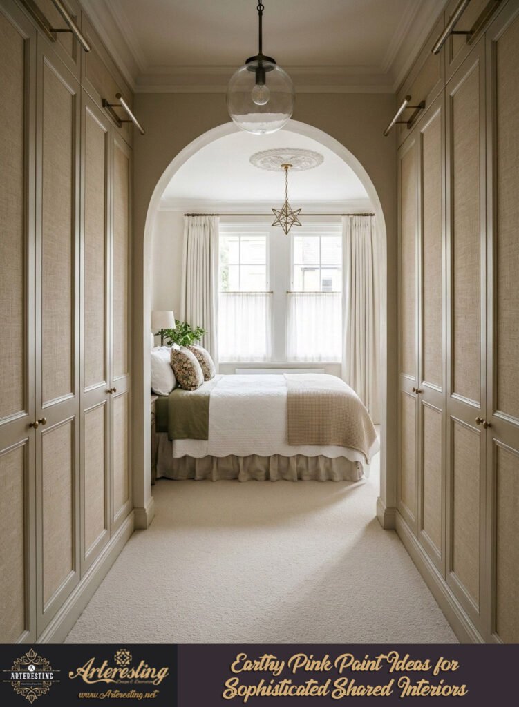
Human perception is deeply tied to language and preconceived notions. If a household member immediately balks at the mention of the word, bypass the label entirely during the planning phase. Presenting the shade as part of an integrated, warm neutral palette often dissolves resistance before it starts.
When viewed strictly within a cohesive spatial context, the brain registers the color as a versatile warm neutral rather than a specific chromatic category. Many homeowners live happily with these sophisticated walls for months before realizing the classification of the shade.
Reframing Color Through Context
Allowing a partner to experience the atmosphere first removes the psychological barrier associated with traditional color names. Focus conversations on the warmth, light reflection, and tactile quality of the finish rather than its position on the color wheel.
- Describe the paint using its atmospheric qualities, such as warm plaster or aged clay.
- Focus on how the shade complements existing furniture pieces.
- Allow the completed room to speak for itself before revealing color names.
Reframe Pink as an Elevated Neutral
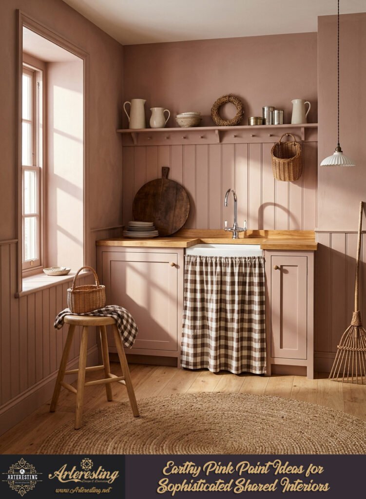
Transitioning From Bold to Liveable
Treating a muted, desaturated hue as a timeless neutral opens up entirely new possibilities for residential design. Just like traditional creams, beiges, or sage greens, these complex variations provide a liveable backdrop for busy family spaces, serene bedrooms, and refined living areas alike.
Kitchen cabinetry and bespoke architectural joinery benefit immensely from these dusky tones. They introduce subtle character and warmth without feeling clinical or overly styled, serving as a sophisticated alternative to standard brilliant white or stark gray cabinetry.
Implementing Subtle Tonal Variations
Selecting the right pale variant ensures the interior remains fresh and restrained over time. Look closely at formulations featuring hidden grey, brown, or yellow undertones that shift gracefully under changing daylight.
- Opt for blush bases infused with yellow to keep spaces inviting.
- Choose grey-undertoned variants for sleek, contemporary architectural zones.
- Apply these tones to high-traffic joinery for enduring elegance.
Start with Small Details to Ease Transition
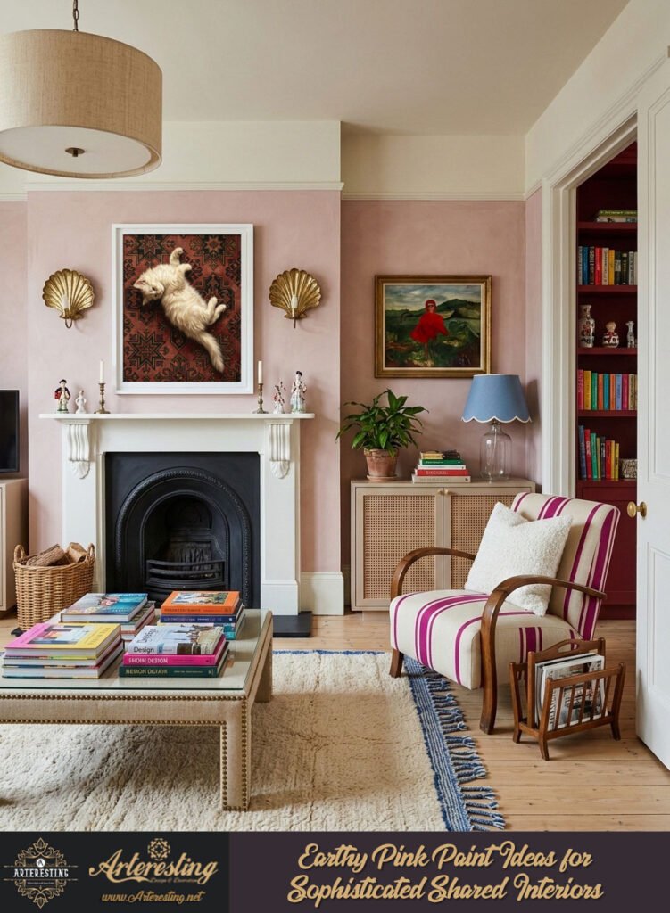
Gradual Integration Through Architectural Features
Jumping straight into a whole-room transformation can feel overwhelming when styling a home with a reluctant partner. Introducing the color in contained doses offers an ideal way to test how the tone interacts with natural daylight before making a full commitment.
Paint the interior of display shelving, recessed architectural alcoves, or decorative wall panelling first. These smaller canvases let you evaluate the emotional impact of the hue while keeping the overarching room neutral.
Layering Muted Accessories and Textiles
Soft furnishings provide a flexible medium for testing new palettes without altering permanent architectural surfaces. Introduce the hue through tactile elements such as heavyweight linen upholstery, bespoke lampshades, or curated wall art.
- Layer textured wool or linen cushions onto neutral sofas.
- Hang muted textile artwork to echo the palette across the room.
- Use ceramic decor pieces on open shelving to tie the scheme together.
Use It in North-Facing or Darker Rooms
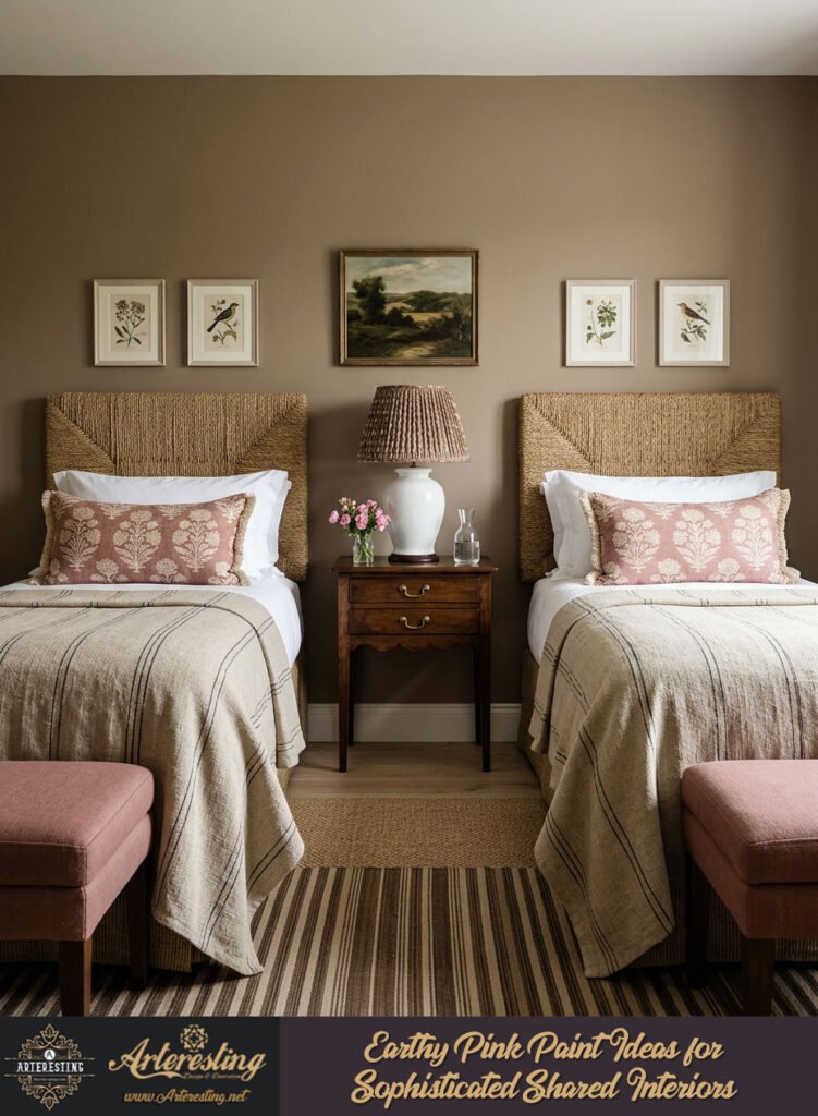
Warming Up Challenging Natural Light
North-facing rooms receive cool, bluish light that can easily make a living space feel austere or uninviting. Off-white or plaster-toned neutrals carrying the gentlest whisper of warmth instantly counteract this chill, injecting vital life into otherwise shadowed interiors.
Bathrooms and narrow transitional hallways benefit immensely from these enveloping hues. Wrapping a forgotten corridor in a warm, earthy tone transforms a purely functional passageway into a welcoming, atmospheric threshold.
Maximizing Ambience in Compact Spaces
Darker rooms require a thoughtful approach to spatial styling to avoid feeling claustrophobic. Utilizing a desaturated, warm-undertoned paint color allows the walls to embrace the low light rather than fighting against it, creating an intimate, cocoon-like environment.
- Apply warm plaster tones generously in windowless hallways.
- Use soft-sheen finishes in compact bathrooms to bounce gentle light.
- Pair these spaces with warm, diffused lighting to enhance coziness.
Elevating a shared home with pink requires moving away from sugary hues toward desaturated tones infused with brown, gray, or yellow undertones. Techniques such as color-drenching, eliminating high-contrast white woodwork, and styling with tactile natural materials allow pink to function as a sophisticated, grounding neutral that flatters any room.