Table of Contents
In a world where neutral and muted colors reign supreme, a surprising TikTok-fuelled trend is peeking over the horizon. The allure of primary colors is making a vibrant comeback to encourage us to celebrate bold design choices.
From the ‘Unexpected Red Theory’ to a love affair with cobalt blue, 2024’s biggest color trends are embracing the power of primary colors to infuse energy and personality into our living spaces. These bold, bright, vibrant hues represent the purest forms of color and are starting to establish themselves as the ultimate mark of a well-dressed home.
At its core, the trend is about an injection of dopamine decor. The difference, however, is that this trend is not maximalism, though nor is it minimalism, but instead a rather harmonious blend of the two. It’s an interior design trend that fills your home with joy, invigorating a space with bold color and paint, but not in a way that dominates or overwhelms. It’s about making a case for the surprising and the unexpected with bursts of primary colors, mixing of periods, and clashing of prints and patterns.
Here, we take a deep dive into this retro-embued palette and consult the experts to get their take on embracing this vibrant interior design trend in your home.
What Are Primary Colors?
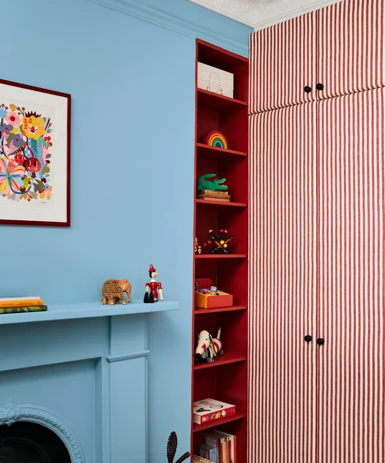
Put, primary colors are the 3 most fundamental: red, yellow, and blue. These pigments cannot be made by mixing any other color, and, together they can then be combined in a myriad of combinations to create every hue on the color wheel.
In interior design, the color wheel is used to best inform room color ideas, looking at how different colors can either complement or contrast with each other to affect the feel and mood of the space. And while the primaries may be the foundations of all colors, often they’re decidedly less popular than their derivatives. Until today.
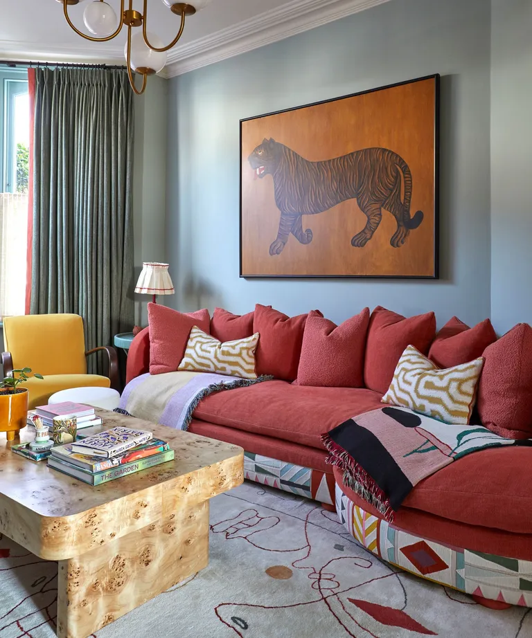
This resurgence of popularity for using pops of primary colors is, like most trends these days, in part thanks to TikTok. According to creator and Brooklyn-based interior designer Taylor Simon of @intayriors who coined the ‘Unexpected Red Theory’ (and went viral for it), these bursts of bright ‘work in any space, because it’s so bold you’re making a statement.’
She explains, ‘You don’t have to have a super colorful home to incorporate these colors, the one pop is more than enough.’ And in fact, it’s more desirable. The idea is that once your pop of red, blue, or yellow is added to a space in moderation, it automatically looks better.
However, because of their impact, decorating with primary colors can be daunting. To find out the easiest and most on-trend ways to introduce these vibrant shades into your homes, we’ve corralled the experts for their very best advice below.
How To Use The Unexpected Red Theory To Decorate With Primary Colors
1. DIP YOUR TOES IN WITH ACCENTS AND ACCESSORIES
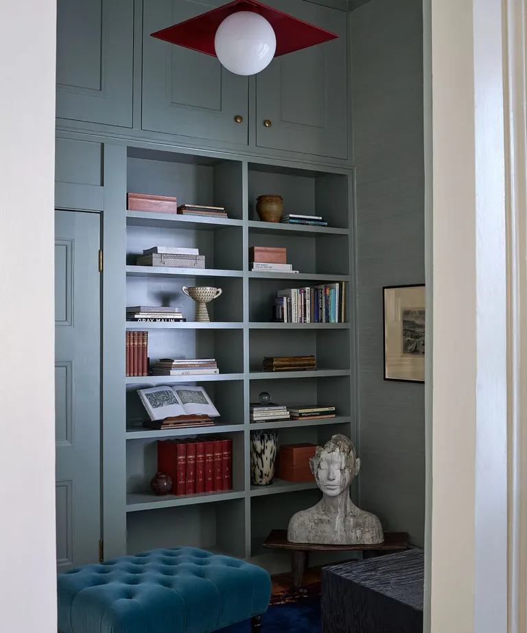
If the idea of decorating with primary colors feels a bit overwhelming, fear not. 2024’s take on a color pop is more, well, random. According to TikTok, the idea is to add one item that’s bright and bold (big or small) to a room where it seemingly doesn’t match, and it instantly elevates it. And with that, accessories are the perfect starting point.
Pieces like a throw pillow, blanket, lighting, art, or a decorative object in a pop of color can instantly uplift a space, providing a pop of energy without committing to a full-blown color scheme.
Katie Logan LeBlanc, co-founder of Logan Killen Interiors who designed the space above, finds pops of red one of the easiest colors to use as it can take on many personalities, depending on the shade.
‘Red is often considered a bold color, but we often use it in slightly desaturated tones almost as a neutral,‘ explains Katie. ‘It warms up any space, making it feel cozy and alive, and also has the added benefit of being a unifier with any woods layered into the room. Pillows, lighting, rugs, and accent furniture offer easy ways to layer in bright colors,’ she adds.
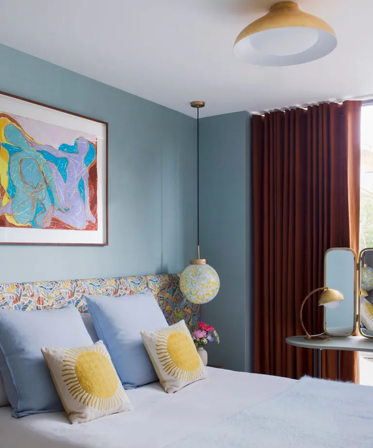
Caroline Milns, head of interior design at Zulufish, finds primary colors to act almost like a punctuation mark, adding a moment to stop and pause within an interior.
‘Embracing bold colors in accessories is the easiest way to introduce them into a scheme,‘ says Caroline. ‘It is a good idea to consider balancing the strength of color with a healthy dose of white or neutral shades to ground the brighter tones, and combine with stronger patterns such as geometrics or stripes as these dramatic motifs can temper the strength of the color.’
2. CONSIDER PAINTING SOMETHING UNEXPECTED
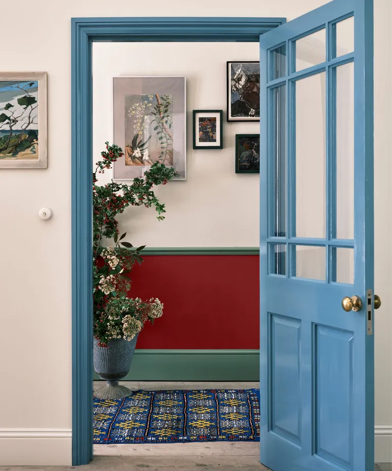
For a bolder statement, consider painting the unexpected elements in your home in a lively color. Doors, frames, trims, and even inside cupboards are often overlooked opportunities for injecting personality into a space. A sunshine yellow front door, blue window frames, or a red cupboard interior can add an element of surprise that sparks joy.
‘Introducing beautiful bold primary shades like Stone Blue, Babouche, and Bamboozle to unexpected areas is the perfect way to add mood-boosting color to every space, without feeling too scary,‘ suggests Charlotte Cosby, creative director at Farrow & Ball.
‘Thread these shades into neutral schemes to inject energy by painting furniture or areas you wouldn’t initially think of decorating, such as the back of bookshelves, fireplaces, or the interior of a cupboard – this will bring a room to life without being too overpowering,’ she advises. ‘Alternatively, for a bold scheme that evokes pure joy, use across greater expanses or over walls, woodwork, and ceiling for an incredible color-drenched look.’
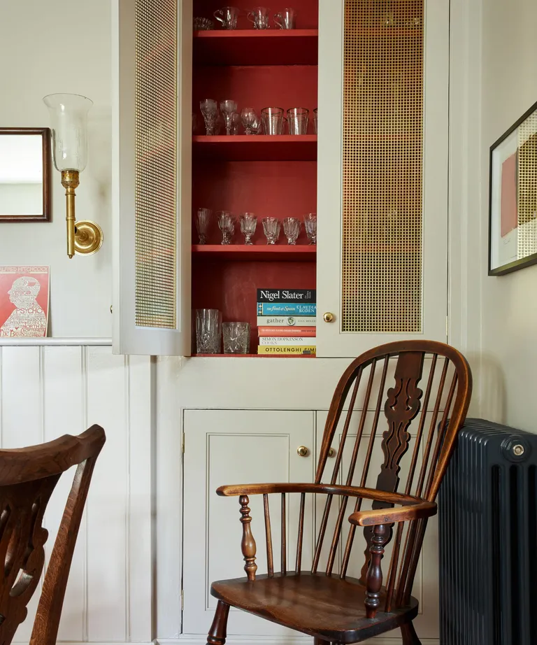
‘Opting for primary colors is a great way to add visual interest to any scheme,’ agrees Benjamin Moore‘s director of marketing, Helen Shaw. ‘Even if you’re a little color-shy, just featuring a few bright accents will create a fun and uplifting space.’
‘Painting a single wall, ceiling, or elements of the woodwork is a good way to use such color so it doesn’t feel too overwhelming,’ she suggests. ‘If you are lucky enough to have architectural features such as picture rails and cornices in your home, adding a burst of red, yellow, or blue to create highlights is guaranteed to boost your space.’
3. USE THE ELEMENT OF SURPRISE AND LOOK UP – OR DOWN
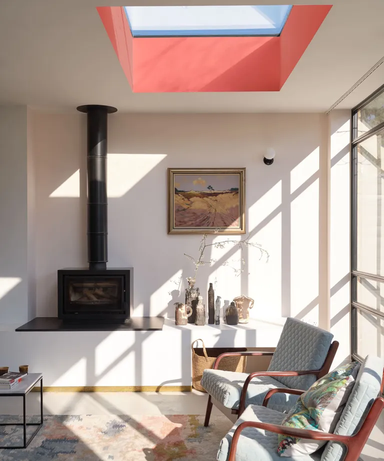
To fully embrace the unexpected, look beyond eye level and consider the vertical and horizontal opportunities in your space. Ceiling lights, statement-painted ceilings, flooring, and rugs are all powerful tools to either ground a space or draw the eye upward. A primary-colored pendant light or a vibrant rug can redefine the entire atmosphere of a room.
When an otherwise neutral room calls for a bit of energy, an injection of color can give that space a much-needed jolt. Take the space by Farrow & Ball seen above, for example, the tones in the space are entirely muted with a subtle base note of pinky tones which is then accented with a bold lick of red on the ceiling.
Because the room already has these undertones of the primary color in its palette, the red feels unifying and of course, intriguing.
‘Introducing pops of yellow into a room creates a gentle warmth, injecting energy into a scheme without overwhelming the overall aesthetic,’ adds Gemma McCloskey, founder and creative director of Cúpla. ‘Yellow accents against neutral backgrounds, such as whites, greys or natural tones, tend to stand out beautifully, creating a visually striking contrast.’
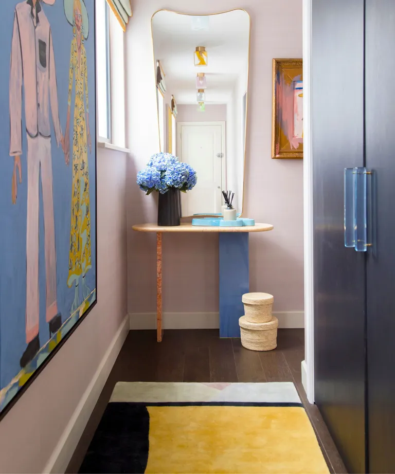
A rug can play the starring or supporting role within an interior scheme.
‘Primary colors are so bold that many can be fearful of embracing this palette within an interior, and yet they can be an easy way to bring energy and life to a space,’ observes Layla Holmes, founder of carpet and rug makers Holmes Bespoke. ‘One of the brilliant elements about rug design is that a rug can be either the statement piece that you take your lead from or by taking colors and pattern from an existing space and weaving these details into the room.’
‘For example, a bright rug will make a wonderful impact, deliver instant warmth, and create a visual statement, adds Layla. ‘Or, if you have elements of that shade already in your scheme – whether that is on the walls or a key piece of furniture – by threading that color through the rug as a highlight, it will create an instant sense of harmony and balance, allowing this bolder pop of color to be gently suffused across the room.’
A space injected with vibrant tones is one infused with personality, sparking joy and conversation all at once. And while it might be a trend that doesn’t inspire everyone, take note of the principles and inspiration from the experts and try a little color experiment of your own.
‘Primary colors can be used to inject color and add a youthful touch to an interior, especially when used in contrast with more pared-back tones,’ says Dominic Myland, CEO of British paint brand Mylands. ‘A bold red can create a graphic accent when used on shelving or woodwork, and pairs well with light, bright blues for a striking color palette.’
Whether you choose to tread carefully with a few well-placed vibrant accessories, paint some unexpected elements of your home, or boldly look up and down to redefine your space, primary colors add a retro and playful spark to any space.

4 comments
[…] Posts Colors that go with orange – 7 perfect… You’ve heard of the Unexpected Red theory but… 7 ways to make your living room look… Cottage Interior Style Unveiled: 7 Expert Steps to… […]
[…] with Green: 8 Designer Dark Paints for… Colors that go with orange – 7 perfect… You’ve heard of the Unexpected Red theory but… 7 ways to make your living room look… Cottage Interior Style Unveiled: 7 Expert Steps to… […]
[…] with Green: 8 Designer Dark Paints for… Colors that go with orange – 7 perfect… You’ve heard of the Unexpected Red theory but… 7 ways to make your living room look… Cottage Interior Style Unveiled: 7 Expert Steps to… […]
[…] to be confused with the unexpected red theory, the Red Thread Theory is instead a principle derived from a metaphor common in Nordic countries […]