
Table of Contents
Selecting the perfect architectural palette requires immense discipline. Specifically, securing timeless interior paint colors prevents the costly cycle of trend-chasing. Furthermore, a precise shade mathematically anchors the spatial flow of a home. Consequently, the right pigment establishes an enduring, elevated atmosphere.
1. Farrow & Ball Kittiwake: A Classic Wall Shade
Kittiwake operates as a soft, steel blue that instills immediate spatial tranquility. Therefore, designers favor this classic wall shade for communal gathering zones. Crucially, its balanced neutrality allows seamless transitions across diverse architectural textures and shifting material trends.
Visually, Kittiwake introduces a muted tension between gray and blue. Furthermore, this subtle undertone behavior shifts dynamically under natural daylight. Consequently, morning light pulls forward its crisp coolness. Alternatively, warm evening incandescents soften the pigment into a muted slate.
How should you execute this? Specifically, specify Kittiwake in open-concept living rooms. Moreover, pair it with unlacquered brass hardware and organic linen drapery. This approach physically grounds the room while maintaining atmospheric levity.

2. Benjamin Moore Swiss Coffee
Swiss Coffee delivers an elegant, warm off-white foundation with faint green undertones. Consequently, this welcoming hue prevents stark sterility in residential interiors. Designers consistently specify it to harmonize both warm and cool architectural palettes effortlessly over time.
Crucially, stark whites visually flatten architectural details. Therefore, Swiss Coffee injects the necessary thermal balance into a room. Specifically, the slight green base neutralizes aggressive yellow light. Visually, this creates a soft, ambient glow against interior walls.
Furthermore, the pigment responds beautifully to textured plaster. How can you deploy this? Apply it across extensive wall expanses and connecting corridors. Moreover, extend the application to baseboards for a monolithic, continuous envelope.

3. Sherwin-Williams Notable Hue
Notable Hue represents a highly calibrated intersection of blue and gray. Specifically, it provides an inviting pop of color without overwhelming the spatial volume. Therefore, this elegant shade functions perfectly as a ceiling accent or within intimate enclosures.
Visually, a purely saturated blue rapidly dominates small footprints. Consequently, Notable Hue relies on heavy gray casting to mute its visual impact. Furthermore, this desaturation allows the eye to rest.
Crucially, it behaves less like a primary color and more like an atmospheric shadow. How should you apply this? Specifically, coat the ceiling of a formal dining room to compress the vertical volume intimately. Alternatively, drench a compact study entirely in this shade.

4. Benjamin Moore Hale Navy: Defining Enduring Room Colors
Hale Navy stands as the definitive dark blue neutral in architectural design. Consequently, these enduring room colors remain versatile across decades of stylistic shifts. Crucially, its profound depth commands attention while gracefully supporting secondary focal points in the room.
Furthermore, true navy absorbs chaotic ambient light. Therefore, Hale Navy visually recedes, pushing foreground furniture into sharp relief. Visually, the dense pigmentation mimics the grounding effect of structural shadows.
Moreover, it lacks the severe starkness of pure black. How do you implement this shade? Specifically, saturate custom kitchen cabinetry to ground the culinary workspace. Consequently, pair these timeless interior paint colors with honed Carrara marble to telegraph historical permanence.
5. Benjamin Moore Chantilly Lace
Chantilly Lace functions as the absolute purest white within the designer arsenal. Specifically, it balances brightness with faint warmth to create a crisp, airy backdrop. Therefore, it consistently enhances complex architectural trim and adapts to shifting light exposures.
Crucially, many whites suffer from hidden pink or yellow biases. Furthermore, Chantilly Lace completely strips away these volatile undertones. Visually, it acts as a flawless spatial palate cleanser.
Consequently, it reflects both harsh Eastern sunrises and soft Western sunsets accurately. How should you execute this? Specifically, use it exclusively on complex millwork, crown molding, and wainscoting. Moreover, applying it in a satin finish maximizes light bounce down narrow hallways.
6. Benjamin Moore Prussian Blue
Prussian Blue introduces deep, historical drama inspired by classic European pigments. Consequently, this rich shade evokes the immersive qualities of open water. Therefore, it instantly transforms utilitarian powder rooms or moody dens into highly intimate, atmospheric sanctuaries.
Visually, high-pigment blues alter spatial perception by blurring hard corners. Furthermore, Prussian Blue envelopes the occupant, creating a sense of psychological safety. Crucially, the historical weight of the color demands respect and careful lighting.
Consequently, flat daylight flattens its inherent complexity. How do you style this? Specifically, apply it in a high-gloss lacquer finish within a windowless powder room. Moreover, illuminate the space with low-wattage sconce lighting to ignite the pigment.
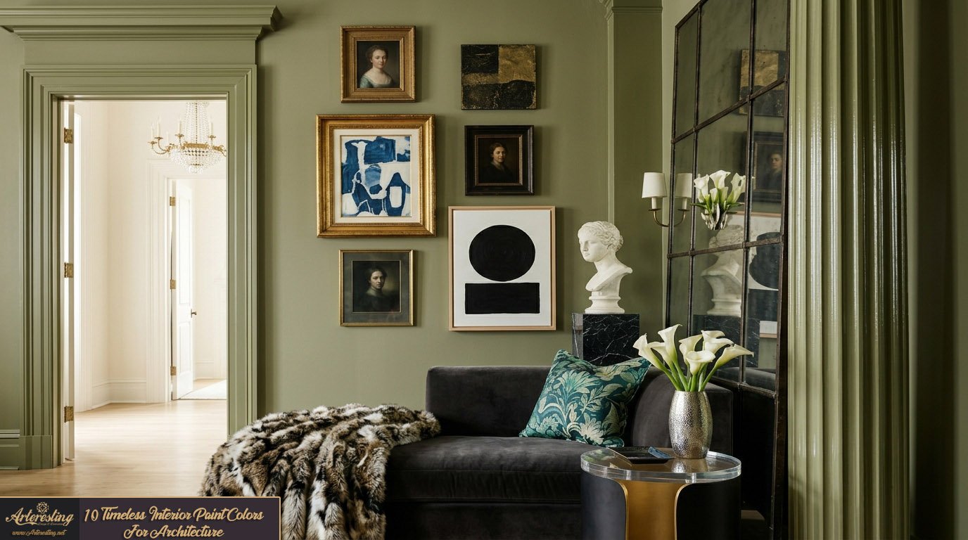
7. Sherwin-Williams Cocoon
Cocoon emerges as a profoundly warm, moody green that defies standard neutral categorizations. Specifically, it offers unexpected depth that digital photography rarely captures accurately. Therefore, it serves brilliantly across entire rooms, enveloping custom millwork and heavy architectural moldings.
Crucially, green operates as nature’s ultimate neutral. Furthermore, Cocoon leans heavily into olive and umber undertones to strip away synthetic vibrancy. Visually, this creates a deeply organic, grounding shell for interior living.
Consequently, it visually lowers heart rates and promotes lingering conversations. How should you utilize it? Specifically, color-drench a library or listening room. Moreover, paint the baseboards, walls, and ceiling simultaneously to erase visual boundaries.
Shop The Look
8. Sherwin-Williams Shiitake: Selecting Sophisticated Neutral Paints
Shiitake functions as an exceptionally versatile warm gray chameleon. Crucially, this shade harmonizes seamlessly with exotic stone countertops and warm timber cabinetry. Therefore, designers rely on such sophisticated neutral paints to provide an infallible backdrop for highly textural spaces.
Furthermore, cool grays often render spaces sterile and commercial. Consequently, Shiitake injects heavy mushroom and taupe undertones to warm the spatial envelope. Visually, it bridges the gap between austere modernism and rustic comfort.
Moreover, it actively responds to adjacent materials, reflecting their inherent warmth. How do you deploy it? Specifically, use it as the primary wall color in heavily mill-worked kitchens. Consequently, it softens the transition between harsh stainless steel appliances and organic wood grains.
Shop The Look
9. Farrow & Ball Wimborne White
Wimborne White offers a clean, luminous foundation that remains structurally relevant across eras. Specifically, this shade leverages a microscopic dose of warm pigment to soften harsh reflections. Therefore, it provides an adaptable canvas that brilliantly captures and diffuses natural light.
Crucially, an entirely untinted white feels medically abrasive. Furthermore, Wimborne White incorporates just enough yellow to mimic historical limewash. Visually, this grants the walls a subtle, vibrating energy rather than flat opacity.
Consequently, it performs exceptionally well in heritage properties and modern builds alike. How should you apply it? Specifically, utilize it across entire open-plan living sectors. Moreover, finish it in a dead-flat matte to absorb light gently.

10. Farrow & Ball Down Pipe: Mastering Timeless Interior Paint Colors
Down Pipe proves that dramatic, dark charcoals possess immense architectural longevity. Specifically, it injects profound depth and sophisticated elegance without succumbing to fleeting trends. Therefore, mastering these timeless interior paint colors allows for striking metallic contrast and spatial definition.
Visually, Down Pipe carries a hidden green-blue complexity beneath its leaden surface. Furthermore, this prevents the charcoal from reading as a dead, flat black. Crucially, the dark pigment forces the eye to focus inward on the room’s illuminated contents.
Consequently, it acts as a theatrical backdrop for curated living. How do you execute this? Specifically, coat the walls of an intimate dining room or structural fireplace surround. Moreover, strictly use brushed brass accents to pierce the dark void.

Architectural Color Specification Matrix
| Paint Shade | Brand | Primary Undertone | Optimal Spatial Application |
| Kittiwake | Farrow & Ball | Steel Blue | Open-Concept Living Rooms |
| Swiss Coffee | Benjamin Moore | Warm Green | Extensive Connecting Corridors |
| Notable Hue | Sherwin-Williams | Gray-Blue | Formal Dining Ceilings |
| Hale Navy | Benjamin Moore | True Deep Blue | Custom Kitchen Cabinetry |
| Chantilly Lace | Benjamin Moore | Pure Neutral | Complex Architectural Millwork |
| Prussian Blue | Benjamin Moore | Historic Blue | Lacquered Powder Rooms |
| Cocoon | Sherwin-Williams | Olive/Umber | Color-Drenched Libraries |
| Shiitake | Sherwin-Williams | Mushroom/Taupe | Timber-Clad Kitchens |
| Wimborne White | Farrow & Ball | Faint Yellow | Open-Plan Heritage Sectors |
| Down Pipe | Farrow & Ball | Green-Blue | Intimate Fireplace Surrounds |
Ultimately, achieving spatial perfection requires restraint and strategic pigment selection. Specifically, committing to timeless interior paint colors ensures your architectural framework never feels obsolete. Furthermore, always test these shades physically against your unique lighting conditions. Consequently, your home will maintain its elevated, enduring elegance.
Timeless interior paint colors rely on balanced undertones and stable light reflectance to maintain architectural relevance over decades. Design professionals consistently specify shades like Benjamin Moore’s Swiss Coffee for warm neutrality and Farrow & Ball’s Hale Navy for structural depth. These selections anchor a room visually, allowing furnishings to evolve while the spatial atmosphere remains enduring and sophisticated.
1 comment
[…] Related: 10 Timeless Interior Paint Colors For Architecture […]