
Table of Contents
Choosing the right paint fundamentally alters spatial perception. If you are searching for colors that make a house look expensive, the solution relies on chromatic complexity rather than price tags. Specifically, designers manipulate light and undertones to engineer interiors that feel highly architectural and profoundly considered.
1. Rich And Earthy Neutrals
Earthy neutrals establish a foundation of quiet sophistication. Warm beige tones with layered undertones shift dynamically throughout the day. Consequently, this prevents walls from reading flat, allowing light to pool softly and create an intimate, boutique hotel atmosphere.
Decorating with neutrals demands absolute precision. Furthermore, Sherwin-Williams’ Renwick Beige offers the exact depth required for this execution. Designer Mallory Robins utilizes this enveloping tone for its distinct complexity. Visually, it adds structural dimension to a primary bedroom. Therefore, you should select shades slightly darker than standard builder-grade beige. This deliberate choice immediately grounds the room.
Shop The Look
2. Deep Olive Green: Colors That Make A House Look Expensive
Deep olive green generates masterful spatial drama, particularly in smaller footprints. Dark greens heavily saturated with black and blue undertones provide a sophisticated backdrop. Crucially, these jewel tones recede visually, which expands the perceived boundaries of the room.
Related: 10 Timeless Interior Paint Colors For Architecture
Saturated hues operate effectively when balanced with organic textures. Specifically, Gabrielle Bove recommends Sherwin-Williams’ Ripe Olive to achieve this exact atmospheric shift. The rich color swallows harsh light and softens hard architectural lines. Consequently, layering warm woven materials against this dark background prevents the scheme from feeling heavy. Instead, the contrast produces a highly tactile and collected environment.

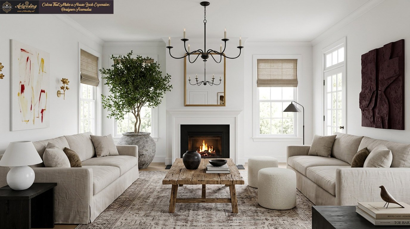
3. Delicate Off-Whites: Elevated Room Colors
Warmer off-whites reflect natural light softly, making spaces feel inviting and highly refined. Soft whites create a quiet canvas that allows architecture, stone, and natural oak to dominate. Visually, they bring warmth and depth without overpowering the primary structure.
Aileen Warren advises utilizing varying paint finishes to introduce movement into a white room. Specifically, applying different sheens forces the light to bend differently across surfaces. Furthermore, Sabah Mansoor emphasizes that layering natural linen, plaster, and cream tones prevents a flat appearance. You must mix tonal whites intentionally.
| Architectural Element | Recommended Paint Finish | Visual Effect |
| Walls | Matte | Absorbs light; hides imperfections smoothly. |
| Trim & Baseboards | Satin | Reflects light gently; defines structural borders. |
| Ceilings | Flat | Eliminates glare; draws the eye downward. |

4. Soft Mauve: Muted Complexity
Soft mauve introduces color while maintaining the strict chromatic restraint of a neutral. Shades heavily anchored by gray undertones read as low-key and relaxed. Therefore, the color registers emotionally rather than visually, producing a highly sophisticated environment.
Christy Allen utilizes Benjamin Moore’s Desert Light to achieve this delicate balance. The paint operates almost invisibly upon entry. However, you immediately notice the relaxed atmosphere it generates. If you want to utilize colors that make a house look expensive while introducing subtle warmth, soft mauve provides the perfect vehicle. Specifically, this shade requires restraint. You should let the subtle gray undertones dictate the accompanying textiles.
Shop The Look
5. Rich Burgundy: A Luxury Interior Color Palette
Rich burgundy anchors architecture through intense color saturation. Jewel-toned purples and deep plum reds possess a historical association with high-end interiors. Crucially, applying this immersive color to joinery transforms basic built-ins into dramatic, structural focal points.
Rebecca Letwin favors Benjamin Moore’s Dark Walnut to immediately upgrade living spaces. Visually, this deep hue makes rooms feel both cocooning and deeply intentional. Furthermore, successful implementation requires high contrast. You must place warm brass accents and bright white objects against the dark background. Consequently, these lighter elements command attention rather than disappearing into the shadows.
Mastering spatial styling requires strict adherence to lighting behavior and tonal depth. Ultimately, the colors that make a house look expensive rely on deliberate contrast, rich textures, and nuanced undertones. Therefore, applying these exact designer formulas ensures your home feels structurally sound and entirely intentional.